# Addons Product Block
Source: https://blocks-docs.geticonicapps.com/block-guides/addons-product-block
Complete guide to the Addons Product Block — a toggle-based upsell block that lets shoppers add complementary products to their cart directly from the product page. Covers setup, product selection, placement, best practices, common mistakes, and troubleshooting.
## What Is the Addons Product Block?
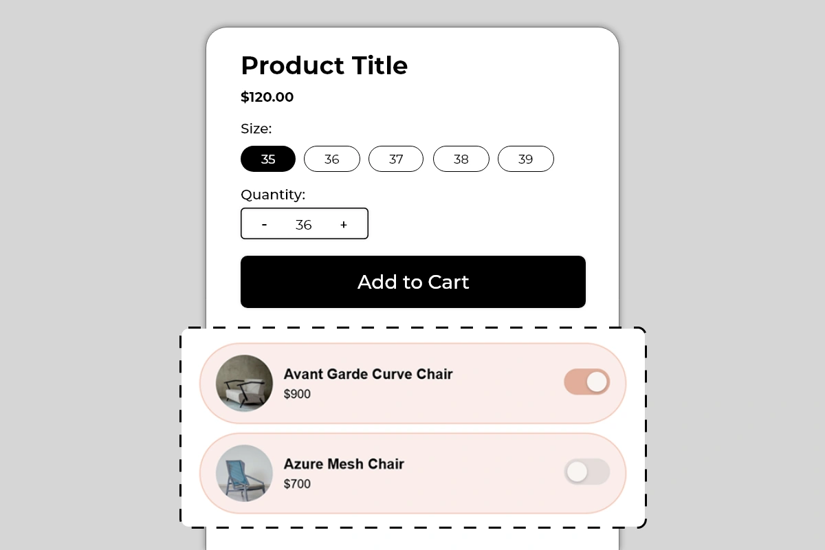
The Addons Product Block displays a list of complementary products directly on your product page, each with a toggle switch that shoppers use to add them to their cart alongside the main product. Each add-on row shows a product image, product name, and price — with a toggle on the right that activates or deactivates the add-on.
When a shopper toggles an add-on on, that product is added to their cart together with the main product they are buying. No separate product page visit required. No extra search needed. The add-on goes into the cart in one tap.
This block is one of the most direct average order value tools in Iconic Blocks — it turns a single-product purchase into a multi-product purchase at the exact moment the shopper is already in buying mode.
## Why It Matters for Conversion and AOV
Getting a shopper to the point of buying is the hardest part of e-commerce. Once a shopper is on a product page, engaged, and about to add to cart, they are in the highest-intent state they will ever be in. This is the moment when suggesting a complementary product has the highest chance of being accepted.
The toggle format is specifically designed to reduce friction in this moment:
* It does not interrupt the main purchase flow
* It does not redirect to another product page
* It does not require the shopper to search or browse
* A single tap adds the product — a second tap removes it
The result is that shoppers who would never have sought out the add-on product independently will add it simply because it is presented at the right moment in a frictionless format. This is the core mechanic behind add-on and bundle upselling — and it works because the effort required is near zero.
## How to Add the Addons Product Block
1. Go to **Online Store → Themes** in your Shopify admin
2. Click **Customize** on your active theme
3. Using the top dropdown, open your **product template**
4. In the left sidebar, click **Add block**
5. Under **Apps**, select **Iconic Blocks → Addons Product**
6. The block appears in your layout — configure it in the **right sidebar**
7. Drag the block to your preferred position in the left sidebar
8. Click **Save**
## Key Settings
**Add-on Products** Select the products you want to display as add-ons. These are pulled from your Shopify product catalog. You can add multiple products — each appears as its own row in the block. The product image, name, and price are pulled automatically from the product in your Shopify admin.
Choose products carefully — see Best Practices below for guidance on what makes a good add-on versus a poor one.
**Product Image** Pulled automatically from the product's main image in Shopify. Displayed as a circular thumbnail on the left of each row. If a product's main image is not ideal for a small circular thumbnail — for example, a full lifestyle shot — consider updating the product image in Shopify admin to a clean product-only image that works at small sizes.
**Product Name** Pulled automatically from the product title in Shopify. Displayed in bold in the center of the row. If your product titles are long, they may truncate on smaller screens — keep product titles concise for products used as add-ons.
**Price** Pulled automatically from the product's current price in Shopify. Displayed below the product name. If the product has a sale price, confirm which price is showing and that it is accurate.
**Toggle State on Load** Configure whether each add-on starts with the toggle in the on or off position when the page loads. Starting a toggle in the on position means the add-on is pre-selected — the shopper has to actively turn it off if they do not want it. This increases add-on attachment rate but can feel presumptuous if not clearly communicated. Use pre-selected toggles only for genuinely essential or universally relevant add-ons.
**Card Background Color** The background color of each add-on row card. The default is a soft pink/blush tone as shown in the example. Choose a color that is noticeably different from the product page background — enough to visually group the add-on rows as a distinct block — but soft enough not to overpower the product content above.
**Toggle Active Color** The color of the toggle when it is switched on. The default matches the card background in a deeper tone. Use your brand's primary color here — it makes the active toggle feel intentional and on-brand.
**Block Heading** An optional heading above the add-on rows — for example, *Complete the Look*, *Frequently Bought Together*, *Add to Your Order*, or *You May Also Need*. A heading contextualizes the block and makes it clear to shoppers what these products are and why they are being shown.
## Choosing the Right Add-on Products
The products you select for this block determine its effectiveness entirely. A poorly chosen add-on will be ignored. A well-chosen add-on will be toggled on by a significant percentage of shoppers.
**What makes a good add-on:**
* Directly complements the main product — a chair cover for a chair, a lens cap for a camera, socks for shoes
* Lower in price than the main product — an add-on priced higher than the main product feels like an upsell to a better product, not an add-on to the current one
* Something the shopper genuinely needs alongside the main product — a charger for an electronic device, a carrying case for equipment
* A consumable or accessory the shopper would buy anyway — replacement parts, care products, cleaning kits
**What makes a poor add-on:**
* A completely unrelated product from a different category
* A product that is the same as or more expensive than the main product
* A product the shopper would never think to need — no matter how good the product is, if the shopper has no mental model for needing it, they will not toggle it on
* A product that is already included with the main product — showing it as an add-on creates confusion
## Placement Strategy
**Best position: Directly below the Add to Cart button** This is the placement shown in Image 1 and the most effective position for this block. A shopper who has decided to buy the main product sees the add-ons immediately after the Add to Cart button. They are in active buying mode — this is exactly when a frictionless add-on toggle is most likely to be accepted. The sequence is: decide to buy main product → see complementary add-ons → toggle on the relevant one → add everything to cart.
**Second best position: Between the price and Add to Cart button** Works for add-ons that are so closely related to the main product that they influence the buying decision itself — for example, a warranty, a protection plan, or a customization option. In this case the shopper evaluates the main product and the add-on together before deciding.
**Avoid placing it:**
* Above the product title — add-ons are supplementary, not introductory
* At the bottom of the page below reviews and descriptions — by this point the shopper has already decided and the add-on opportunity is largely missed
* Before the shopper has seen the main product price — add-on pricing only makes sense in context of the main product price the shopper has already seen
## Best Practices
* **Limit to 2 to 3 add-ons maximum.** One well-chosen add-on converts better than five mediocre ones. Too many options creates decision fatigue and can reduce both the add-on conversion rate and the main product conversion rate. Pick the 2 to 3 most relevant, highest-value add-ons and stop there.
* **Price add-ons below the main product.** An add-on priced at $20 to $50 alongside a $120 main product feels natural — a small incremental spend for a useful complement. An add-on priced at $200 alongside a \$120 product feels like being upsold to a different product entirely.
* **Use a descriptive block heading.** *Complete the Look* works for fashion. *Frequently Bought Together* works for home and electronics. *Add to Your Order* works for consumables. The heading should tell the shopper exactly why these products are being shown and what relationship they have to the main product.
* **Test pre-selected toggles carefully.** Pre-selecting an add-on can increase attachment rate but can also frustrate shoppers who do not notice the toggle is on and end up with an unwanted product in their cart. If you use pre-selected toggles, make the toggle state clearly visible and use a heading that signals the add-on is included by default.
* **Keep product images clean and product-focused.** Circular thumbnails at small sizes work best with clean, centered product images on a plain or minimal background. Lifestyle images and busy compositions do not read well at thumbnail size.
* **Update add-on selections seasonally or when product relevance changes.** An add-on that was relevant during winter may not be relevant in summer. Review the add-on selections periodically and update them to maintain relevance.
## Common Mistakes
**Selecting add-ons that are unrelated to the main product** Showing a candle as an add-on on a footwear product page has no logical connection for the shopper. They will ignore it. Every add-on must have an obvious and immediate relationship to the main product.
**Using too many add-ons** A block with 5 or 6 add-on rows takes up significant vertical space and overwhelms the shopper with choices. Decision fatigue reduces both add-on and main product conversion. Keep it to 2 to 3 maximum.
**Pricing add-ons higher than the main product** A $900 add-on shown below a $120 main product is not an add-on — it is a more expensive alternative. Shoppers will either be confused or feel pressured. Add-ons should feel like a small, sensible incremental spend.
**Not verifying product prices are current** Add-on prices are pulled from Shopify in real time. If a product goes on sale or the price changes, the block will reflect the new price automatically. This is generally correct behavior — but verify that sale prices showing in the block are accurate and intentional before publishing.
**Pre-selecting high-value add-ons without clear communication** Pre-selecting a $150 add-on toggle means a shopper who does not notice it will reach checkout with an unexpected $150 item in their cart. This creates disputes and erodes trust. Only pre-select low-cost, genuinely essential add-ons — and always use a heading that makes the pre-selection visible and intentional.
**Using poor quality or unsuitable thumbnail images** A blurry, off-center, or lifestyle-heavy image does not read well at the small circular thumbnail size used by this block. Update product images in Shopify admin for any product used as an add-on to ensure the thumbnail is clean, centered, and immediately identifiable.
## Troubleshooting
**The add-on is not being added to the cart when toggled on**
* *Cause:* The product may be out of stock, or there is a cart conflict with the toggle action.
* *Solution:* Verify the add-on product has available inventory in **Shopify Admin → Products → \[Product] → Inventory**. Test the toggle on the live page in an incognito browser. If the issue persists, contact Iconic Blocks support.
**The product image is not showing or showing incorrectly**
* *Cause:* The product does not have a main image set in Shopify, or the image is not loading correctly.
* *Solution:* Go to **Shopify Admin → Products → \[Product]** and verify a main product image is uploaded. If the image exists but is not rendering, hard refresh the live page. If the issue continues, contact Iconic Blocks support.
**The block is not appearing on the product page**
* *Cause:* The block was not saved after being added, or it was added to the wrong product template.
* *Solution:* Go to **Online Store → Themes → Customize**, open the correct product template, confirm the block is in the left sidebar layout, and click **Save**.
**The add-on price shown is incorrect**
* *Cause:* The price in the block is pulled directly from the product in Shopify. If it looks wrong, the product price in Shopify admin may have been updated or a discount may be active.
* *Solution:* Go to **Shopify Admin → Products → \[Product]** and verify the current price is correct. Check for any active automatic discounts that may be affecting the displayed price.
**The block appears on some products but not others**
* *Cause:* Your store uses multiple product templates and the block was only added to one.
* *Solution:* Open each product template in the Theme Editor and add the block to any template where it is missing. Configure different add-on products per template if the complementary products differ by product category.
**The block is visible in the Theme Editor but not on the live store**
* *Cause:* Changes were not saved, or the browser is showing a cached version of the page.
* *Solution:* Click **Save** in the Theme Editor, then open the live product page in a new private or incognito browser window.
# Badges Block
Source: https://blocks-docs.geticonicapps.com/block-guides/badges-block
Complete guide to the Badges Block — colorful pill-style tags that highlight product attributes, certifications, and urgency signals on the product page. Covers setup, placement, best practices, common mistakes, and troubleshooting.
## What Is the Badges Block?
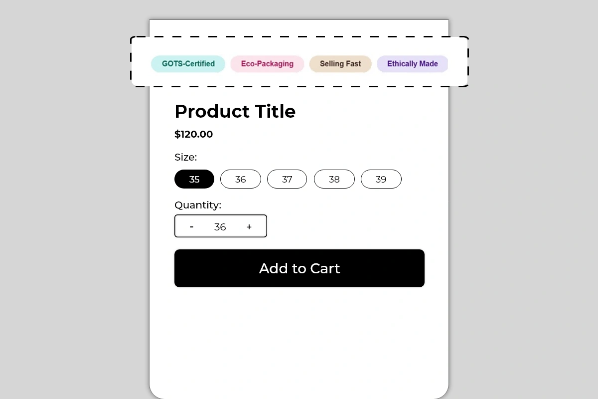
The Badges Block displays a row of small, colorful pill-shaped tags on your product page. Each badge shows a short label — a product attribute, certification, urgency signal, or brand claim — in a distinct pastel color that makes it immediately visible without being aggressive or intrusive.
Unlike trust badges or benefit lists, these badges are scannable at a glance. A shopper does not need to read a sentence or process an icon. They see *GOTS-Certified* or *Selling Fast* in under a second and it registers instantly.
Use this block to surface product qualities and signals that might otherwise be buried in your description or missed entirely by shoppers who skim.
## Why It Matters for Conversion
Most shoppers form their first impression of a product within a few seconds of landing on the page. At that moment they are not reading — they are scanning. Pill badges are designed specifically for this scanning behavior.
A badge like *Ethically Made* signals brand values before a shopper reads a single word of the description. *Selling Fast* creates urgency without a countdown timer. *Customer Favorite* adds social proof without a review widget. *Limited Stock* prompts action without a separate stock indicator block.
Each badge communicates one signal in the least amount of time possible — which is exactly what the first few seconds of a product page visit require.
## How to Add the Badges Block
1. Go to **Online Store → Themes** in your Shopify admin
2. Click **Customize** on your active theme
3. Using the top dropdown, open your **product template**
4. In the left sidebar, click **Add block**
5. Under **Apps**, select **Iconic Blocks → Badges**
6. The block appears in your layout — configure it in the **right sidebar**
7. Drag the block to your preferred position in the left sidebar
8. Click **Save**
## Key Settings
**Badge Label** The text displayed inside each pill. Keep every label to 1 to 3 words maximum. The badge format is designed for short, punchy labels — not sentences. Longer text breaks the pill shape and reduces readability.
Good examples:
* *GOTS-Certified*
* *Eco-Packaging*
* *Selling Fast*
* *Ethically Made*
* *Customer Favorite*
* *Limited Stock*
* *Vegan Formula*
* *Handcrafted*
* *Award-Winning*
**Badge Background Color** Each badge has its own individually configurable pastel background color. The color should be distinct enough to visually separate each badge from the others but soft enough not to overpower the product page. Avoid using the same color for multiple badges — color differentiation helps the eye process each badge as a separate signal.
**Text Color** Matches or complements the badge background. Keep text dark enough to be readable against the pastel background. The examples use a slightly deeper tone of the same hue as the background — this creates a cohesive, polished look without harsh contrast.
**Number of Badges** The block supports multiple badges displayed in a horizontal row that wraps to a second row on smaller screens. Use between 3 and 6 badges. Fewer than 3 looks sparse. More than 6 starts to crowd the block and dilutes the impact of each individual signal.
**Badge Order** Arrange badges by priority — the most important signal first on the left, since that is where the eye naturally starts. If you have a certification and an urgency signal, put the certification first to establish credibility, then follow with the urgency badge.
## Placement Strategy
**Best position: Above the product title** This is the placement shown in the image and the most effective position for this block. Badges placed above the product title are the first thing a shopper sees when they land on the page. They set context and expectation before the shopper even reads the product name. A *GOTS-Certified* or *Ethically Made* badge here immediately communicates brand values to the right audience.
**Second best position: Between the product title and price** This works well when your badges are urgency or availability signals — *Selling Fast*, *Limited Stock*, *Customer Favorite*. Placed between the title and price, they create a sense of demand at the exact moment the shopper is about to evaluate the cost.
**Avoid placing it:**
* Below the Add to Cart button — badges are first-impression signals, not closing arguments
* Inside the product description — they lose visual separation and blend into text
* At the bottom of the product page — almost no shoppers will see them there
## Best Practices
* **Use badges for signals that cannot fit anywhere else.** Certifications, ethical claims, trending signals, and niche product attributes are perfect for badges. If the information can go in a benefit item or trust badge, put it there. Badges work best for short claims that stand alone.
* **Keep every label to 3 words or fewer.** The pill shape only works visually when the text is short. The moment a badge label wraps inside the pill, it stops looking like a badge and starts looking like a broken layout.
* **Use different colors for each badge.** Color is part of how the eye separates and processes each badge. Two badges in the same color look like a group, not individual signals. Each badge should be immediately distinguishable at a glance.
* **Match badge content to the product, not the store.** A badge saying *GOTS-Certified* should only appear on products that are actually GOTS-certified. Generic badges applied to every product lose credibility fast.
* **Combine urgency and attribute badges for maximum impact.** A row of *Ethically Made, Eco-Packaging, Customer Favorite, Selling Fast* covers brand values, social proof, and urgency simultaneously — in under two seconds of reading time.
* **Keep badge colors soft, not bold.** Pastel tones work because they add color without competing with the product image or the Add to Cart button. Bold or saturated colors draw too much attention to the badges and away from the product itself.
## Badge Ideas by Store Type
**Fashion and apparel** *Ethically Made, GOTS-Certified, Eco-Packaging, Selling Fast, Limited Edition, Handcrafted*
**Health, wellness, and supplements** *Vegan Formula, Gluten-Free, Lab Tested, No Additives, Customer Favorite, Limited Stock*
**Beauty and skincare** *Cruelty-Free, Dermatologist Tested, Natural Ingredients, Award-Winning, Bestseller*
**Food and beverage** *Organic, Non-GMO, Locally Sourced, Sugar-Free, Chef Approved, Selling Fast*
**Home and lifestyle** *Handcrafted, Sustainably Sourced, Limited Edition, Customer Favorite, Eco-Friendly*
## Common Mistakes
**Writing badge labels that are too long** A label like *Made With Organic Cotton* does not fit cleanly inside a pill badge. It wraps, breaks the shape, and looks unfinished. Cut it to *Organic Cotton* or *GOTS-Certified* — same message, correct format.
**Using the same color for multiple badges** When two or more badges share the same background color, they visually merge into one group. The individual signal strength of each badge drops. Always assign a unique color to each badge.
**Adding badges that do not apply to the product** Displaying *Limited Stock* on a product that has 500 units in stock, or *GOTS-Certified* on a product without that certification, damages trust the moment a shopper investigates. Every badge must be accurate.
**Using too many badges** Six or more badges in a row starts to feel like visual noise. Shoppers stop reading them individually and start ignoring the block entirely. Pick the 3 to 5 most impactful signals and stop there.
**Placing badges below the fold** Badges are designed for immediate first-impression impact. If they are placed below the product description or near the bottom of the page, they are not doing their job. Keep them above the product title or between the title and price at the latest.
## Troubleshooting
**The block is not appearing on the product page**
* *Cause:* The block was not saved after being added, or it was added to the wrong product template.
* *Solution:* Go to **Online Store → Themes → Customize**, open the correct product template, confirm the block is visible in the left sidebar layout, and click **Save**.
**Badge colors look different on the live store than in the Theme Editor**
* *Cause:* The theme's CSS may be applying its own background or color styles that override the block settings.
* *Solution:* Try a stronger or more distinct color value in the badge settings. If the issue continues, contact Iconic Blocks support with your store URL.
**Badge labels are wrapping inside the pill on mobile**
* *Cause:* The badge label is too long for the pill shape at smaller screen widths.
* *Solution:* Shorten each badge label to 3 words or fewer. Preview using the mobile view toggle in the Theme Editor after each change.
**Badges appear on some products but not others**
* *Cause:* Your store uses multiple product templates and the block was only added to one.
* *Solution:* Open each product template in the Theme Editor and add the block to any template where it is missing.
**The block is visible in the Theme Editor but not on the live store**
* *Cause:* Changes were not saved, or the browser is showing a cached version of the page.
* *Solution:* Click **Save** in the Theme Editor, then open the live product page in a new private or incognito browser window.
# Benefits Block
Source: https://blocks-docs.geticonicapps.com/block-guides/benefits-block
Complete guide to the Benefits Block — including both checklist and grid layouts, step-by-step setup, placement strategy, best practices, common mistakes, and troubleshooting.
## What Is the Benefits Block?
The Benefits Block displays your product's key selling points directly on the product page in a scannable, visual format. Instead of burying benefits inside a long product description, this block puts them front and center — right where shoppers are making their buying decision.
It comes in two layout styles:
* **Benefits List** — a vertical checklist with an icon, a bold keyword, and a short supporting text per item
* **Benefits Grid** — a two-column card layout with an icon, a title, and a subtitle per item
Both layouts serve the same purpose. The right choice depends on your product type, the number of benefits you want to show, and the visual style of your store.
## Why It Matters for Conversion
Shoppers skim product pages. They do not read full descriptions — they scan for reasons to buy or reasons to hesitate. If your key selling points are written inside a paragraph, most shoppers will miss them entirely.
The Benefits Block solves this by presenting your strongest selling points in a format that is impossible to miss and takes seconds to read. Placed directly below the Add to Cart button or just above it, it gives shoppers the quick confirmation they need to feel confident about their purchase.
## Layout 1 — Benefits List
### What It Looks Like
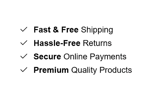
A vertical list where each row contains:
* A **checkmark or custom icon** on the left
* A **bold keyword** (e.g. *Fast & Free*) followed by supporting text (e.g. *Shipping*)
* Each item stacked cleanly below the last
Best for stores that want a clean, minimal look — works well for fashion, lifestyle, general merchandise, and any store where trust and reassurance are the primary message.
### How to Add Benefits List
1. Go to **Online Store → Themes** in your Shopify admin
2. Click **Customize** on your active theme
3. Using the top dropdown, open your **product template**
4. In the left sidebar, click **Add block**
5. Under **Apps**, select **Iconic Blocks → Benefit #1**
6. The block appears in your layout — configure it in the **right sidebar**
7. Drag the block to your preferred position in the left sidebar
8. Click **Save**
### Key Settings — Benefits List
**Icon** Choose a checkmark or upload a custom icon for each benefit item. Keep icons consistent across all items — mixing styles looks unpolished.
**Bold Keyword** This is the first part of each benefit line and displays in bold. Keep it to 1–3 words. This is what the shopper reads first — make it the most impactful word in the benefit (e.g. *Free*, *Secure*, *Hassle-Free*).
**Benefit Text** The regular weight text that follows the bold keyword. This completes the benefit statement (e.g. *Shipping*, *Online Payments*, *Returns*). Keep it short — 2 to 4 words.
**Number of Items** Add between 3 and 5 benefit items. Fewer than 3 looks sparse. More than 5 starts to feel like a list nobody will read.
**Spacing and Dividers** Control the spacing between items and whether a divider line appears between each row. Dividers work well on light themes. Remove them on dark or minimal themes for a cleaner look.
## Layout 2 — Benefits Grid
### What It Looks Like
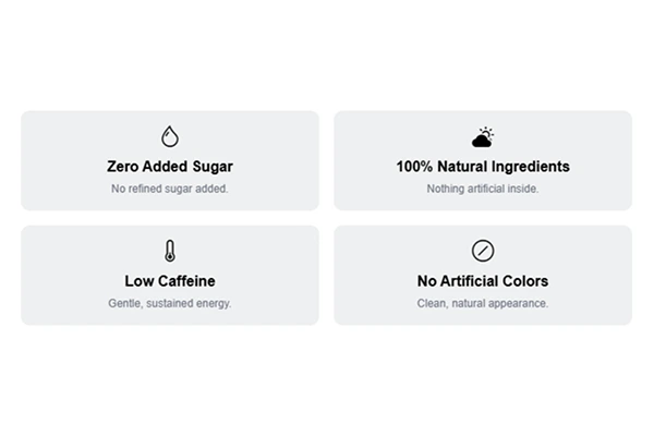
A two-column card grid where each card contains:
* An **emoji or icon** at the top center
* A **bold title** below the icon (e.g. *Zero Added Sugar*)
* A **short subtitle** below the title (e.g. *No Refined Sugar Added.*)
Each card has a light background, giving it a boxed, structured appearance. Best for health, food, wellness, beauty, and supplement products where specific product attributes need individual emphasis.
### How to Add Benefits Grid
1. Go to **Online Store → Themes** in your Shopify admin
2. Click **Customize** on your active theme
3. Using the top dropdown, open your **product template**
4. In the left sidebar, click **Add block**
5. Under **Apps**, select **Iconic Blocks → Benefit #2**
6. The block appears in your layout — configure it in the **right sidebar**
7. Drag the block to your preferred position in the left sidebar
8. Click **Save**
### Key Settings — Benefits Grid
**Icon or Emoji** Each card supports an emoji or uploaded icon at the top. Emojis work well for food and wellness products because they are immediately recognizable and add visual warmth. Custom icons work better for brands with a more formal or premium tone.
**Card Title** The bold text inside each card. This should name the benefit directly — not describe it. Keep it under 5 words (e.g. *Zero Added Sugar*, *100% Natural Ingredients*).
**Card Subtitle** A single short sentence that supports the title. This is not the place for marketing language — use it to add one specific, credible detail (e.g. *No Refined Sugar Added.*, *Nothing artificial inside.*).
**Number of Cards** The grid works best with 4 cards (2 rows of 2). You can also use 2, but 4 is the most visually balanced and easiest to read on both desktop and mobile.
**Card Background Color** Use a light neutral that complements your theme background. Avoid strong colors — the card background is structural, not decorative. Its job is to separate each benefit visually, not draw attention to itself.
## Placement Strategy
Where you place the Benefits Block on your product page has a direct impact on how many shoppers see it and act on it.
**Best position: Directly below the Add to Cart button** This is the highest-impact placement. A shopper reads the product name, sees the price, selects their variant, and is about to click Add to Cart. The benefits block at this exact moment answers the unspoken question — *"Why should I buy this right now?"*
**Second best position: Between the price and the Add to Cart button** Works well if your product page is long and the Add to Cart button sits lower on the page. Placing benefits here keeps them visible in the zone where the buying decision is being made.
**Avoid placing it:**
* At the very bottom of the product page — most shoppers will never scroll that far
* Above the product title — it disrupts the natural reading flow
* Inside a collapsed accordion or tab — it reduces visibility significantly
## Best Practices
* **Lead with your strongest benefit first.** Shoppers read top to bottom. Put the benefit that removes the biggest objection at the top of the list.
* **Use specific language, not generic claims.** *Free shipping on all orders* converts better than *Great Shipping*. *30-day hassle-free returns* converts better than *Easy Returns*.
* **Match the layout to your product type.** Use Benefits List for trust and reassurance messaging. Use Benefits Grid for product-specific attributes and features.
* **Keep all benefit text at a similar length.** Inconsistent lengths look unfinished and break the visual rhythm of the block.
* **Do not use both layouts on the same product page.** Pick one. Using both creates visual repetition and dilutes the impact of each.
* **Test on mobile before publishing.** The Grid layout especially needs to be checked on mobile — cards should stack cleanly and remain readable at small screen sizes.
## Common Mistakes
**Using vague benefit text** Writing *Good Quality* or *Best Products* communicates nothing specific. Every benefit should answer a real question a shopper might have.
**Adding too many items** More than 5 items in a list or more than 6 cards in a grid starts to feel overwhelming. If everything is highlighted, nothing stands out. Pick your best 3 to 4 benefits and stop there.
**Placing the block too far down the page** If the block appears after a long description, size guides, and shipping tabs, most shoppers will never see it. Benefits need to be in the zone where the purchase decision is happening — near the price and Add to Cart button.
**Using mismatched icons** Mixing flat icons with emojis or using icons of different visual weights makes the block look inconsistent. Choose one style and apply it across all items.
**Writing card subtitles that repeat the title** *Title: Zero Added Sugar / Subtitle: No sugar added.* — this adds no value. Use the subtitle to add a new piece of information, not restate what the title already says.
## Troubleshooting
**The block is not appearing on the product page**
* *Cause:* The block was added but the theme was not saved, or it was added to the wrong template.
* *Solution:* Go to **Online Store → Themes → Customize**, open the correct product template, confirm the block is visible in the left sidebar layout, and click **Save**.
**The block appears on some products but not others**
* *Cause:* Your store uses multiple product templates and the block was only added to one of them.
* *Solution:* In the Theme Editor, check each product template separately and add the block to any template where it is missing.
**Icons are not displaying**
* *Cause:* The icon file format is not supported, or the image did not upload correctly.
* *Solution:* Use PNG or SVG format. Re-upload the icon in the block settings. If the issue persists, try a different browser.
**The grid cards are stacking unevenly on mobile**
* *Cause:* Card subtitles are significantly different lengths, causing uneven card heights.
* *Solution:* Edit subtitle text so all cards have a similar character count. Aim for one short sentence per card, consistently.
**The block is visible in the Theme Editor preview but not on the live store**
* *Cause:* Changes were not saved, or the browser is showing a cached version of the page.
* *Solution:* Click **Save** in the Theme Editor, then open the live product page in a new private/incognito browser window.
# Circle Menu Block
Source: https://blocks-docs.geticonicapps.com/block-guides/circle-menu-block
Complete guide to the Circle Menu Block — a scrollable horizontal row of circular image links for navigating variants, related products, or collections directly from the product page. Covers setup, image selection, linking, placement, best practices, common mistakes, and troubleshooting.
## What Is the Circle Menu Block?
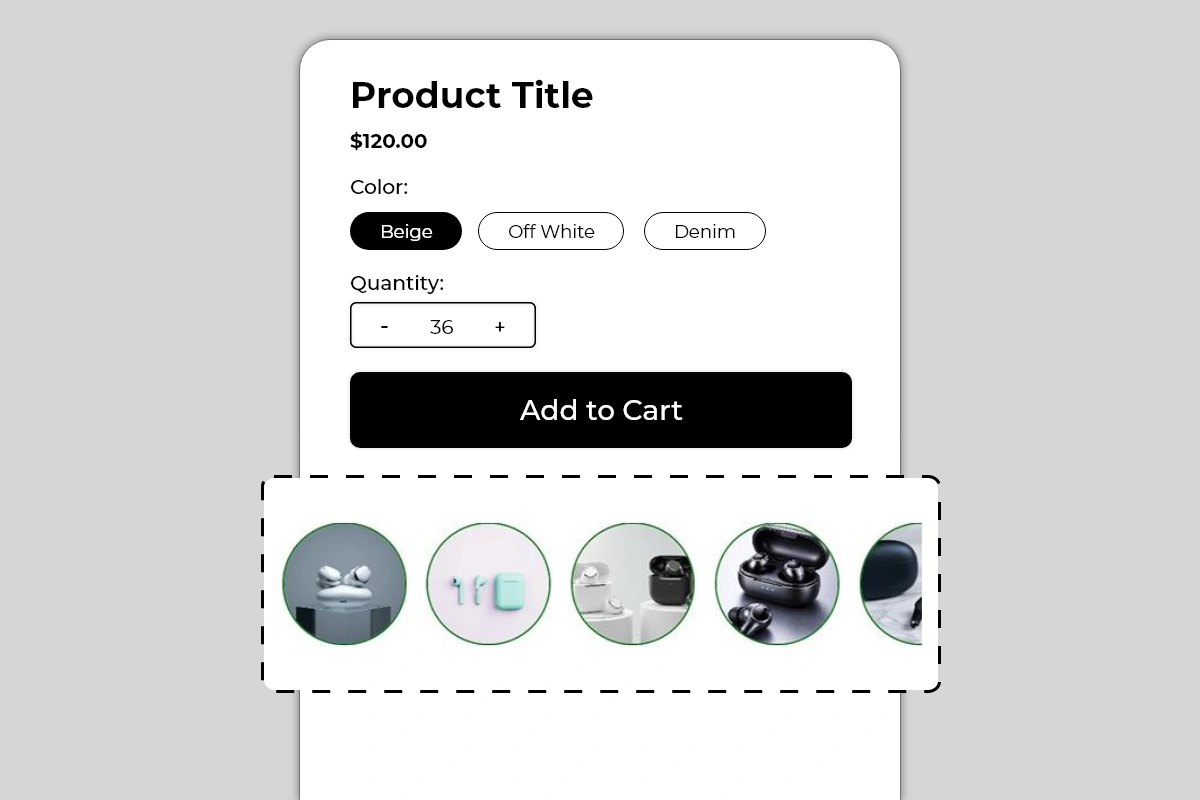
The Circle Menu Block displays a horizontally scrollable row of circular image thumbnails on your product page. Each circle contains an image and links to a product, variant, or URL you specify. Shoppers scroll through the row and tap or click any circle to navigate directly to that item.
The block is purely visual — no labels, no prices, no text. The images do the entire job of communicating what each circle links to. A colored border around each circle adds visual definition and is fully configurable to match your brand.
This block is used in two primary ways:
* **Variant navigation** — showing different colors, styles, or versions of the same product as individual circles, each linking to the relevant variant or product page
* **Related product navigation** — showing complementary or similar products from the same category, letting shoppers move between them without going back to a collection page
## Why It Matters for Conversion
Two of the most common reasons shoppers leave a product page without buying are:
1. They want a different variant or version of the product but cannot find it easily
2. They are comparing the product to similar options and have to navigate away to do so
The Circle Menu Block solves both problems by keeping the navigation on the product page itself. A shopper who can see all available variants as visual circles — and switch between them with a single tap — is less likely to leave the page to find what they want. A shopper who can browse related products without returning to the collection page stays engaged in the buying flow for longer.
The circular format specifically works because it is visual and immediate. Shoppers assess product images faster than they read product titles. A row of product circles communicates the full range at a glance — which is exactly what a shopper needs when deciding between variants or comparing options.
## How to Add the Circle Menu Block
1. Go to **Online Store → Themes** in your Shopify admin
2. Click **Customize** on your active theme
3. Using the top dropdown, open your **product template**
4. In the left sidebar, click **Add block**
5. Under **Apps**, select **Iconic Blocks → Circle Menu**
6. The block appears in your layout — configure it in the **right sidebar**
7. Drag the block to your preferred position in the left sidebar
8. Click **Save**
## Key Settings
**Circle Images** Upload or select the image for each circle. These are manually uploaded — they are not automatically pulled from product variants. This gives you full control over which image represents each circle, but it also means you are responsible for keeping images accurate and up to date when products or variants change.
Use clean, centered product images with a consistent background across all circles. Consistency across all circles in the row is what makes the block look designed rather than assembled.
**Link per Circle** Each circle has its own URL or product link. Set this to the product page, variant URL, or collection URL you want the shopper to navigate to when they tap that circle. Verify every link is correct and active before publishing — a broken link in a navigation block is a dead end for the shopper.
**Circle Border Color** The colored ring around each circle. Shown in green in the example. This border is what visually defines each circle against the page background. Use your brand's primary color or an accent color that complements your theme. Keep it consistent across all circles — varying border colors per circle creates visual noise.
**Border Width** Control the thickness of the circle border. A thin border (1 to 2px) looks minimal and refined. A thicker border (3 to 4px) is more prominent and works better on busy or dark backgrounds. Default works for most themes.
**Active/Selected Circle State** When a shopper is currently on the product that corresponds to one of the circles, that circle can show a different border style or color to indicate it is the currently active item. This active state helps with orientation — shoppers know which product they are currently viewing within the set. Configure the active state color to be distinct from the default border color.
**Circle Size** Control the diameter of each circle. The default size works for most product pages. Increase if the images need more detail to be distinguishable. Reduce if the row is taking up too much vertical space. Always preview on mobile after adjusting — circles that look good on desktop can feel large or small on a phone screen.
**Number of Circles Visible** The block shows a fixed number of circles at full size before the row becomes horizontally scrollable. The partial fifth circle visible in the image is a deliberate affordance — it signals to shoppers that there are more items to scroll to. Do not configure the block to show all circles fully if you have more than 4 — the partial cut-off circle is an important scroll indicator.
## Use Cases by Store Type
**Fashion and apparel** Show the same product in different colorways — one circle per color variant. Each circle links to the product page for that color. A shopper on the black version can instantly switch to the white or navy version without returning to the collection.
**Footwear** Show the same shoe model in different colors or materials. Each circle links to the correct product page for that variant. Works especially well for stores with a hero product available in multiple options.
**Electronics and accessories** Show different models or versions of a product — as demonstrated in the images with different earbud products. Each circle links to the product page for that model. Shoppers compare options visually without leaving the product page context.
**Beauty and skincare** Show different shades, scents, or formulations of a product. Each circle links to the relevant variant. The visual format works particularly well for color-differentiated products like lipsticks, nail polishes, or eyeshadows.
**Home and lifestyle** Show a product available in different finishes, sizes, or materials. Each circle links to the correct variant. Particularly effective for furniture, ceramics, or textiles where visual differentiation between variants is the primary decision factor.
## Placement Strategy
**Best position: Directly below the Add to Cart button** This is the placement shown in Image 1 and the most effective position for this block. A shopper who has evaluated the product and is near the Add to Cart button sees the circle menu immediately below. If they are not completely sold on the current variant, they can quickly switch to another without losing their place on the page. This keeps them engaged rather than navigating away.
**Second best position: Between the product title and variant selectors** Works well when the circles represent color or style variants of the same product. Placing them near the existing variant selectors creates a visual selection area where the shopper can see both the native Shopify variant buttons and the circle images together.
**Avoid placing it:**
* Above the product title — navigation elements belong below the product identity, not above it
* At the very bottom of the page — by the time a shopper reaches the bottom they have either committed or left
* Immediately above the Add to Cart button — the circle menu should follow the buying decision, not interrupt it
## Best Practices
* **Use consistent images across all circles.** All circles should use the same image style — same background, same angle, same framing. Mixing lifestyle shots with product-only shots, or images from different angles, makes the row look inconsistent and reduces the visual quality of the block.
* **Keep the image subject centered.** Circular cropping cuts the corners of every image. A product that sits at the edge of the frame will be cropped out of the circle. Center the key subject of every image before uploading.
* **Always verify every link before publishing.** A circle that links to a 404 page or a wrong product is worse than no link at all. Test every circle on the live page after publishing.
* **Use the partial circle cutoff as a scroll signal.** Do not configure the block to show all circles fully if you have more than 4 items. The partially visible fifth circle tells shoppers the row is scrollable. Without it, shoppers may not realize there are more items.
* **Keep the circle count reasonable.** A row of 3 to 6 circles works well. More than 8 circles makes the row feel like a catalog rather than a curated navigation. If you have many variants, consider grouping them or using Shopify's native variant selectors for the full range.
* **Update images and links immediately when products change.** If a variant is discontinued or a product page URL changes, the corresponding circle will either show an outdated image or link to a broken page. Set a process to update this block whenever your product catalog changes.
## Common Mistakes
**Using images that are too different in style or framing** A row where one circle has a plain white background product shot, the next has a lifestyle photo, and the third has a dark studio image looks undesigned and inconsistent. All circles in a row should use the same image treatment.
**Not testing links after publishing** It is easy to paste a link incorrectly or link to a product that has since been unpublished. Always open every circle link on the live page after publishing and verify it lands on the correct product or variant.
**Showing all circles without a scroll indicator** If you have 6 products but configure the block to show all 6 fully without any cut-off, shoppers have no visual cue that the row is interactive or that it contains navigable items. The partial circle at the end is what makes the scrollable nature of the block apparent. Keep at least one circle partially cut off.
**Using poor quality or small source images** Circular thumbnails are displayed at a consistent size on the page. If the source image is low resolution, it will look blurry in the circle. Use product images of at least 400 x 400 pixels for every circle.
**Setting every circle border to a different color** Varying border colors per circle creates visual chaos. The border should be a consistent design element across all circles — one color, same weight. If you want to indicate the currently active item, use the active state setting to differentiate just that one circle.
**Forgetting to update the block when products change** This block is manually configured — images and links do not update automatically when products change in Shopify. If a product is renamed, repriced, or discontinued, the circle image and link will not update on their own. Build a habit of reviewing this block whenever your product catalog changes.
## Troubleshooting
**A circle is linking to the wrong product or a 404 page**
* *Cause:* The link was entered incorrectly, or the product URL has changed since the block was configured.
* *Solution:* Open the block settings in the Theme Editor, locate the affected circle, and update the link to the correct current product URL. Test on the live page after saving.
**Circle images are appearing blurry or pixelated**
* *Cause:* The source images uploaded to the block are too low in resolution for the circle size being used.
* *Solution:* Replace the affected images with higher resolution versions — minimum 400 x 400 pixels recommended. Re-upload in the block settings and save.
**The row is not scrolling on mobile**
* *Cause:* A theme CSS conflict may be preventing horizontal scroll behavior, or all circles are fitting within the screen width without requiring scroll.
* *Solution:* Add more circles so the row exceeds the screen width, or check for theme CSS conflicts. If scrolling is broken on a device where it should be active, contact Iconic Blocks support with your store URL and device type.
**The block is not appearing on the product page**
* *Cause:* The block was not saved after being added, or it was added to the wrong product template.
* *Solution:* Go to **Online Store → Themes → Customize**, open the correct product template, confirm the block is in the left sidebar layout, and click **Save**.
**The active circle state is not showing correctly**
* *Cause:* The active state is determined by the current page URL matching the circle's link. If the URL structure does not match exactly — for example, due to variant parameters — the active state may not trigger.
* *Solution:* Verify the link set for each circle exactly matches the URL of the corresponding product page as it appears in the browser address bar. Contact Iconic Blocks support if the active state continues to behave unexpectedly.
**The block appears on some products but not others**
* *Cause:* Your store uses multiple product templates and the block was only added to one.
* *Solution:* Open each product template in the Theme Editor and add the block to any template where it is missing. Configure separate circle sets per template if the related products differ by category.
**The block is visible in the Theme Editor but not on the live store**
* *Cause:* Changes were not saved, or the browser is showing a cached version of the page.
* *Solution:* Click **Save** in the Theme Editor, then open the live product page in a new private or incognito browser window.
# Countdown Timer Block
Source: https://blocks-docs.geticonicapps.com/block-guides/countdown-timer-block
Complete guide to the Countdown Timer Block — a live timer with a progress bar that creates urgency on product pages. Covers setup, configuration, placement strategy, best practices, common mistakes, and troubleshooting.
## What Is the Countdown Timer Block?
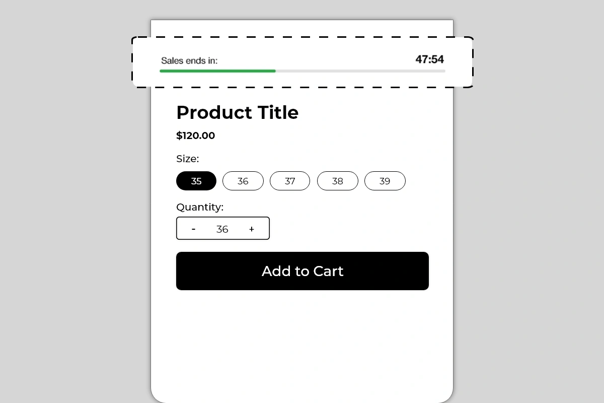
The Countdown Timer Block displays a live countdown on your product page showing how much time is left before a sale, offer, or deal ends. It shows a custom label, a ticking timer in minutes and seconds, and a green progress bar that visually depletes in real time as the clock runs down.
Unlike a static text message saying *"Sale ends soon"*, this block shows an actual clock counting down, which creates a fundamentally different psychological response. A shopper watching time run out is far more motivated to act than a shopper reading a vague claim of urgency.
## Why It Matters for Conversion
The single biggest conversion killer on any product page is the decision to *"come back later."* When a shopper feels no time pressure, there is no cost to delaying the purchase — and most delayed purchases never happen.
A countdown timer removes that option. It makes the cost of waiting visible and real. The depleting progress bar reinforces this visually — every second the bar gets shorter, the offer gets closer to expiring. This combination of a live clock and a shrinking visual bar is one of the most effective urgency mechanisms available on a product page.
Used correctly — meaning tied to a real, time-limited offer — a countdown timer can meaningfully increase the percentage of shoppers who convert on their first visit instead of leaving and never returning.
## How to Add the Countdown Timer Block
1. Go to **Online Store → Themes** in your Shopify admin
2. Click **Customize** on your active theme
3. Using the top dropdown, open your **product template**
4. In the left sidebar, click **Add block**
5. Under **Apps**, select **Iconic Blocks → Countdown Timer**
6. The block appears in your layout — configure it in the **right sidebar**
7. Drag the block to your preferred position in the left sidebar
8. Click **Save**
## Key Settings
**Label Text** The short text displayed on the left side of the timer — shown as *Sales ends in:* in the example. This sets the context for the countdown. Keep it to 3 to 5 words. The label should tell the shopper exactly what is ending so the urgency is immediately understood.
Good label examples:
* *Sales ends in:*
* *Offer expires in:*
* *Deal ends in:*
* *Free shipping ends in:*
* *Flash sale ends in:*
**Countdown Duration** Set the total time the timer counts down from. This is typically set in minutes. The example shows 47:54 — just under 48 minutes remaining. Choose a duration that is realistic for your offer. A timer set to 60 minutes that resets every time the page loads is not a real countdown — see Common Mistakes below.
**Progress Bar Color** The bar starts full and depletes as time runs out. The default color is green. You can change this to match your brand color or use a color that signals urgency — green for early time remaining, or consider a warmer tone if you want the bar to feel more pressing as it depletes.
**Progress Bar Background Color** The unfilled portion of the bar. Keep this light and neutral — light gray works on most themes. The contrast between the filled bar color and the empty background is what makes the depletion visually clear.
**Timer Text Color** The color of the countdown numbers on the right. Keep this dark and high contrast — the timer numbers need to be immediately readable. Bold black on white works for most themes.
**Label Text Color** The color of the label on the left. Typically matches body text or is slightly lighter — the label is supporting context, not the primary focus. The countdown number and the bar are the visual anchors.
## Placement Strategy
**Best position: Above the product title** This is the placement shown in the image and the highest-impact position for a countdown timer. A shopper landing on the product page sees the timer immediately — before the title, before the price. This creates urgency from the very first second of the page visit and frames the entire product evaluation under time pressure.
**Second best position: Between the price and Add to Cart button** If your timer is tied specifically to a price offer — a discounted price that expires — placing it between the price and Add to Cart button connects the urgency directly to the buying decision. The shopper sees the price, sees the clock running out, and acts.
**Third position: Directly below the Add to Cart button** Works as a reinforcing signal for shoppers who have scrolled past the title and are close to converting but have not yet committed. Seeing the timer just below the button they are about to click can be the final push.
**Avoid placing it:**
* At the bottom of the product page — the timer only creates urgency if it is seen early in the page visit
* Repeated in multiple positions on the same page — one timer is a signal, two timers looks desperate
* On pages where no real offer is active — a timer with no corresponding offer confuses shoppers
## Best Practices
* **Always tie the timer to a real offer.** A countdown that counts down to nothing — no price change, no expiry, no consequence — destroys trust the moment a shopper realizes it. Every timer should correspond to an actual limited-time event: a sale price, a free shipping window, a flash deal, a promotional code expiry.
* **Set a realistic duration.** A timer showing 47 minutes creates genuine urgency. A timer showing 23 hours feels like a standard sale banner. A timer showing 5 minutes feels fake if the page resets it every visit. Match the duration to the real urgency of the offer.
* **Use the label to name the offer specifically.** *Sales ends in:* is good. *Free Shipping ends in:* is better — it tells the shopper exactly what they will lose if they wait. The more specific the label, the more real the urgency feels.
* **Pair with a discount or offer that is visible on the same page.** The timer works best when the shopper can see both the offer and the clock simultaneously. If the discount is only visible at checkout, the urgency of the timer is weakened because the shopper cannot see what they are racing to claim.
* **Remove the timer when the offer is no longer active.** A countdown that has expired and now shows 00:00 — or worse, resets — signals to shoppers that the urgency was artificial. Take the block down or update it when the offer ends.
* **Test on mobile before publishing.** The label, timer, and progress bar all need to fit cleanly in a single row on smaller screens. If the layout breaks on mobile, shorten the label text and verify the bar scales correctly.
## Common Mistakes
**Using a timer that resets on every page load** If the countdown starts from the same time every time a shopper visits or refreshes the page, it is not a real countdown — it is a looping animation. Shoppers who notice this immediately lose trust in the store. Use a timer tied to a real end time, not a recurring interval.
**Running a timer with no corresponding offer** A timer that counts down to nothing — no sale, no expiry, no consequence — is misleading. If a shopper sees *Sales ends in: 00:00* and the price has not changed, they know the urgency was fake. This damages trust more than not having a timer at all.
**Setting the duration too long** A timer showing 18 hours or 23 hours does not create urgency — it reads as a standard promotional banner. Timers work because time is visibly running out. Keep durations under a few hours for maximum urgency impact.
**Leaving an expired timer on the page** An expired timer showing 00:00 with no offer change is confusing and looks broken. As soon as an offer ends, either remove the block or update it with the next active offer.
**Using a label that is too vague** *Hurry!* or *Limited Time!* as a label tells the shopper nothing specific. Always name what is ending — *Sales ends in:*, *Free Shipping ends in:*, *Discount expires in:*. Specificity makes the urgency credible.
**Placing the timer where shoppers cannot see it** A timer placed below the fold — below the description, tabs, or reviews — will be seen by very few shoppers. The timer must be in the immediate view area when the page loads to have any urgency impact.
## What Happens When the Timer Expires?
Decide in advance what shoppers should see at the end of the countdown. Check the block settings (right sidebar in the Theme Editor) for any option that controls the expired state (for example: hide the block, show 00:00, or replace with a message). If there is no expired-state setting, plan to manually remove or update the block when the offer ends so the product page does not display an expired timer.
## Troubleshooting
**The timer is not counting down — it appears frozen**
* *Cause:* A browser or theme script conflict is preventing the timer from running, or the block did not load correctly.
* *Solution:* Hard refresh the live product page (Ctrl + Shift + R or Cmd + Shift + R). If the timer still does not move, try a different browser. If the issue persists, contact Iconic Blocks support.
**The progress bar is not visible on the live store**
* *Cause:* The bar color is too similar to the background color, or the theme CSS is overriding the bar styling.
* *Solution:* Increase the contrast between the bar color and background color in the block settings. Preview on the live page in an incognito window after saving.
**The block is not appearing on the product page**
* *Cause:* The block was not saved after being added, or it was added to the wrong product template.
* *Solution:* Go to **Online Store → Themes → Customize**, open the correct product template, confirm the block is visible in the left sidebar layout, and click **Save**.
**The layout is breaking on mobile — label and timer are overlapping**
* *Cause:* The label text is too long to fit alongside the timer number on smaller screens.
* *Solution:* Shorten the label to 3 words or fewer — *Sale ends in:* instead of *This special offer ends in:*. Preview using the mobile toggle in the Theme Editor after each change.
**The block appears on some products but not others**
* *Cause:* Your store uses multiple product templates and the block was only added to one.
* *Solution:* Open each product template in the Theme Editor and add the block to any template where it is missing.
# Delivery Info Block
Source: https://blocks-docs.geticonicapps.com/block-guides/delivery-info-block
Complete guide to the Delivery Info Block — a three-step visual shipping timeline showing estimated order, dispatch, and delivery dates on the product page. Covers setup, configuration, placement, best practices, common mistakes, and troubleshooting.
## What Is the Delivery Info Block?
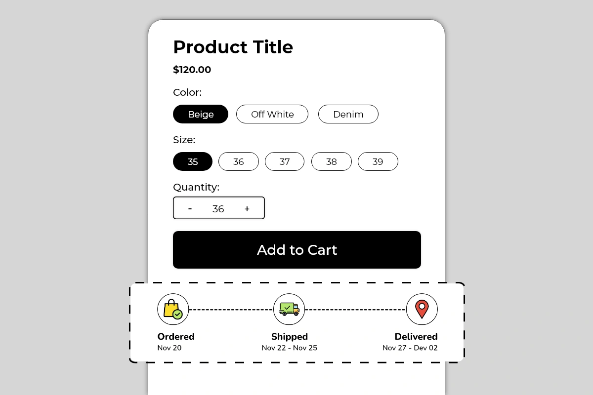
The Delivery Info Block displays a visual three-step shipping timeline directly on your product page. It shows three stages — **Ordered**, **Shipped**, and **Delivered** — connected by a dashed line, with a relevant icon for each stage and a date or date range below each label.
It comes in two visual styles:
* **Colored style** — outlined circular icons with colored illustrations, lighter and more visual
* **Dark filled style** — solid dark circular icons with white icons inside, minimal and high-contrast
Both styles communicate the same information. The right choice depends on your theme's visual tone.
## Why It Matters for Conversion
Shipping uncertainty is one of the most documented reasons for product page abandonment. Shoppers want to know one thing before they buy: *when will this arrive?*
If your product page does not answer that question clearly, shoppers have two options — contact you to ask, or leave to find a store that shows it upfront. Most choose to leave.
The Delivery Info Block answers the shipping question proactively, in a visual format that takes under three seconds to read. A shopper who can see *Ordered Nov 20 → Shipped Nov 22–25 → Delivered Nov 27–Dec 02* has no remaining uncertainty about when their order will arrive. That certainty removes one of the most common reasons to delay or abandon a purchase.
## How to Add the Delivery Info Block
1. Go to **Online Store → Themes** in your Shopify admin
2. Click **Customize** on your active theme
3. Using the top dropdown, open your **product template**
4. In the left sidebar, click **Add block**
5. Under **Apps**, select **Iconic Blocks → Delivery Info**
6. The block appears in your layout — configure it in the **right sidebar**
7. Drag the block to your preferred position in the left sidebar
8. Click **Save**
## Key Settings
**Style** Choose between the colored outlined icon style or the dark filled icon style. The colored style works better on light, lifestyle-focused themes. The dark filled style works better on minimal, monochrome, or premium themes. Preview both before deciding — pick the one that feels native to your existing product page design.
**Stage 1 — Ordered**
* **Label:** Default is *Ordered* — this can be renamed if your workflow uses different terminology
* **Date:** Set the date the order is typically placed or confirmed — usually today's date or *same day* for the shopper
* **Icon:** Shopping bag with a checkmark — indicates purchase confirmation
**Stage 2 — Shipped**
* **Label:** Default is *Shipped* — rename to *Dispatched* or *Processing* if that better reflects your workflow
* **Date:** Set the expected dispatch date range — shown as *Nov 22 – Nov 25* in the example, indicating the window within which the order will leave your warehouse
* **Icon:** Delivery truck — indicates the order is in transit
**Stage 3 — Delivered**
* **Label:** Default is *Delivered*
* **Date:** Set the expected delivery date range — shown as *Nov 27 – Dec 02* in the example, giving shoppers a realistic delivery window
* **Icon:** Location pin — indicates arrival at destination
**Icon Style Color** For the colored variant, adjust the icon and circle border colors to match your brand. Keep all three icons visually consistent — same style, same weight, same color family.
**Connector Line Style** The dashed line connecting the three stages is a fixed design element. It communicates the journey from left to right visually. No configuration is needed for this element.
## Placement Strategy
**Best position: Directly below the Add to Cart button** This is the placement shown in Image 1 and the most effective position for this block. A shopper who has just decided to buy — or is on the verge of it — sees the delivery timeline immediately below the Add to Cart button. It confirms that the purchase will arrive within a known, acceptable timeframe and removes the last shipping-related hesitation before they commit.
**Second best position: Between the price and Add to Cart button** Works well when shipping speed is a key selling point for your store or product — for example, same-day dispatch, express shipping, or time-sensitive gifting products. Showing the timeline before the Add to Cart button makes delivery speed part of the value proposition.
**Avoid placing it:**
* Above the product title — delivery information is a supporting detail, not a headline
* At the bottom of the page below descriptions and reviews — most shoppers will not scroll that far before making a decision
* Inside an accordion or tab — collapsed delivery info removes the very certainty this block is designed to create
## Best Practices
* **Use realistic date ranges, not aspirational ones.** If your standard shipping takes 7 to 10 days, show 7 to 10 days. If you show 3 to 5 days and regularly deliver in 8, you will generate complaints and returns even from customers who received their order. Accuracy builds more trust than speed claims.
* **Update dates regularly.** A block showing November delivery dates in March tells shoppers the store is not maintained. Set a recurring reminder to update the dates in the block every 1 to 2 weeks to keep them current and credible.
* **Use date ranges, not single dates.** A single date (*Delivered Nov 27*) creates a hard expectation. A range (*Nov 27 – Dec 02*) sets a realistic window and reduces complaints when delivery falls on day 5 of a 5-day window.
* **Match the block style to your theme.** The dark filled style on a dark or minimal theme looks intentional and designed. The colored style on a light lifestyle theme feels native. A mismatch — colored icons on a dark premium theme — looks out of place and reduces credibility.
* **Rename stage labels if they better reflect your process.** If you have a processing window before dispatch, rename Stage 2 to *Processing* or *Dispatched* to accurately represent your fulfillment workflow. Accuracy in the labels builds more trust than defaulting to generic terms.
* **If you offer express or standard shipping options, consider separate product templates.** If delivery timelines differ significantly between shipping options, use separate product templates with different Delivery Info blocks configured for each. Showing one timeline that applies to only one shipping tier can mislead shoppers on the other.
## Common Mistakes
**Showing inaccurate delivery dates** This is the most damaging mistake with this block. A shopper buys based on the delivery window shown, the order arrives later than stated, and they raise a dispute or leave a negative review. Always set dates that reflect your actual average fulfillment and carrier performance — not your best-case scenario.
**Never updating the dates** Dates that are weeks or months out of date immediately signal that the store is not well-maintained. A shopper who notices the delivery block showing dates from a previous month will question whether the rest of the store information is current. Build a habit of updating the block dates on a fixed schedule.
**Using single delivery dates instead of ranges** A fixed delivery date creates a hard commitment. Carriers are not always on time. Always use a range to set realistic expectations and protect yourself from complaints when delivery falls within your normal window but not on a specific day.
**Choosing an icon style that clashes with the theme** Colorful illustrated icons on a dark, minimal theme look inconsistent and reduce the perceived quality of the page. Always preview both style options against your actual product page before publishing.
**Setting the Ordered date in the past** If the Ordered stage shows a date that has already passed, it creates confusion — the shopper has not ordered yet. Set the Ordered date to reflect when a purchase made today would be confirmed — either today's date, *Today*, or the next business day.
## Troubleshooting
**The block is not appearing on the product page**
* *Cause:* The block was not saved after being added, or it was added to the wrong product template.
* *Solution:* Go to **Online Store → Themes → Customize**, open the correct product template, confirm the block is visible in the left sidebar layout, and click **Save**.
**The dates are showing incorrectly or not updating**
* *Cause:* The date fields were not saved after being edited, or a browser cache is showing an older version.
* *Solution:* Re-enter the dates in the block settings and click **Save**. Then open the live product page in a new private or incognito browser window to verify the updated dates are showing.
**The icons are not displaying correctly**
* *Cause:* A theme CSS conflict is affecting the icon rendering, or the block did not load fully.
* *Solution:* Hard refresh the live page. If icons are still broken, try switching between the colored and dark filled style in the settings and save. If the issue persists, contact Iconic Blocks support with your store URL.
**The three stages are stacking vertically instead of showing in a horizontal row on mobile**
* *Cause:* This may be expected behavior on very small screen widths depending on the theme layout.
* *Solution:* Preview the block on mobile using the Theme Editor toggle. If the stacking looks unacceptable, shorten the date text in each stage to reduce width. Contact Iconic Blocks support if the layout appears broken rather than just stacked.
**The block appears on some products but not others**
* *Cause:* Your store uses multiple product templates and the block was only added to one.
* *Solution:* Open each product template in the Theme Editor and add the block to any template where it is missing. Configure dates per template if delivery timelines differ between product types.
**The block is visible in the Theme Editor but not on the live store**
* *Cause:* Changes were not saved, or the browser is showing a cached version of the page.
* *Solution:* Click **Save** in the Theme Editor, then open the live product page in a new private or incognito browser window.
# Discount Ticket Block
Source: https://blocks-docs.geticonicapps.com/block-guides/discount-ticket-block
Complete guide to the Discount Ticket Block — a coupon-styled block that displays discount codes with a one-click copy button directly on the product page. Covers setup, configuration, placement, best practices, common mistakes, and troubleshooting.
## What Is the Discount Ticket Block?
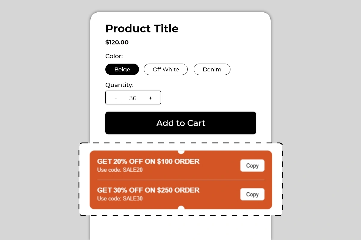
The Discount Ticket Block displays your active discount codes directly on the product page in a styled coupon ticket format. Each offer shows a bold headline describing the deal, the discount code below it, and a **Copy** button that lets shoppers copy the code to their clipboard in one click — ready to paste at checkout.
The block supports multiple offers stacked inside a single ticket, separated by a clean divider line. The notched edges on the top and bottom center of the block give it the visual appearance of a physical coupon ticket — immediately recognizable to any shopper as a discount they can use.
## Why It Matters for Conversion
Discount codes are one of the most common tools Shopify merchants use to drive sales — but most stores deliver them in ways that create friction:
* Sent in an email the shopper has to go find and open
* Shown in a popup that disappears after a few seconds
* Only revealed at checkout after the shopper has already committed
By the time a shopper is on your product page, that discount code is either forgotten or invisible. The result is a shopper who has an active offer but does not use it — and in many cases, leaves without buying because they do not feel they are getting the best deal.
The Discount Ticket Block solves this by putting the code exactly where the purchase decision is being made — on the product page, visible, copyable, and impossible to miss. A shopper who can see the discount and copy it in one click has one less reason to hesitate and one more reason to add to cart immediately.
## How to Add the Discount Ticket Block
1. Go to **Online Store → Themes** in your Shopify admin
2. Click **Customize** on your active theme
3. Using the top dropdown, open your **product template**
4. In the left sidebar, click **Add block**
5. Under **Apps**, select **Iconic Blocks → Discount Ticket**
6. The block appears in your layout — configure it in the **right sidebar**
7. Drag the block to your preferred position in the left sidebar
8. Click **Save**
## Key Settings
**Offer Headline** The bold text at the top of each ticket row. This should state the offer clearly and specifically — what percentage or amount off, and what the condition is if any. Keep it in uppercase for visual impact, matching the style shown in the example.
Good headline examples:
* *GET 20% OFF ON \$100 ORDER*
* *GET 30% OFF ON \$250 ORDER*
* *FREE SHIPPING ON ORDERS ABOVE \$50*
* *FLAT 15% OFF — TODAY ONLY*
* *BUY 2 GET 1 FREE — USE CODE BELOW*
**Discount Code** The actual code the shopper needs to enter at checkout. Displayed below the headline as *Use code: SALE20*. This must exactly match the discount code set up in your Shopify admin under **Discounts**. If the code in the block does not match the active code in Shopify, the shopper will copy a code that does not work — which is one of the worst trust-breaking experiences in ecommerce.
**Copy Button** The Copy button on the right of each offer row allows the shopper to copy the discount code to their clipboard with a single click. This button is built into the block — no additional setup required. Verify it works correctly on the live page after publishing.
**Number of Offers** The block supports multiple offers stacked in a single ticket. Use this when you have tiered discounts — for example, 20% off on orders above $100 and 30% off on orders above $250. Showing both tiers encourages shoppers to increase their order value to reach the higher discount threshold, which directly improves average order value.
**Background Color** The entire ticket uses a solid background color. The default example uses a strong orange. Choose a color that is noticeably different from your product page background so the ticket stands out immediately. This block should be visually prominent — it is carrying an offer the shopper needs to see.
**Text Color** White text on a colored background is the most readable combination for this block. Avoid light text on light backgrounds or dark text on dark backgrounds. The offer headline and code must be immediately readable at a glance.
## Placement Strategy
**Best position: Directly below the Add to Cart button** This is the placement shown in the image and the most effective position for a discount ticket. A shopper is about to click Add to Cart and sees the ticket — they copy the code, add to cart, and apply it at checkout. The offer is top of mind at the exact moment of conversion.
**Second best position: Between the price and Add to Cart button** Works well when the discount is price-dependent — for example, a percentage off that changes the effective price the shopper is paying. Placing it here lets the shopper see the offer alongside the price and mentally calculate their savings before clicking Add to Cart.
**Avoid placing it:**
* Above the product title — the discount ticket is a conversion closer, not a first impression tool. Let the product establish itself before showing the offer.
* At the bottom of the product page — by the time a shopper scrolls that far, they have either decided or left. The ticket needs to be in the active buying zone.
* Inside an accordion or collapsed tab — a hidden discount code is no better than one buried in an email.
## Best Practices
* **Always verify the code works before publishing.** Go to your Shopify admin under **Discounts**, confirm the code is active, check the conditions and expiry date, and test the code in a real checkout before the block goes live. A broken discount code damages trust more than not showing one at all.
* **Use tiered discounts to increase average order value.** Showing two offers — 20% off on $100 and 30% off on $250 — gives shoppers an incentive to add more to their cart to reach the higher tier. This is one of the most effective AOV strategies available and the Discount Ticket Block is designed specifically to display this pattern.
* **Keep the headline uppercase and specific.** Uppercase text in the offer headline creates visual weight and reads like a real discount ticket. Vague headlines like *SAVE BIG* underperform specific ones like *GET 20% OFF ON \$100 ORDER*.
* **Use a background color that contrasts with your page.** The ticket needs to stand out. On a white product page, orange, red, green, or a strong brand color all work. A light pastel ticket on a white page will be overlooked.
* **Remove or update the block when the offer expires.** An expired discount code on the product page that fails at checkout is a serious trust problem. Update the block every time your discount offer changes.
* **Match the code exactly as it appears in Shopify Discounts.** Codes are case-sensitive in some setups. If your Shopify discount code is *SALE20*, do not display it as *sale20* in the block. Use the exact format the shopper needs to enter.
## Common Mistakes
**Displaying a code that does not exist or has expired** This is the most damaging mistake with this block. A shopper copies the code, adds to cart, goes to checkout, pastes the code, and gets an error. At that point, trust is broken and the sale is almost certainly lost. Always keep the block in sync with your active Shopify discounts.
**Using a vague offer headline** *GET DISCOUNT* or *SPECIAL OFFER* tells the shopper nothing about what they are actually getting. Every headline should state the exact offer — percentage, amount, or condition. Specificity makes the offer feel real and worth acting on.
**Using a background color that blends into the page** A light-colored ticket on a white background looks like part of the page layout, not a prominent offer. The ticket needs to visually pop — use a strong, saturated background color that makes the block immediately identifiable as a coupon.
**Not testing the Copy button on mobile** The Copy button relies on the browser's clipboard API, which behaves differently across devices and browsers. Always test the Copy button on a real mobile device after publishing — not just in the Theme Editor preview.
**Showing a discount that applies store-wide on a product-specific page without clarification** If your discount code only applies to certain products or collections and the shopper copies it from a product page where it does not apply, they will get a checkout error. Make sure the offer displayed in the block matches the product it is shown on.
## Troubleshooting
**The Copy button is not working**
* *Cause:* The browser's clipboard API is blocked, or the button is not functioning correctly on the live page.
* *Solution:* Test in a different browser and on a real mobile device. If the issue is consistent across browsers, contact Iconic Blocks support with your store URL and the browser you are using.
**The discount code is not being accepted at checkout**
* *Cause:* The code in the block does not match the active code in Shopify Discounts, or the discount has expired or has conditions that are not met.
* *Solution:* Go to **Shopify Admin → Discounts**, verify the code is active, check the expiry date and minimum order conditions, and update the block to match exactly.
**The block is not appearing on the product page**
* *Cause:* The block was not saved after being added, or it was added to the wrong product template.
* *Solution:* Go to **Online Store → Themes → Customize**, open the correct product template, confirm the block is visible in the left sidebar layout, and click **Save**.
**The ticket background color looks different on the live store**
* *Cause:* The theme's CSS may be applying its own background styles that override the block color setting.
* *Solution:* Try a different color value in the block settings and save. If the override continues, contact Iconic Blocks support.
**The block appears on some products but not others**
* *Cause:* Your store uses multiple product templates and the block was only added to one.
* *Solution:* Open each product template in the Theme Editor and add the block to any template where it is missing.
**The block is visible in the Theme Editor but not on the live store**
* *Cause:* Changes were not saved, or the browser is showing a cached version of the page.
* *Solution:* Click **Save** in the Theme Editor, then open the live product page in a new private or incognito browser window.
# Inventory Badge Block
Source: https://blocks-docs.geticonicapps.com/block-guides/inventory-badge-block
Complete guide to the Inventory Badge Block — a color-coded stock status indicator that automatically displays in stock, low stock, and critical stock messages based on inventory levels. Covers setup, thresholds, placement, best practices, common mistakes, and troubleshooting.
## What Is the Inventory Badge Block?
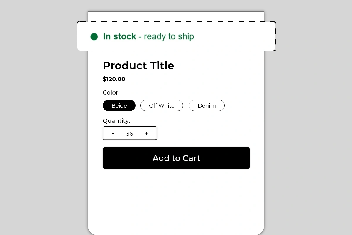
The Inventory Badge Block displays a real-time stock status message on your product page using a color-coded dot indicator. The dot color and message text change automatically based on your product's current inventory level — green for healthy stock, orange for low stock, and red for critically low stock.
Each status state is fully customizable:
* **Green state** — shown when stock is above your defined threshold (*In stock - ready to ship*)
* **Orange state** — shown when stock falls below a mid-level threshold (*Low stock - 8 items left*)
* **Red state** — shown when stock is critically low (*Low stock - only 1 left!*)
The block reads your actual Shopify inventory in real time. You do not manually update the message — the block handles it automatically based on the thresholds you set.
## Why It Matters for Conversion
Stock visibility does two things simultaneously — it reassures shoppers who want to know a product is available, and it creates urgency for shoppers who are hesitating.
A green *In stock - ready to ship* badge removes availability doubt before a shopper even considers adding to cart. An orange *Low stock - 8 items left* badge introduces social proof — other people are buying this. A red *Low stock - only 1 left!* badge creates immediate urgency that is difficult to ignore.
The critical insight is that this urgency is real. Unlike a countdown timer that can be set to any arbitrary duration, inventory levels are actual data. A shopper who sees *only 1 left* and knows that is genuine will act faster than they would for any artificial urgency mechanism. Authenticity is what makes this block particularly effective.
## Prerequisites
* **Iconic Blocks installed** and added as an app embed/available in your theme editor so you can find it under **Apps** when adding blocks.
* **Inventory tracking enabled** for the products you want to display (in **Shopify Admin → Products → \[Product] → Inventory**, enable *Track quantity* and set quantities).
## How to Add the Inventory Badge Block
1. Go to **Online Store → Themes** in your Shopify admin
2. Click **Customize** on your active theme
3. Using the top dropdown, open your **product template**
4. In the left sidebar, click **Add block**
5. Under **Apps**, select **Iconic Blocks → Inventory Badge**
6. The block appears in your layout — configure it in the **right sidebar**
7. Drag the block to your preferred position in the left sidebar
8. Click **Save**
## Key Settings
**In Stock Threshold** Set the inventory quantity above which the green *In stock* state is shown. For example, if you set this to 20, any product with more than 20 units in stock will show the green badge. This threshold depends on your typical stock levels — for high-volume products, set it higher. For limited products, even 10 units might qualify as healthy stock.
**In Stock Message** The text displayed when the product is above the in-stock threshold. Default is *In stock - ready to ship*. Customize this to match your fulfillment language — *In stock - ships today*, *Available - dispatches in 24hrs*, or simply *In stock* if you prefer minimal text.
**Low Stock Threshold** Set the inventory quantity below which the orange state triggers. For example, if you set this to 20, any product with between 6 and 20 units will show the orange badge. The message for this state can include the actual quantity — *Low stock - \[X] items left* — which pulls the live inventory number automatically.
**Low Stock Message** The text for the orange state. Including the live inventory count makes this message more specific and credible — *Low stock - 8 items left* is more urgent than *Low stock* alone. Use the dynamic quantity variable if the block supports it to pull the number automatically.
**Critical Stock Threshold** Set the inventory quantity below which the red state triggers. For example, if you set this to 5, any product with 5 or fewer units will show the red badge. This is your highest urgency state — use it sparingly and only when stock is genuinely critical.
**Critical Stock Message** The text for the red state. This is where the most urgent language belongs — *Low stock - only 1 left!*, *Almost gone - 3 remaining*, *Selling fast - only 2 left!*. Keep it short and make the number specific if possible.
**Dot Color per State** Each of the three states has its own configurable dot color. The defaults — green, orange, red — follow a universally understood traffic light convention that shoppers recognize immediately. Only change these if your brand has a specific reason to — the default colors communicate status faster than any custom palette.
**Text Color per State** Each state also has its own text color. In the example, each state's text color matches its dot color — green text for in stock, orange text for low stock, red text for critical stock. This color consistency reinforces the status signal and makes each state immediately distinguishable.
**Font Weight** The bold keyword (*In stock*, *Low stock*) draws the eye first, followed by the supporting detail in regular weight. This hierarchy is built into the block — the first part of the message is bold, the second part is regular. Do not change this pattern — it is what makes the message readable at a glance.
## How the Three States Work Together
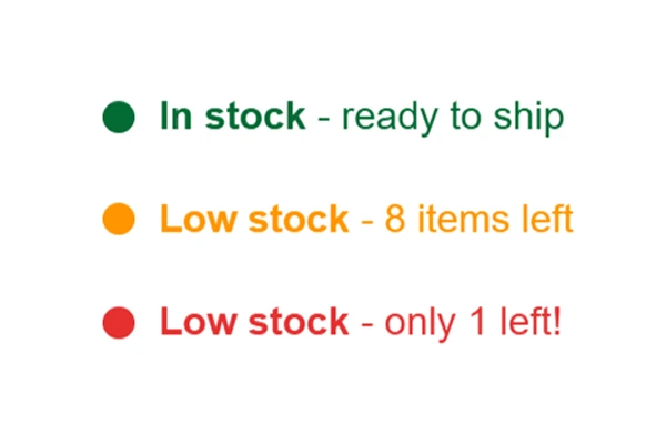
## Out of Stock Behavior (Inventory = 0)
Decide what you want shoppers to see when a product is sold out. Confirm how the block behaves at **0** inventory in your theme editor preview (for example, whether it hides automatically or continues to show the lowest state). If it continues to display, set your **Critical Stock Threshold** and message so inventory = 0 is never shown as *In stock*, and consider using an explicit sold-out message if the block provides one.
| Stock Level | Dot Color | Default Message | Shopper Signal |
| ------------------------- | --------- | -------------------------- | --------------------------------- |
| Above in-stock threshold | 🟢 Green | *In stock - ready to ship* | Available, no risk of missing out |
| Below low-stock threshold | 🟡 Orange | *Low stock - 8 items left* | Selling, act soon |
| Below critical threshold | 🔴 Red | *Low stock - only 1 left!* | Act now or miss out |
The block transitions between these states automatically as inventory changes. You configure the thresholds once and the block handles the rest.
## Placement Strategy
**Best position: Above the product title** This is the placement shown in Image 1 and one of the strongest positions for the Inventory Badge. A shopper landing on the page sees the stock status before anything else. A green badge immediately signals availability. An orange or red badge sets an urgency frame for the entire product page visit — the shopper evaluates the product knowing it is limited.
**Second best position: Between the product title and price** Works well when you want availability to be part of the product evaluation — the shopper reads the title, sees the stock status, then sees the price. The sequence builds toward the buying decision naturally.
**Third position: Between the price and Add to Cart button** Effective for urgency-focused placement — the shopper has evaluated the product and is deciding whether to buy. Seeing *Low stock - only 2 left!* directly above the Add to Cart button at this moment is a strong conversion trigger.
**Avoid placing it:**
* Below the Add to Cart button — availability information is pre-purchase context, not post-decision reassurance
* At the bottom of the product page — stock status must be visible during the evaluation phase, not after
* Inside an accordion or tab — hidden stock information creates no urgency
## Best Practices
* **Set thresholds that reflect your actual inventory patterns.** If your products regularly have 200+ units in stock, setting the in-stock threshold at 50 means you are almost always showing the green badge. That is fine — it reassures shoppers. But if you set the low-stock threshold too high and the orange badge shows when you have 80 units, it feels dishonest when shoppers discover stock is plentiful. Match thresholds to reality.
* **Let the live quantity show in low and critical stock messages.** *Low stock - 8 items left* is significantly more credible and urgent than *Low stock*. The specific number feels real. A vague label feels like a marketing claim.
* **Use the red state only when stock is genuinely critical.** If every product always shows the red badge because you set the critical threshold too high, shoppers will stop trusting it. Reserve the red state for when stock is truly limited — under 5 units is a reasonable starting point for most stores.
* **Keep all three message styles consistent in length.** If the green message is 4 words and the red message is 8 words, the block changes size as stock levels change. This can shift other elements on the page. Write messages of similar character length across all three states.
* **Combine with the Countdown Timer block for maximum urgency.** A low stock badge paired with a sales countdown timer creates two simultaneous urgency signals — limited quantity and limited time. This combination is particularly effective for flash sales and promotional periods.
## Common Mistakes
**Setting all thresholds too high** If your critical stock threshold is set to 50 and you typically stock 60 units, the red badge appears almost immediately after restocking and stays there. This makes the urgency feel artificial and trains shoppers to ignore it. Set thresholds proportionally to your actual inventory volume.
**Using vague messages without quantity** *Low stock* without a number is a claim. *Low stock - 6 items left* is a fact. Shoppers respond to facts. If your block settings support dynamic quantity in the message, always use it for the orange and red states.
**Keeping the block live when a product is out of stock** If a product sells out and the block still shows *In stock - ready to ship* because the inventory update has not propagated, shoppers will add to cart and hit an out-of-stock error at checkout. Verify that inventory syncing between Shopify and the block is working correctly.
**Using non-standard dot colors** Replacing green with purple, orange with teal, and red with blue removes the immediate intuitive readability of the traffic light convention. Shoppers understand green/orange/red instinctively. Custom colors require the shopper to interpret the meaning — which adds friction. Only change dot colors if there is a strong brand reason.
**Showing stock numbers for products with unlimited or untracked inventory** If a product in your Shopify store has inventory tracking turned off, the block may display incorrectly or show unexpected values. Make sure inventory tracking is enabled in **Shopify Admin → Products** for every product where this block is used.
## Troubleshooting
**The badge is showing the wrong state for the current stock level**
* *Cause:* The thresholds are configured incorrectly, or Shopify inventory has not synced with the block yet.
* *Solution:* Check the threshold settings in the block configuration and verify they reflect your intended logic. Check the product's actual inventory in **Shopify Admin → Products → \[Product] → Inventory**. If the sync is delayed, wait a few minutes and refresh the live page.
**The block is showing a stock count of zero but the product is not sold out**
* *Cause:* Inventory tracking may be disabled for the product in Shopify, causing the block to read zero.
* *Solution:* Go to **Shopify Admin → Products → \[Product]**, scroll to the Inventory section, and make sure *Track quantity* is enabled. Set the correct stock quantity and save.
**The badge is not appearing on the product page**
* *Cause:* The block was not saved after being added, or it was added to the wrong product template.
* *Solution:* Go to **Online Store → Themes → Customize**, open the correct product template, confirm the block is in the left sidebar layout, and click **Save**.
**The badge appears on some products but not others**
* *Cause:* Multiple product templates are in use and the block was only added to one, or inventory tracking is disabled on some products.
* *Solution:* Check each product template in the Theme Editor and add the block where it is missing. Also verify inventory tracking is enabled for all affected products in Shopify admin.
**The dot color or text color is not matching what was configured**
* *Cause:* Theme CSS may be overriding the color settings applied by the block.
* *Solution:* Try a stronger, more distinct color value in the block settings and save. If the override continues, contact Iconic Blocks support with your store URL.
**The block is visible in the Theme Editor but not on the live store**
* *Cause:* Changes were not saved, or the browser is showing a cached version of the page.
* *Solution:* Click **Save** in the Theme Editor, then open the live product page in a new private or incognito browser window.
# Payment Icons Block
Source: https://blocks-docs.geticonicapps.com/block-guides/payment-icons-block
Complete guide to the Payment Icons Block — displays branded payment method icons with an optional trust heading directly on the product page. Covers setup, icon selection, placement strategy, best practices, common mistakes, and troubleshooting.
## What Is the Payment Icons Block?
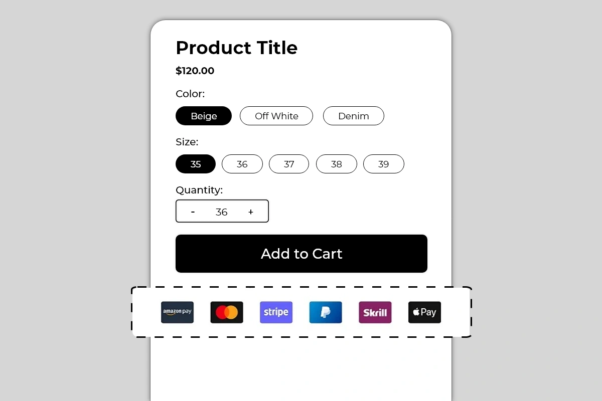
The Payment Icons Block displays a row of branded payment method icons on your product page — showing shoppers exactly which payment options are accepted before they reach checkout. It supports an optional heading above the icons, such as *Your Payment Is Protected with Us*, which adds a trust layer alongside the visual payment logos.
Available icons include widely recognized payment brands such as Amazon Pay, Mastercard, Stripe, PayPal, Skrill, Apple Pay, and more. Each icon uses its official branding — the actual logo, colors, and badge format that shoppers recognize instantly.
## Why It Matters for Conversion
Payment uncertainty is a silent conversion killer. Many shoppers — particularly first-time visitors — will not proceed to checkout if they are not confident their preferred payment method is accepted. Rather than finding out at checkout that their payment option is not available, they leave the product page without even trying.
Displaying payment icons on the product page does two things:
**It removes payment uncertainty before checkout.** A shopper who sees the PayPal or Apple Pay logo on the product page knows they can complete the purchase without entering card details. That single piece of information removes a real barrier for a significant segment of shoppers.
**It adds a trust signal at the point of decision.** Recognized payment brand logos — especially Mastercard, PayPal, and Apple Pay — carry institutional trust. Seeing these logos on a product page signals that the store is legitimate and professionally set up, even to first-time visitors who have no prior experience with the brand.
## How to Add the Payment Icons Block
1. Go to **Online Store → Themes** in your Shopify admin
2. Click **Customize** on your active theme
3. Using the top dropdown, open your **product template**
4. In the left sidebar, click **Add block**
5. Under **Apps**, select **Iconic Blocks → Payment Icons**
6. The block appears in your layout — configure it in the **right sidebar**
7. Drag the block to your preferred position in the left sidebar
8. Click **Save**
## Key Settings
**Heading Text** An optional single line of text displayed above the payment icons (for example, *Your Payment Is Protected with Us*). This heading adds a trust statement that frames the icons as a security signal rather than just a list of logos.
Use it when:
* Your store is new and shoppers may not yet trust the brand
* You want to explicitly connect payment logos to security messaging
* Your product price point is high enough that payment trust is a significant consideration
Skip it when:
* Your product page already has trust badges covering payment security
* You prefer a minimal layout and the icons alone communicate enough
* The heading would make the block feel repetitive alongside other trust content
Good heading examples:
* *Your Payment Is Protected with Us*
* *Safe & Secure Checkout*
* *We Accept All Major Payment Methods*
* *100% Secure Payment*
**Payment Icons Selection** Choose which payment icons to display. Only show payment methods that are actually enabled and functional in your Shopify checkout. See Common Mistakes for why this matters.
Icons typically available include:
* Amazon Pay
* Mastercard
* Visa
* Stripe
* PayPal
* Skrill
* Apple Pay
* Google Pay
* American Express
* Shop Pay
**Icon Size** Control the size of each payment badge. The default size works for most themes. Increase slightly if the icons look too small on desktop. Reduce if the row is overflowing on mobile. Always preview on mobile after adjusting.
**Icon Spacing** Control the gap between each icon in the row. Even spacing creates a clean, professional look. Too little spacing makes the badges look crowded. Too much spacing on mobile can cause the row to wrap unevenly.
**Heading Font Size and Color** If you are using the optional heading, configure the font size and color to match your theme's body text style. The heading should be readable but not compete visually with the payment icons themselves — use a medium weight and neutral color.
**Alignment** Center alignment works best for this block on most themes. Left alignment works if your product page layout is predominantly left-aligned and you want the icons to flow with the rest of the content.
## Placement Strategy
**Best position: Directly below the Add to Cart button** This is typically the most effective position for payment icons. A shopper who is about to click Add to Cart sees the payment logos immediately below. This confirms their payment method is accepted at the exact moment of commitment — removing one of the last barriers before conversion.
**Second best position: Between the price and Add to Cart button** Works well for higher-priced products where payment method availability is a primary concern before the shopper even considers adding to cart. Seeing PayPal or Apple Pay next to a \$300 price point immediately reduces payment anxiety.
**Avoid placing it:**
* Above the product title — payment information is a checkout detail, not a product introduction
* At the bottom of the page — it needs to be visible in the buying decision zone
* Repeated in multiple positions on the same page — one instance is a signal, two looks cluttered
## Best Practices
* **Only show payment methods that are actually active in your checkout.** This is the single most important rule for this block. If a shopper sees the PayPal logo on the product page, adds to cart, reaches checkout, and PayPal is not available — it creates confusion and erodes trust. Every icon shown must correspond to a working payment option.
* **Verify payment method availability in your Shopify admin before publishing.** Go to **Shopify Admin → Settings → Payments** and confirm every method shown in the block is enabled and configured correctly.
* **Use the heading for new stores or high-value products.** The heading *Your Payment Is Protected with Us* adds a security context that is particularly valuable for stores that are still building brand recognition. For established brands with strong trust signals elsewhere on the page, the icons alone are sufficient.
* **Keep the icon count to what is genuinely relevant.** Showing 10 payment icons when you only actively support 4 looks dishonest and creates checkout confusion. Show the 4 to 6 methods your customers actually use most.
* **Check mobile layout after selecting icons.** A row of 6 or more icons can wrap to a second line on smaller screens. Preview on mobile and adjust icon size or count if the layout breaks.
* **Pair with the Trust Badges Strip for maximum checkout confidence.** Payment icons answer *"can I pay my preferred way?"* while trust badges answer *"is this store safe and will I be protected?"* The two blocks together cover the full spectrum of pre-checkout trust concerns.
## Common Mistakes
**Displaying payment icons for methods not enabled in checkout** The most serious mistake with this block. If a shopper sees Apple Pay on the product page and Apple Pay is not available at checkout, the mismatch creates confusion and distrust. Always keep the icons in this block exactly in sync with your active Shopify payment methods.
**Showing too many icons** A row of 10 or 12 payment badges looks unvetted and cluttered. It signals that the icons were added without thought rather than curated to reflect what the store actually supports. Stick to the 4 to 6 methods your customers are most likely to use.
**Using the heading redundantly** If your page already has a Trust Badges block with *Secure Payment* as one of the badges, adding a heading of *Your Payment Is Protected with Us* above the payment icons repeats the same message twice. Either use the heading without a Secure Payment trust badge, or skip the heading and let the trust badge cover that message.
**Not checking mobile layout** Six full-size payment badges in a horizontal row can overflow or wrap awkwardly on mobile screens. Always use the mobile preview toggle in the Theme Editor after configuring this block and adjust icon size or count if needed.
**Placing the block above the Add to Cart button on a crowded product page** On pages with many blocks between the title and Add to Cart button, adding payment icons to that zone makes it more crowded. Payment icons work best below Add to Cart — they are confirmatory, not persuasive. Keep them out of the primary evaluation zone unless payment method is a key selling point.
## Troubleshooting
**The block is not appearing on the product page**
* *Cause:* The block was not saved after being added, or it was added to the wrong product template.
* *Solution:* Go to **Online Store → Themes → Customize**, open the correct product template, confirm the block is in the left sidebar layout, and click **Save**.
**Icons are not displaying or showing as broken images**
* *Cause:* A specific icon asset failed to load, or there is a browser caching issue.
* *Solution:* Hard refresh the live page. If specific icons are consistently not showing, deselect and reselect them in the block settings and save. If the issue continues, contact Iconic Blocks support.
**The icon row is wrapping onto two lines on mobile**
* *Cause:* Too many icons selected, or icon size is set too large for smaller screen widths.
* *Solution:* Reduce the number of icons to 4 or 5, or decrease the icon size setting. Preview on mobile using the Theme Editor toggle after each change.
**The heading text is not matching the rest of the page typography**
* *Cause:* The heading font size or color is not aligned with the theme's body text style.
* *Solution:* Adjust the heading font size and color in the block settings to match your theme's standard text. Use the Theme Editor preview to compare against surrounding text elements.
**The block appears on some products but not others**
* *Cause:* Your store uses multiple product templates and the block was only added to one.
* *Solution:* Open each product template in the Theme Editor and add the block to any template where it is missing.
**The block is visible in the Theme Editor but not on the live store**
* *Cause:* Changes were not saved, or the browser is showing a cached version of the page.
* *Solution:* Click **Save** in the Theme Editor, then open the live product page in a new private or incognito browser window.
# Random Text Block
Source: https://blocks-docs.geticonicapps.com/block-guides/random-text-block
Complete guide to the Random Text Block — a single-line custom text banner for product pages. Covers setup, placement strategy, best practices, common mistakes, and troubleshooting.
## What Is the Random Text Block?
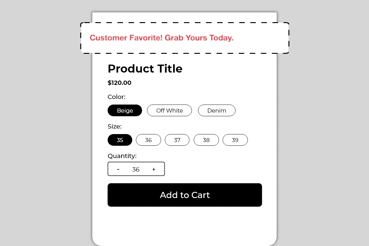
The Random Text Block displays a single line of custom text as a full-width banner on your product page. It is a simple, flexible block with one job — draw immediate attention to one specific message before a shopper engages with the product details.
You control the text completely. Use it for:
* Urgency messages — *Limited Stock! Order Before It's Gone.*
* Social proof callouts — *Customer Favorite! Grab Yours Today.*
* Offer highlights — *Free Shipping on This Product Today Only.*
* Product-specific claims — *As Seen on Instagram. 10,000+ Happy Customers.*
* Seasonal promotions — *Festive Sale — Extra 10% Off Applied at Checkout.*
There are no icons, no subtitles, no cards. Just a clean, prominent line of text that the shopper sees immediately when they land on the product page.
## Why It Matters for Conversion
The first few seconds a shopper spends on a product page determine whether they stay and engage or leave. Most product pages open with the product title and price — functional, but neutral. The Random Text Block gives you a way to lead with something that creates immediate interest, urgency, or confidence before the shopper has even read the product name.
A single well-written line placed at the top of the product page can:
* Set a positive tone before the shopper evaluates the price
* Create urgency that keeps the shopper engaged rather than bouncing
* Highlight an offer they might otherwise miss
* Reinforce social proof at the very first moment of attention
It is one of the simplest blocks in Iconic Blocks and one of the fastest to set up — but the quality of the text you put in it determines everything.
## How to Add the Random Text Block
1. Go to **Online Store → Themes** in your Shopify admin
2. Click **Customize** on your active theme
3. Using the top dropdown, open your **product template**
4. In the left sidebar, click **Add block**
5. Under **Apps**, select **Iconic Blocks → Random Text**
6. The block appears in your layout — configure it in the **right sidebar**
7. Drag the block to your preferred position in the left sidebar
8. Click **Save**
## Key Settings
**Text Content** This is the only content field in the block. Write one short, direct sentence. The entire conversion impact of this block rests on what you write here — see Best Practices below for guidance on what works.
**Text Color** Set the color of the text. Use a color that stands out from your theme's default body text — the example uses a red/coral tone which creates clear visual contrast against the white background. Match your brand color or use a high-contrast accent color that signals importance without clashing with the rest of the page.
**Font Size** Control how large the text appears. The default size works for most themes. Increase it slightly if the block is placed above the product title and you want it to command attention. Do not make it larger than your product title — the title should still be the dominant heading on the page.
**Text Alignment** Left, center, or right. Center alignment works best for short single-line messages. Left alignment works better if your product page layout is left-aligned and you want the text to flow naturally with the rest of the content.
**Background** The block background is typically white or transparent to match the product card. If your theme has a colored product page background, check that the text remains readable after saving.
## Placement Strategy
**Best position: Above the product title** This is the placement shown in the image and the most impactful position for this block. It is the first thing a shopper sees when they land on the product page — before the title, before the price, before anything else. A compelling message here sets the tone for the entire product page visit.
**Second best position: Between the price and Add to Cart button** If your message is offer or urgency related — *Free Shipping Today Only* or *Only 3 Left in Stock* — placing it just above the Add to Cart button reinforces the reason to act at the exact decision moment.
**Avoid placing it:**
* Below the Add to Cart button — by this point the shopper has already decided and the message adds no value
* In the middle of the product description — it interrupts the reading flow and loses its impact
* At the very bottom of the product page — almost no shoppers will see it there
## Best Practices
* **Write for one specific outcome.** Every message should do one job — create urgency, highlight social proof, announce an offer, or reinforce a claim. Do not try to combine two messages in one line.
* **Keep it to one sentence.** The block is designed for a single punchy line. If you need more than one sentence, a different block — like Benefits or Trust Badges — is a better fit.
* **Use numbers and specifics when possible.** *10,000+ Happy Customers* is more convincing than *Loved by Many*. *Only 5 Left* is more urgent than *Low Stock*.
* **Match the message to the product.** Do not use a generic store-wide message on every product. The more relevant the text is to the specific product, the more effective it will be.
* **Change the message regularly.** A seasonal offer, a trending product callout, or a fresh social proof line keeps the block relevant. A message that has not been updated in months starts to lose credibility.
* **Use a contrasting text color.** The text needs to stand out clearly from the background. If your theme is white, use a brand color, red, or dark tone for the text. Avoid light gray or pastel text — it will not get noticed.
* **Do not use ALL CAPS for the entire message.** It reads as aggressive and is harder to scan. Capitalizing the first letter of each key word — as in *Customer Favorite! Grab Yours Today.* — creates emphasis without shouting.
## Common Mistakes
**Writing a vague or generic message** *Great product! Buy now.* tells the shopper nothing they did not already know. Every word in this block needs to earn its place. If the message does not add information, urgency, or confidence — rewrite it.
**Leaving the default placeholder text live** Some merchants set up the block during configuration and forget to update the text before publishing. Always review your live product page after adding this block to confirm the correct message is showing.
**Using the same text across every product** When every product page shows the same Random Text message, it starts to feel like a site-wide banner rather than a product-specific signal. Shoppers learn to ignore it. Customize the message per product or at least per product category.
**Making the text too long** A long sentence that wraps across two lines loses its impact as a quick-read banner. If your message needs more than one line on desktop, shorten it. On mobile, even shorter lines wrap — always preview on mobile after writing your message.
**Choosing a text color that blends into the background** If the text color is too close to the background color, the block becomes invisible. Always check contrast — the message should be immediately readable without the shopper having to look for it.
## Troubleshooting
**The block is not appearing on the product page**
* *Cause:* The block was not saved after being added, or it was added to the wrong product template.
* *Solution:* Go to **Online Store → Themes → Customize**, open the correct product template, confirm the block is in the left sidebar layout, and click **Save**.
**The text is showing but the color looks wrong on the live store**
* *Cause:* Theme CSS is overriding the text color set in the block settings.
* *Solution:* Try a stronger contrast color in the block settings. If the issue persists, contact Iconic Blocks support with a link to your product page.
**The message is wrapping onto two lines on mobile**
* *Cause:* The text is too long for smaller screen widths.
* *Solution:* Shorten the message to under 50 characters where possible. Preview using the mobile view toggle in the Theme Editor before saving.
**The block appears on some products but not others**
* *Cause:* Your store uses multiple product templates and the block was only added to one.
* *Solution:* Open each product template in the Theme Editor and add the block to any template where it is missing. Customize the text per template if needed.
**The block is visible in the Theme Editor but not on the live store**
* *Cause:* Changes were not saved, or the browser is showing a cached version.
* *Solution:* Click **Save** in the Theme Editor, then open the live product page in a new private or incognito browser window.
# Review Summary Block
Source: https://blocks-docs.geticonicapps.com/block-guides/review-summary-block
Complete guide to the Review Summary Block — a compact single-line social proof bar showing a star rating label, visual star score, and review count on the product page. Covers setup, configuration, placement, best practices, common mistakes, and troubleshooting.
## What Is the Review Summary Block?
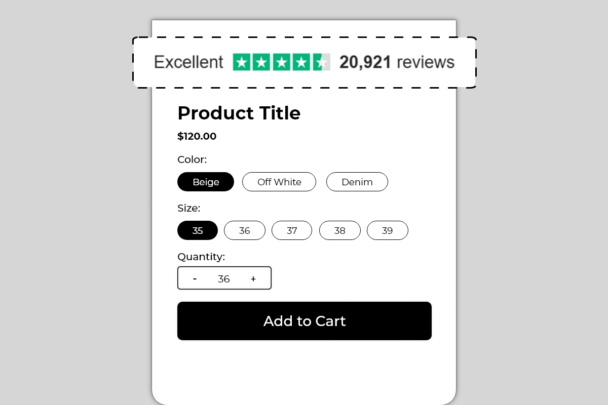
The Review Summary Block displays a compact, single-line social proof summary on your product page. It shows three pieces of information in one clean row — a rating label, a visual star rating, and a total review count — in the widely recognized Trustpilot green star format.
The example shows: **Excellent ★★★★½ 20,921 reviews**
This block does not connect to Trustpilot or any review platform automatically. You enter the rating label, star score, and review count manually in the block settings. This means you can use it to reflect your actual Trustpilot rating, your aggregate review count from any platform, or a combined figure from multiple sources.
## Why It Matters for Conversion
Social proof is one of the most powerful conversion levers available on a product page. Before a first-time shopper commits to a purchase, they look for evidence that other people have bought from this store and had a good experience.
A review summary does this in the least amount of space possible. A single line showing *Excellent* and *20,921 reviews* communicates three things instantly:
* **The store is established** — 20,921 reviews mean thousands of customers have bought and reviewed
* **The experience is positive** — *Excellent,* with a near-perfect star rating, signals consistent satisfaction
* **The risk of buying is low** — volume and quality of reviews together reduce purchase anxiety significantly
Placed at the top of the product page, this block sets a credibility frame for everything the shopper reads after it. A shopper who sees strong social proof first evaluates the product more favorably than one who sees the product with no prior trust signal.
## How to Add the Review Summary Block
1. Go to **Online Store → Themes** in your Shopify admin
2. Click **Customize** on your active theme
3. Using the top dropdown, open your **product template**
4. In the left sidebar, click **Add block**
5. Under **Apps**, select **Iconic Blocks → Review Summary**
6. The block appears in your layout — configure it in the **right sidebar**
7. Drag the block to your preferred position in the left sidebar
8. Click **Save**
## Key Settings
**Rating Label** The text label displayed on the left side of the block. Default and most recognized value is *Excellent* — the standard Trustpilot label for a 4.5 to 5 star rating. You can also use *Great*, *Good*, or a custom label, but *Excellent* carries the strongest immediate recognition for shoppers familiar with Trustpilot's rating scale.
Standard rating labels by score:
* 4.5 to 5.0 → *Excellent*
* 4.0 to 4.4 → *Great*
* 3.5 to 3.9 → *Good*
* 3.0 to 3.4 → *Average*
**Review Count** The number displayed after the star rating — shown as *20,921 reviews* in the example. Enter your actual total review count from your review platform. Format it with a comma for large numbers — *20,921* reads more credibly than *20921*. Update this periodically as your review count grows.
**Star Color** The default is Trustpilot green — a universally recognized color for this rating format. Only change this if your brand has a specific reason to. The green star format carries instant recognition that a custom color loses.
**Label and Count Text Color** Keep this consistent with your theme's body text color — dark gray or black on white backgrounds. The text is supporting context for the stars, not the primary visual element.
**Font Size** The default size works for most themes. Increase slightly if the block feels too small relative to surrounding elements. Do not make it larger than the product title — this is a supporting social proof signal, not a headline.
## Placement Strategy
**Best position: Above the product title** This is the placement shown in Image 1 and the highest-impact position for a review summary. A shopper landing on the product page sees *Excellent ★★★★½ 20,921 reviews* before they read anything else. This sets a strong credibility baseline that frames the entire product evaluation positively. Every claim the product makes after this point is read through the lens of established trust.
**Second best position: Between the product title and price** Works well when you want the social proof to sit alongside the product identity — the shopper reads the title, immediately sees the review score, then evaluates the price. The sequence builds confidence toward the buying decision.
**Avoid placing it:**
* Below the Add to Cart button — social proof should build confidence before the decision, not after
* At the bottom of the product page — it will be seen by almost no one in a position where it can influence conversion
* Inside an accordion or tab — hidden social proof provides no conversion value
## Best Practices
* **Always use your real, accurate rating and review count.** The review count and star score in this block are manually entered — which means there is no automatic check preventing you from entering inflated numbers. Displaying *50,000 reviews* when you have 200 is immediately detectable by shoppers who look for your store elsewhere. Use your actual numbers. Real social proof converts better than inflated social proof because it is credible.
* **Update the review count regularly.** As your review count grows, update the number in the block settings. A store showing *124 reviews* that actually has 2,400 is leaving credibility on the table. Set a monthly reminder to update the count.
* **Use the Trustpilot green star format without modification if your rating comes from Trustpilot.** The green stars are brand-specific to Trustpilot. If your reviews come from Google, Shopify reviews, or another platform, consider whether using Trustpilot's visual format for a non-Trustpilot rating count is appropriate for your brand. The format works regardless of source, but transparency builds more long-term trust.
* **Pair with product-level reviews lower on the page.** The Review Summary Block works at the macro level — store or brand-wide social proof. If you also have a reviews app showing individual product reviews below the description, the two work together: the summary builds immediate trust at the top, individual reviews provide detailed validation lower on the page.
* **Do not use this block if your review count is very low.** A line showing *Excellent ★★★★★ 7 reviews* does not build trust — it raises questions about why there are so few. Wait until you have at least 50 to 100 reviews before using this block. A small but genuine number is better displayed through individual review snippets than a summary bar.
## Common Mistakes
**Inflating the review count or star rating** Entering numbers that do not reflect reality is the fastest way to break trust when a shopper cross-checks your store on Google or Trustpilot. If your real rating is 4.1, show 4.1 — not 4.8. Accuracy in social proof is more persuasive than perfection because it is believable.
**Never updating the review count** A block that showed *1,240 reviews* six months ago and still shows the same number today looks stale. Growing review counts signal an active, trusted store. Update the number every month to keep it current.
**Using the block with a low or mediocre rating** Displaying *Average ★★★☆☆ 340 reviews* on your product page actively works against conversion — it draws attention to a below-average rating. Only use this block when your aggregate rating is 4.0 or above. If your rating is lower, focus on improving it before making it a prominent product page element.
**Choosing a non-standard star color** Changing the star color from Trustpilot green to a custom brand color removes the instant recognition that makes this format effective. Most shoppers recognize the green star format immediately and respond to it positively. A purple or red star rating looks like a custom design element, not an established review signal.
**Using the block as a substitute for actual reviews** The Review Summary Block is a summary signal — it tells shoppers how many people have reviewed and what the overall score is. It does not replace individual reviews. Shoppers who want detail will look for individual reviews. If your store has no review app showing actual customer feedback, the summary number feels unverifiable. Use this block alongside a reviews app, not instead of one.
## Troubleshooting
**The block is not appearing on the product page**
* *Cause:* The block was not saved after being added, or it was added to the wrong product template.
* *Solution:* Go to **Online Store → Themes → Customize**, open the correct product template, confirm the block is in the left sidebar layout, and click **Save**.
**The stars are not rendering correctly — showing full stars instead of a partial star**
* *Cause:* The star rating was entered as a whole number. Partial stars require a decimal value.
* *Solution:* Enter the rating as a decimal in the block settings — for example, *4.5* instead of *5*. Save and verify on the live page.
**The review count is not showing commas for large numbers**
* *Cause:* The number was entered without formatting in the block settings.
* *Solution:* Manually enter the number with comma formatting in the review count field — *20,921* rather than *20921*.
**The block appears on some products but not others**
* *Cause:* Your store uses multiple product templates and the block was only added to one.
* *Solution:* Open each product template in the Theme Editor and add the block to any template where it is missing.
**The star color or text color is not displaying correctly on the live store**
* *Cause:* Theme CSS may be overriding the color settings from the block.
* *Solution:* Try reapplying the color values in the block settings and saving. If the override continues, contact Iconic Blocks support with your store URL.
**The block is visible in the Theme Editor but not on the live store**
* *Cause:* Changes were not saved, or the browser is showing a cached version of the page.
* *Solution:* Click **Save** in the Theme Editor, then open the live product page in a new private or incognito browser window.
# Trust Badges Block
Source: https://blocks-docs.geticonicapps.com/block-guides/trust-badges-block
Complete guide to the Trust Badges Block — covering both list and horizontal strip layouts, step-by-step setup, placement strategy, best practices, common mistakes, and troubleshooting.
## What Is the Trust Badges Block?
The Trust Badges Block displays your store's trust signals — things like free shipping, return policy, and secure payment — directly on the product page in a clear, visual format.
Trust badges exist to answer the hesitation every first-time shopper has before buying:
* *Is this store legitimate?*
* *What if I need to return it?*
* *Is my payment safe here?*
When these questions go unanswered on the product page, shoppers leave to find the answers elsewhere — and most do not come back. Trust badges answer these questions instantly, at exactly the right moment, without the shopper having to look for them.
The block comes in two layout styles:
* **Trust Badges List** — a vertical stack of full-width rows, each with an icon, a bold title, and a supporting subtitle
* **Trust Badges Strip** — a compact horizontal row with an icon and a short label per badge, displayed side by side
## Why It Matters for Conversion
First-time visitors to your store have no prior experience with your brand. They cannot verify your store's legitimacy the way they can with a physical shop. Trust badges are the fastest way to bridge that gap — they visually communicate that your store is safe, fair, and reliable before a shopper has to take any risk.Stores that display clear trust signals near the Add to Cart button consistently see lower bounce rates and higher conversion rates from first-time visitors — the hardest segment to convert.
## Layout 1 — Trust Badges List
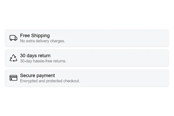
### What It Looks Like
A vertical stack of badge rows where each row contains:
* A **colored icon** on the left
* A **bold title** in the center (e.g. *Free Shipping*)
* A **short subtitle** below the title (e.g. *No extra delivery charges.*)
* Each badge sits inside its own light-background card with clear separation between rows
Best for stores that want to give each trust signal its own space and emphasis. Works well when you have 3 to 5 badges and want shoppers to read and absorb each one individually.
### How to Add Trust Badges List
1. Go to **Online Store → Themes** in your Shopify admin
2. Click **Customize** on your active theme
3. Using the top dropdown, open your **product template**
4. In the left sidebar, click **Add block**
5. Under **Apps**, select **Iconic Blocks → Trust Badges List**
6. The block appears in your layout — configure it in the **right sidebar**
7. Drag the block to your preferred position in the left sidebar
8. Click **Save**
### Key Settings — Trust Badges List
**Icon** Each badge row has its own icon. Use icons that are immediately recognizable and directly related to the badge message — a delivery truck for shipping, a shield for security, a return arrow for returns. Colored icons perform better than flat monochrome ones because they draw the eye faster.
**Badge Title** The bold text for each badge. Keep it under 4 words and make it specific — *Free Shipping*, *30 Days Return*, *Secure Payment*. Do not use vague labels like *Great Service* or *We Care*.
**Badge Subtitle** A single short sentence that adds one specific detail to the title — *No extra delivery charges.*, *30-day hassle-free returns.*, *Encrypted and protected checkout.* This is where you add credibility. Keep it under 8 words.
**Number of Badges** 3 badges is the most effective number for this layout. It is enough to cover the three biggest purchase concerns — shipping, returns, and payment security — without making the block feel heavy. You can add up to 3.
**Card Background** Use a light neutral background for each card. The background creates visual separation between badges. Avoid bright or bold colors — the badge content should do the work, not the background.
## Layout 2 — Trust Badges Strip
### What It Looks Like
A single horizontal row where each badge contains:
* A **colored icon** centered above the label
* A **short bold label** below the icon (e.g. *Free Shipping*, *30 Days Return*, *Secure Payment*)
* All badges displayed side by side in one compact strip with no subtitle text
Best for stores with a minimal theme or limited vertical space on the product page. The strip format is compact, non-intrusive, and works especially well immediately below the Add to Cart button where space is tight but trust signals still need to be visible.
### How to Add Trust Badges Strip
1. Go to **Online Store → Themes** in your Shopify admin
2. Click **Customize** on your active theme
3. Using the top dropdown, open your **product template**
4. In the left sidebar, click **Add block**
5. Under **Apps**, select **Iconic Blocks → Trust Badges Strip**
6. The block appears in your layout — configure it in the **right sidebar**
7. Drag the block to your preferred position in the left sidebar
8. Click **Save**
### Key Settings — Trust Badges Strip
**Icon** Same icon guidance as the List layout — use recognizable, colored icons that match the badge label. In the Strip layout, the icon carries more weight because there is no subtitle to support it. Make sure the icon alone communicates the message clearly.
**Badge Label** This is the only text per badge in the Strip layout. It must be short and immediately understood — 2 to 3 words maximum. *Free Shipping*, *Easy Returns*, *Safe Checkout* are all effective. Anything longer will crowd the strip on mobile.
**Number of Badges** 3 badges works best for the Strip layout — one for shipping, one for returns, one for payment. With 3 badges, the strip is balanced and readable on both desktop and mobile.
**Spacing Between Badges** Control the gap between each badge in the strip. On wider themes, more spacing makes the strip feel premium. On compact themes, tighter spacing keeps it contained. Preview on mobile after adjusting.
## Which Layout Should You Use?
| | Trust Badges List | Trust Badges Strip |
| --------------------- | --------------------------------------- | --------------------------------------------- |
| **Best for** | Stores needing detailed trust messaging | Stores wanting compact, minimal trust signals |
| **Space used** | More vertical space | Minimal vertical space |
| **Information shown** | Icon + Title + Subtitle | Icon + Label only |
| **Ideal badge count** | 3 | 3 |
| **Works best near** | Below Add to Cart | Directly below Add to Cart button |
| **Mobile experience** | Stacks cleanly | Stays in a row or wraps neatly |
If you are unsure, start with the **Strip layout**. It is less intrusive, works on almost any theme, and can be placed directly below Add to Cart without disrupting the page flow. Upgrade to the List layout if you find shoppers still have trust-related questions or hesitations after seeing the strip.
## Placement Strategy
**Best position for both layouts: Directly below the Add to Cart button** This is the single most important placement for trust badges. A shopper reads the product title, sees the price, selects their variant, and is about to click Add to Cart. At that exact moment, a visible trust signal — *Free Shipping, 30 Days Return, Secure Payment* — removes the last hesitation and confirms the purchase is safe.
**Second best position: Between the price and Add to Cart button** Works well on product pages where the Add to Cart button is lower on the page or where the shopper needs trust confirmation before they even reach the button.
**Avoid placing it:**
* At the bottom of the product page — below the description, tabs, and reviews — where most shoppers will never scroll to
* Above the product title — it disrupts the reading flow before the shopper even knows what the product is
* Inside an accordion or collapsed section — hidden trust signals have no conversion impact
## Best Practices
* **Cover the three core concerns every time** — shipping, returns, and payment security. These are the three questions every first-time shopper has. If your badges do not address all three, you are leaving hesitation on the table.
* **Be specific in your subtitle text.** *30-day hassle-free returns* is more convincing than *Easy Returns*. Specificity signals that the policy is real, not just marketing language.
* **Use colored icons, not plain black ones.** Color draws attention faster and makes each badge visually distinct from the others. Plain icons in the same color as body text tend to blend into the page.
* **Make sure your badges reflect real policies.** If your badge says *Free Shipping* but your store charges for shipping, it damages trust the moment a shopper reaches checkout. Every badge must reflect an actual store policy.
* **Do not use both layouts on the same product page.** Use one or the other. Displaying the same trust information twice in two different formats looks repetitive and reduces the credibility of both.
* **Check mobile layout before publishing.** The Strip layout especially needs to be verified on mobile — badges should remain readable and evenly spaced at small screen sizes.
## Common Mistakes
**Using badges that do not match actual store policies** Displaying *Free Shipping* when you charge for shipping, or *30 Days Return* when your policy is 7 days, creates a trust problem the moment the shopper hits checkout. Badges must always reflect real, current policies.
**Using vague badge labels** *Great Service* and *We Care About You* communicate nothing specific. A shopper cannot act on these. Every badge should address a concrete concern — shipping cost, return window, or payment safety.
**Adding too many badges** More than 5 badges in the List layout or more than 3 in the Strip layout makes the block feel cluttered and reduces the impact of each individual signal. Less is more — prioritize the badges that remove the biggest objections.
**Placing badges too far down the page** Trust signals only work if shoppers see them before they decide to leave. If they are below the fold or after a long product description, they are not doing their job. Place them in the active decision zone — near the price and Add to Cart button.
**Using inconsistent icon styles** Mixing flat icons with colored illustrated icons, or using icons of very different visual sizes, makes the block look unprofessional. Choose one icon style and apply it consistently across all badges.
## Troubleshooting
**The block is not appearing on the product page**
* *Cause:* The block was not saved after being added, or it was added to a different product template than the one your products use.
* *Solution:* Go to **Online Store → Themes → Customize**, open the correct product template, confirm the block is visible in the left sidebar layout, and click **Save**.
**Badges appear on some products but not others**
* *Cause:* Your store has multiple product templates and the block was only added to one.
* *Solution:* Open each product template in the Theme Editor and add the block to any template where it is missing.
**Icons are not showing**
* *Cause:* The icon file was not uploaded correctly or the format is not supported.
* *Solution:* Use PNG or SVG format. Re-upload the icon in the block settings. If the problem continues, clear your browser cache and try again.
**The Strip layout is wrapping awkwardly on mobile**
* *Cause:* Too many badges in the strip, or badge label text is too long.
* *Solution:* Reduce to 3 badges and shorten each label to 2 to 3 words maximum. Preview on mobile in the Theme Editor after each change.
**The block is visible in the Theme Editor but not on the live store**
* *Cause:* Changes were not saved, or the browser is showing a cached version of the page.
* *Solution:* Click **Save** in the Theme Editor, then open the live product page in a new private or incognito browser window to see the updated version.
# Video Slider Block
Source: https://blocks-docs.geticonicapps.com/block-guides/video-slider-block
Complete guide to the Video Slider Block — a scrollable horizontal row of portrait video cards for displaying product demos, lifestyle content, and brand videos directly on the product page. Covers setup, video selection, placement, best practices, common mistakes, and troubleshooting.
## What Is the Video Slider Block?
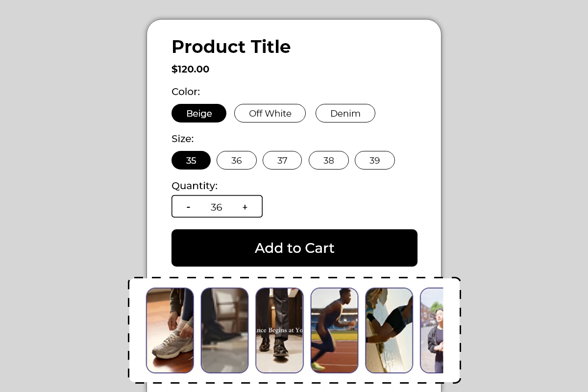
The Video Slider Block displays a horizontally scrollable row of portrait-format video cards directly on your product page. Each card shows a video — either playing inline or opening on tap — in a tall rounded-corner card format designed for mobile-first viewing.
The row scrolls horizontally, with a partially visible card at the end signaling to shoppers that more videos are available. The format is modeled on the short-form vertical video style shoppers are already familiar with from Instagram Reels, TikTok, and YouTube Shorts — which means the interaction pattern requires no explanation.
Use this block to show:
* Product demonstration videos
* Lifestyle and in-use footage
* Customer video testimonials
* Brand story or behind-the-scenes content
* How-to or tutorial videos relevant to the product
## Why It Matters for Conversion
A product image shows what something looks like. A video shows what it does, how it moves, how it fits, and what it feels like to use. For products where the experience of use matters — footwear, apparel, equipment, beauty tools, food, or anything that moves or performs — video is one of the most powerful conversion tools available.
Shoppers who watch a product video before buying have significantly lower return rates because their expectations are set by what they actually saw the product do — not just what they imagined from a static image. Video reduces the uncertainty that drives returns and the hesitation that drives abandonment.
The slider format specifically solves the problem of where to put video on a product page. A single embedded video takes up significant vertical space. The slider allows multiple videos to coexist in a compact, scrollable row that does not dominate the page but is clearly available and inviting to engage with.
## How to Add the Video Slider Block
1. Go to **Online Store → Themes** in your Shopify admin
2. Click **Customize** on your active theme
3. Using the top dropdown, open your **product template**
4. In the left sidebar, click **Add block**
5. Under **Apps**, select **Iconic Blocks → Video Slider**
6. The block appears in your layout — configure it in the **right sidebar**
7. Drag the block to your preferred position in the left sidebar
8. Click **Save**
## Key Settings
**Video Source** Add the URL or upload the video file for each card. Supported sources typically include YouTube, Vimeo, and direct video file uploads. Use the format that gives you the best playback quality and loading speed for your audience. YouTube and Vimeo links are recommended over direct file uploads for larger video files — they load faster and do not affect your store's page speed.
**Thumbnail Image** Each video card displays a thumbnail before the video plays. This can be auto-generated from the video or manually set. A manually set thumbnail gives you full control over what shoppers see before they tap — use a frame that shows the product clearly and invitingly. The thumbnail is what gets a shopper to tap — choose it carefully.
**Video Caption or Overlay Text** An optional short text overlay on the video card — visible in Image 2 on the third card (*nce Begins at Yo* is a partial caption). Use this for a short product claim, a video title, or a call to action. Keep it brief — 3 to 6 words. The text appears over the video thumbnail and should be readable against the video content behind it. Use a text color with enough contrast to be legible on any frame.
**Card Border** A thin border around each card — visible in Image 2 as a subtle dark outline. Configurable in color and width. On white or light backgrounds, a thin border provides clean visual definition for each card. On dark themes, remove or reduce the border.
**Card Corner Radius** Controls the roundness of the card corners. The default is a generous rounded corner as shown in the images. Reduce for a more rectangular, editorial feel. Increase for a softer, more app-like appearance.
**Card Size** Control the height and width of each video card. The default portrait ratio works best for vertical video content. If your videos are landscape format, adjust the card dimensions accordingly — though portrait format is strongly recommended for mobile viewing.
**Number of Cards Visible** Set how many cards are fully visible before the row becomes scrollable. The partial cut-off of the last visible card is an important scroll affordance — keep at least one card partially visible to signal that the row is scrollable.
**Autoplay** Configure whether videos autoplay when the page loads or when they hover over it. Autoplay can increase engagement but may affect page performance and can be disruptive if audio plays automatically. If using autoplay, ensure videos are muted by default.
## Choosing the Right Videos
The videos you put in this block determine how much conversion value it delivers. The slot format encourages multiple videos — but quality always outperforms quantity.
**Best video types for this block:**
* **Product in use** — showing the product being worn, handled, operated, or consumed in a real context. For footwear, this means footage of the shoe being worn while walking, running, or styled. For a skincare product, it means application footage with visible results.
* **Close-up detail footage** — slow-motion or macro shots of material texture, stitching, finish, or mechanism. These answer the tactile questions a static image cannot — what does this actually look and feel like up close?
* **Lifestyle context footage** — the product in the environment where it belongs. A running shoe on a track. A desk lamp in a home office. A backpack in a travel setting. This builds aspirational connection without being overtly promotional.
* **Customer video testimonials** — real customers talking about or demonstrating the product. These carry social proof that branded content cannot replicate.
* **How-to or tutorial clips** — particularly valuable for products with a learning curve or setup process. Showing how easy something is to use can directly address the hesitation shoppers have about whether they can figure it out.
**Video types to avoid:**
* Long promotional brand videos over 60 seconds — shoppers on a product page are in evaluation mode, not viewing mode
* Videos with poor audio that autoplays — disruptive and damaging to the page experience
* Generic stock footage with no connection to the specific product — adds no information value
## Placement Strategy
**Best position: Directly below the Add to Cart button** This is the placement shown in Image 1 and the most effective position for the Video Slider. A shopper who has evaluated the product and is near the buy decision sees the video row immediately below Add to Cart. A compelling video at this moment can provide the final visual confirmation that pushes a hesitant shopper from consideration to purchase.
**Second best position: Below the product description** Works well when the videos serve as supporting evidence for claims made in the description. The shopper reads the description — *"premium cushioning for all-day comfort"* — and immediately below sees video footage of the product being worn. The video validates the written claim visually.
**Third position: Between the price and Add to Cart button** Appropriate for products where video demonstration is critical to the buying decision — for example, a product with a unique mechanism, a beauty tool with a specific application technique, or a food product where visual appeal drives purchase intent. Placing video here makes it part of the primary evaluation before the shopper commits.
**Avoid placing it:**
* Above the product title — video is supporting content, not a headline
* At the very bottom of the page below reviews and FAQs — it will be seen by too few shoppers to have meaningful conversion impact
* As the only trust or conversion block on the page — video works best in combination with trust badges, benefits, and other conversion elements
## Best Practices
* **Use portrait format video for all cards.** The block is designed for vertical video. Landscape videos displayed in portrait cards will be cropped and may lose important content at the edges. Shoot or source vertical video specifically for this block wherever possible.
* **Keep individual videos under 60 seconds.** Shoppers on a product page are not in a passive viewing state. Short, dense videos that show the product clearly and quickly perform better than long videos that take time to get to the point. 15 to 30 seconds is the ideal range for most product page videos.
* **Set a strong thumbnail for every card.** The thumbnail is the first thing shoppers see and determines whether they tap to watch. Use a frame that shows the product clearly at its most appealing — not a transition frame, not a black screen, not a blurry motion frame.
* **Mute autoplay videos by default.** If you enable autoplay, always set videos to mute on load. Autoplay with audio is disruptive and will cause shoppers to close the page. Let shoppers unmute if they want audio.
* **Start with 3 to 5 videos.** More than 5 videos in the slider risks diluting engagement — shoppers watch the first one or two and rarely continue to the fifth or sixth. Curate your strongest videos rather than filling the slider for the sake of volume.
* **Prioritize mobile-optimized video files.** A significant portion of your product page traffic is on mobile. Large video files load slowly on mobile connections. Compress videos before uploading and use YouTube or Vimeo links where possible to leverage their adaptive streaming.
* **Lead with your strongest video first.** The first card in the slider is the one most shoppers will see and engage with. Put your best, most compelling video first — the one that most clearly shows the product at its best.
## Common Mistakes
**Using landscape videos in a portrait card format** A landscape video displayed in a portrait card will be aggressively cropped on the sides. If your existing product videos are all landscape format, either reformat them for vertical display or adjust the card dimensions to match the landscape ratio. Do not force landscape content into portrait cards without checking what gets cropped.
**Using thumbnails that do not show the product** A thumbnail showing a blurry mid-motion frame, a dark background, or a non-product subject will not entice shoppers to tap. Every thumbnail should show the product clearly and attractively.
**Adding too many low-quality videos** Five strong videos convert better than ten mediocre ones. Shoppers engage with the first video and assess the rest based on that experience. If the first video is weak, they will not continue. Curate ruthlessly.
**Enabling autoplay with audio** This is one of the fastest ways to cause a shopper to leave the page. If you use autoplay, mute is non-negotiable.
**Using videos that are too long** A 3-minute brand documentary on a product page is not a conversion tool. Shoppers are evaluating, not watching. Keep videos under 60 seconds. Under 30 seconds is better for most product types.
**Not updating videos when products change** If a product is updated, discontinued, or rebranded, the videos showing the old version may now be inaccurate or misleading. Review the videos in this block whenever a significant product change occurs.
## Troubleshooting
**Videos are not playing on the live page**
* *Cause:* The video URL is invalid, the video has been deleted from the source platform, or the browser is blocking the video embed.
* *Solution:* Verify each video URL is accessible by opening it directly in a browser. Re-enter the URL in the block settings. If using YouTube or Vimeo, ensure the video is set to public and allows embedding.
**Videos are loading slowly or causing page lag**
* *Cause:* Direct video file uploads are large and are loading fully on page load.
* *Solution:* Switch from direct file uploads to YouTube or Vimeo links. These platforms use adaptive streaming that loads video efficiently without impacting page speed. Compress direct upload files if YouTube or Vimeo is not an option.
**Thumbnails are not displaying**
* *Cause:* The thumbnail image was not set, or the auto-generated thumbnail failed to load.
* *Solution:* Manually upload a thumbnail image for each video card in the block settings. Use a JPEG or PNG at a minimum of 400 x 700 pixels for portrait format cards.
**The row is not scrolling on mobile**
* *Cause:* A theme CSS conflict may be preventing horizontal scroll, or all cards are fitting within the screen width.
* *Solution:* Ensure at least one card is partially cut off to trigger the scroll container. If scrolling is broken, check for theme CSS overrides. Contact Iconic Blocks support if the issue persists.
**Video overlay text is not readable**
* *Cause:* The text color does not have enough contrast against the video thumbnail content behind it.
* *Solution:* Change the overlay text color to white or add a semi-transparent dark background behind the text. Test readability across multiple thumbnail frames since the background content varies per card.
**The block is not appearing on the product page**
* *Cause:* The block was not saved after being added, or it was added to the wrong product template.
* *Solution:* Go to **Online Store → Themes → Customize**, open the correct product template, confirm the block is in the left sidebar layout, and click **Save**.
**The block is visible in the Theme Editor but not on the live store**
* *Cause:* Changes were not saved, or the browser is showing a cached version of the page.
* *Solution:* Click **Save** in the Theme Editor, then open the live product page in a new private or incognito browser window.
# Block Combinations by Goal
Source: https://blocks-docs.geticonicapps.com/conversion-strategy/block-combinations-by-goal
Recommends specific block combinations based on four common conversion goals — building trust, creating urgency, increasing average order value, and reducing abandonment — with placement guidance for each.
Not every store has the same conversion problem. A new store with no brand recognition needs trust. A store running a flash sale needs urgency. A store with a healthy conversion but low AOV needs upsell tools. A store with high traffic and low purchase rate likely has an abandonment problem.
This page maps each of those goals to a specific set of blocks and explains how to combine them for maximum impact.
**Before you start:** This guide references *Zone 1*, *Zone 2*, and *Zone 3* as placement areas on the product page. Make sure you know how your theme/app labels these zones (or where to find the zone map in your editor) before placing blocks below.
## Goal 1 — Build Trust with First-Time Visitors
**The problem:** Shoppers land on your product page for the first time, have no prior experience with your brand, and leave without buying because they cannot verify the store is legitimate or the purchase is safe.
**The block combination:**
* **Review Summary Block** — Zone 1, above product title
* **Badges Block** — Zone 1, between title and price (*GOTS-Certified, Ethically Made, Customer Favorite*)
* **Trust Badges** **Block** — Zone 3, below Add to Cart (*Free Shipping, 30 Days Return, Secure Payment*)
* **Payment Icons Block** — Zone 3, below Trust Badges
**Why this works:** The Review Summary establishes brand credibility the moment the shopper lands. The Badges Block signals product quality and values during evaluation. The Trust Badges and Payment Icons in Zone 3 answer the final two pre-checkout questions — *is the store safe?* and *can I pay my way?* — before the shopper commits.
**Who needs this most:** New stores, stores in competitive categories, stores selling to cold audiences from paid ads.
## Goal 2 — Create Urgency and Reduce "I'll Come Back Later"
**The problem:** Shoppers engage with your product page, show clear interest, but leave without buying and do not return. They are not objecting to the product — they are delaying the decision.
**The block combination:**
* **Countdown Timer Block** — Zone 1, above product title (when a sale is active)
* **Inventory Badge Block** — Zone 1 or Zone 2, showing low or critical stock state
* **Random Text Block** — Zone 1, above title (*Only 8 Left — Order Before It's Gone*)
* **Discount Ticket Block** — Zone 2 or Zone 3, showing the active offer code
**Why this works:** The Countdown Timer and Random Text Block create time pressure from the first second of the page visit. The Inventory Badge reinforces scarcity during evaluation. The Discount Ticket ensures the shopper has a clear, copyable incentive to act now rather than later. Together these four blocks answer the shopper's implicit question — *"what happens if I wait?"* — with a clear and credible answer.
**Who needs this most:** Stores running active promotions, flash sale events, limited edition products, seasonal campaigns.
**Important:** Only use this combination when the urgency is real. A countdown timer and low stock badge on a product with unlimited inventory and no active offer will be noticed by shoppers and will permanently damage trust.
## Goal 3 — Increase Average Order Value
**The problem:** Your conversion rate is acceptable but your average order value is lower than it should be. Shoppers buy one product and check out without considering complementary items.
**The block combination:**
* **Discount Ticket Block** — Zone 3, below Add to Cart (tiered discounts: *20% off $100, 30% off $250*)
* **Addons Product Block** — Zone 3, below Discount Ticket
* **Benefits Block** — Zone 2, between price and Add to Cart (reinforcing the value of the main product before introducing add-ons)
**Why this works:** The tiered Discount Ticket gives shoppers a financial incentive to spend more — reaching a higher threshold gets them a better deal. The Addons Block immediately shows them what they can add to reach that threshold. The Benefits Block in Zone 2 ensures the main product is perceived as high-value before the shopper evaluates the add-ons. The combination of financial incentive plus frictionless add-on selection is the most direct AOV lever available in Iconic Blocks.
**Who needs this most:** Stores with multiple complementary products, stores with tiered discount structures, stores where AOV is below category benchmarks.
## Goal 4 — Reduce Abandonment from Shipping and Payment Uncertainty
**The problem:** Shoppers add to cart or reach checkout but abandon. When surveyed or analyzed, the common reasons are shipping cost surprises, unclear delivery timelines, and uncertainty about payment options.
**The block combination:**
* **Delivery Info Block** — Zone 2 or Zone 3, showing Ordered → Shipped → Delivered timeline with dates
* **Trust Badges Block** — Zone 3, below Add to Cart (*Free Shipping, 30 Days Return, Secure Payment*)
* **Payment Icons Block** — Zone 3, below Trust Badges Strip
**Why this works:** The Delivery Info Block answers the shipping timeline question before the shopper reaches checkout — removing the surprise that causes abandonment. The Trust Badges Strip covers the return policy anxiety that makes shoppers hesitant to commit to a purchase they might regret. The Payment Icons Block eliminates the checkout moment where a shopper realizes their preferred payment method is not available. All three blocks together pre-answer the questions that cause checkout abandonment before the shopper ever reaches checkout.
**Who needs this most:** Stores with high add-to-cart rates but low checkout completion rates, stores with international shipping, stores selling to price-sensitive audiences.
## Combining Goals
Most stores have more than one conversion problem at a time. A new store with trust issues may also have a shipping uncertainty problem. A promotional store may also want to increase AOV.
When combining goals, follow this priority order:
1. **Trust first** — a shopper who does not trust the store will not convert regardless of urgency or discount
2. **Clarity second** — a shopper who is confused about shipping or payment will not complete checkout
3. **Urgency third** — urgency only works on shoppers who already want the product
4. **AOV last** — add-on and upsell blocks only perform on shoppers who are already converting
Build your block stack in this order and you will be working with shopper psychology rather than against it.
# Block Setup by Store Type
Source: https://blocks-docs.geticonicapps.com/conversion-strategy/block-setup-by-store-type
Recommends specific block combinations and placement strategies for six common Shopify store types — fashion, health and wellness, food and beverage, electronics, beauty and skincare, and home and lifestyle.
Different product categories have different conversion challenges. A fashion store needs to communicate style and trust. A health store needs to communicate ingredients and safety. A food store needs to communicate freshness and quality. A tech store needs to communicate specs and compatibility.
This page gives you a recommended starting block setup for six common Shopify store types. Each recommendation is based on the most common conversion gaps for that category and uses only the blocks most likely to address them.
These are starting points — not fixed rules. Use them to get set up quickly, then adjust based on what your specific store and customers need.
## Fashion and Apparel
**Primary conversion challenges:** Fit and size uncertainty, style credibility, trust for first-time buyers, and variant navigation across colors and styles.
**Recommended block setup:**
* **Review Summary Block** — Zone 1, above title (*Excellent ★★★★½ — social proof from the start*)
* **Badges Block** — Zone 1, between title and price (*Ethically Made, Eco-Packaging, Selling Fast*)
* **Benefits List Block** — Zone 2, between price and Add to Cart (*Free Returns, Secure Payment, Fast Dispatch*)
* **Trust Badges Block** — Zone 3, below Add to Cart
* **Circle Menu Block** — Zone 3, below Trust Badges (*navigate color variants visually*)
* **Video Slider Block** — Zone 3, below Circle Menu (*lifestyle and styling footage*)
**Key priority:** Trust and social proof in Zone 1. Variant navigation and visual content in Zone 3. Keep Zone 2 clean and focused on the decision.
## Health and Wellness
**Primary conversion challenges:** Ingredient transparency, safety credibility, certificate and certification verification, skepticism about claims.
**Recommended block setup:**
* **Badges Block** — Zone 1, above title (*Vegan, Lab Tested, No Additives, Gluten-Free*)
* **Benefits Grid Block** — Zone 2, between price and Add to Cart (*Zero Added Sugar, 100% Natural, Low Caffeine, No Artificial Colors*)
* **Delivery Info Block** — Zone 2, below Benefits Grid
* **Trust Badges Block** — Zone 3, below Add to Cart (*Money-Back Guarantee, Secure Payment, 30 Days Return*)
* **Review Summary Block** — Zone 3, below Trust Badges Block
**Key priority:** Product attribute transparency in Zones 1 and 2. The Benefits Grid is the most important block for this category — specific, credible product claims displayed clearly are what converts health-conscious shoppers.
## Food and Beverage
**Primary conversion challenges:** Freshness and quality perception, ingredient clarity, delivery speed for perishable items, visual appetite appeal.
**Recommended block setup:**
* **Random Text Block** — Zone 1, above title (*Freshly Roasted. Dispatched Within 24 Hours.*)
* **Badges Block** — Zone 1, between title and price (*Organic, Non-GMO, Locally Sourced, Chef Approved*)
* **Benefits Grid Block** — Zone 2, between price and Add to Cart (ingredients, sourcing, certifications)
* **Delivery Info Block** — Zone 2, below Benefits Grid (*critical for food — shoppers want to know arrival window*)
* **Trust Badges Block** — Zone 3, below Add to Cart
* **Video Slider Block** — Zone 3, below Trust Badges Block (*preparation, sourcing, or lifestyle footage*)
**Key priority:** Freshness and sourcing credentials upfront. Delivery timeline in Zone 2 — food shoppers are more sensitive to delivery windows than most other categories.
## Electronics and Tech Accessories
**Primary conversion challenges:** Compatibility uncertainty, spec credibility, warranty and support confidence, payment flexibility for higher price points.
**Recommended block setup:**
* **Inventory Badge Block** — Zone 1, above title (*In stock - ready to ship*)
* **Benefits List Block** — Zone 2, between price and Add to Cart (*key technical specs and compatibility points in scannable format*)
* **Delivery Info Block** — Zone 2, below Benefits List
* **Trust Badges Block** — Zone 3, below Add to Cart (*1 Year Warranty, Secure Payment, 30 Days Return*)
* **Payment Icons Block** — Zone 3, below Trust Badges Block (*payment flexibility is particularly important at higher price points*)
* **Addons Product Block** — Zone 3, below Payment Icons (*cables, cases, accessories*)
* **Video Slider Block** — Zone 3, below Addons (*product demo and setup footage*)
**Key priority:** Availability and spec clarity in Zones 1 and 2. Payment flexibility and warranty confidence in Zone 3. Add-ons are high-value for this category — most tech purchases come with accessory needs.
## Beauty and Skincare
**Primary conversion challenges:** Ingredient safety and suitability, skin type compatibility, results credibility, brand trust for first-time buyers.
**Recommended block setup:**
* **Review Summary Block** — Zone 1, above title
* **Badges Block** — Zone 1, between title and price (*Cruelty-Free, Dermatologist Tested, Fragrance-Free, Award-Winning*)
* **Benefits Grid Block** — Zone 2, between price and Add to Cart (*key ingredients and skin benefits*)
* **Trust Badges Block** — Zone 3, below Add to Cart (*30 Days Return, Secure Payment, Satisfaction Guaranteed*)
* **Video Slider Block** — Zone 3, below Trust Badges Block (*application technique and before/after content*)
* **Addons Product Block** — Zone 3, below Video Slider (*complementary products in the same routine*)
**Key priority:** Certification badges and ingredient grid in Zone 2 are the highest-conversion elements for this category. Video content showing application and results is the second most important element.
## Home and Lifestyle
**Primary conversion challenges:** Size and scale perception, material quality confidence, delivery timeline for larger items, style compatibility uncertainty.
**Recommended block setup:**
* **Badges Block** — Zone 1, between title and price (*Handcrafted, Sustainably Sourced, Limited Edition*)
* **Benefits List Block** — Zone 2, between price and Add to Cart (*materials, dimensions, care instructions in scannable format*)
* **Delivery Info Block** — Zone 2, below Benefits List (*particularly important for larger items with longer lead times*)
* **Trust Badges Block** — Zone 3, below Add to Cart (*Free Returns, Secure Payment, Satisfaction Guaranteed*)
* **Circle Menu Block** — Zone 3, below Trust Badges Block (*show product in different finishes or colorways*)
* **Video Slider Block** — Zone 3, below Circle Menu (*product in a real home setting*)
**Key priority:** Material and dimension clarity in Zone 2 — home shoppers frequently abandon because they are not confident about size or material suitability. Delivery timeline is equally important for this category.
# How Blocks Work Together
Source: https://blocks-docs.geticonicapps.com/conversion-strategy/how-blocks-work-together
Explains the principles behind combining multiple blocks effectively — covering the three conversion zones on a product page, which blocks belong in each zone, and how to build a block stack that works together rather than competing.
Adding a single block to your product page will give you a marginal improvement. Combining the right blocks in the right positions will give you a meaningful one.
The reason is simple — conversion is not a single event. It is a sequence of micro-decisions a shopper makes as they move down your product page. Each micro-decision is a question:
* *Is this product right for me?*
* *Is this store trustworthy?*
* *Will it arrive on time?*
* *Is this a good deal?*
* *Should I buy now or come back later?*
Each question, if left unanswered, is an exit point. Each block in Iconic Blocks is designed to answer one or two of these questions. The goal of a conversion strategy is to make sure the right questions are answered at the right moment — not all at once, and not in the wrong order.
## The Three Conversion Zones on a Product Page
Every product page has three distinct zones. Each zone serves a different role in the buying decision and requires different types of blocks.
### Zone 1 — First Impression Zone
*Above the product title or between the title and price*
This is what shoppers see in the first 2 to 3 seconds of landing on the page. At this point they have not read anything — they are scanning. The blocks that belong here set the context and frame for the entire page visit.
**Blocks that belong in Zone 1:**
* **Review Summary Block** — establishes immediate credibility before evaluation begins
* **Inventory Badge Block** — sets availability context (*In stock - ready to ship*)
* **Badges Block** — communicates key product attributes and certifications at a glance
* **Random Text Block** — highlights a specific offer, social proof claim, or urgency message
* **Countdown Timer Block** — when a time-limited offer is active, leading with urgency sets the frame
**What this zone achieves:** A shopper who sees strong social proof, clear availability, and relevant product attributes in the first few seconds starts their product evaluation from a position of confidence rather than skepticism. Everything they read after this point is filtered through that first impression.
### Zone 2 — Decision Zone
*Between the price and Add to Cart button*
This is the most critical zone on the product page. The shopper knows what the product is, has seen the price, and is deciding whether to act. Every block placed here influences that decision directly.
**Blocks that belong in Zone 2:**
* **Benefits Block** — answers *"why is this product worth the price?"*
* **Delivery Info Block** — answers *"when will this arrive?"*
* **Discount Ticket Block** — answers *"is there a better deal available right now?"*
* **Inventory Badge Block** — if not placed in Zone 1, low stock urgency here is highly effective
* **Countdown Timer Block** — time pressure at the point of decision is particularly effective
**What this zone achieves:** A shopper in Zone 2 is weighing the cost of buying against the cost of not buying. Every block here either adds value to the buying side of that equation or removes a risk from it. Benefits add value. Delivery info removes uncertainty. Discounts reduce cost friction. Urgency signals raise the cost of delay.
### Zone 3 — Confirmation Zone
*Directly below the Add to Cart button*
A shopper who has scrolled past the Add to Cart button without clicking has not left — they are still evaluating. Zone 3 blocks serve two purposes: they confirm the decision for shoppers who are about to click, and they re-engage shoppers who scrolled past the button and need one more signal to come back up and convert.
**Blocks that belong in Zone 3:**
* **Trust Badges Block** — *"your purchase is safe, your money is protected"*
* **Payment Icons Block** — *"you can pay the way you prefer"*
* **Addons Product Block** — *"add a complementary product to your order"*
* **Circle Menu Block** — *"browse other options in this range"*
* **Video Slider Block** — *"see this product in action before you decide"*
* **Benefits Grid Block** — if not used in Zone 2, product attributes here support the confirmation
**What this zone achieves:** Trust is the final barrier to conversion for most first-time buyers. Payment confirmation removes checkout anxiety. Add-ons increase order value from shoppers who are already committed. Video provides the visual confirmation that static images cannot.
## The Core Principle
**One block per question. One question per zone.**
The most common mistake merchants make when setting up blocks is adding too many in the same zone, covering the same ground. Two trust badge blocks in Zone 3 do not double the trust signal — they dilute it. A benefits block and a badges block both in Zone 1 compete for the same attention.
Treat each zone as having limited attention capacity. Fill it with blocks that answer different questions, not the same question in different formats.
## A Simple Test for Any Block Placement
Before placing any block, ask: *What question does this block answer, and is the shopper asking that question at this point on the page?*
* A shopper at the top of the page is asking *"should I stay and look at this?"*
* A shopper at the price is asking *"is this worth it?"*
* A shopper below Add to Cart is asking *"is it safe to buy?"*
If the block answers the right question at the right moment — it belongs there. If it answers a question the shopper is not yet asking — move it lower.
# Recommended Starter Setup
Source: https://blocks-docs.geticonicapps.com/conversion-strategy/recommended-starter-setup
A simple, universal 5-block starter setup for merchants new to Iconic Blocks. Covers the highest-impact blocks for any store type, with exact placement instructions and guidance on what to add next.
If you are new to Iconic Blocks and want to get set up quickly without overthinking it — this page is for you.
The following setup works for almost any Shopify store in any category. It uses five blocks that together address the four most common reasons shoppers leave product pages without buying: lack of trust, unclear shipping, no visible benefits, and no urgency.
It is not the most advanced setup. It is the most reliable starting point.
## The 5-Block Starter Stack
**Block 1 — Trust Badges Block** *Position: Directly below the Add to Cart button*
Configure three badges: Free Shipping, Returns Policy, Secure Payment. These three cover the universal trust concerns every first-time shopper has regardless of what you are selling. Choose the layout style — list or strip — based on how much vertical space you want to use. The strip is more compact. The list gives each badge more visual weight.
This is the single highest-impact block for new stores. Add this first.
**Block 2 — Benefits List Block** *Position: Between the price and Add to Cart button*
Write 3 to 4 benefit items using your product's strongest selling points. Lead with the most important benefit. Use specific language — *30-day hassle-free returns* not *easy returns*, *free shipping on all orders* not *good shipping*. This block answers the question every shopper asks at the price — *"why is this worth it?"*
**Block 3 — Delivery Info Block** *Position: Below the Benefits List Block, above Add to Cart*
Set realistic dates for your Ordered, Shipped, and Delivered stages. Keep the delivery window honest — a range of dates is better than a single date. This block removes the shipping uncertainty that causes a significant percentage of product page exits before Add to Cart is even reached.
**Block 4 — Review Summary Block** *Position: Above the product title*
Enter your real aggregate rating and review count. Even a modest number — 50 to 100 reviews at 4.2 stars — adds meaningful credibility for first-time visitors. This is the first thing shoppers see when they land on the page and it sets the credibility baseline for everything they evaluate after it.
Only add this block once you have at least 50 genuine reviews. If you are not there yet, skip it and come back when your review count is strong enough to be credible.
**Block 5 — Inventory Badge Block** *Position: Above the product title, below the Review Summary Block if both are used*
Configure the three states — in stock, low stock, critical stock — and set your thresholds based on your typical inventory levels. For most stores, showing *In stock - ready to ship* in green is all this block needs to do day-to-day. When stock genuinely drops, the urgency states activate automatically.
## What Your Product Page Looks Like With This Setup
From top to bottom:
1. *(Review Summary Block)* — Excellent ★★★★½ 1,240 reviews
2. *(Inventory Badge Block)* — 🟢 In stock - ready to ship
3. Product Title
4. Price
5. Variant selectors
6. *(Benefits List Block)* — 3 to 4 key selling points
7. *(Delivery Info Block)* — Ordered → Shipped → Delivered with dates
8. Add to Cart button
9. *(Trust Badges Block)* — Free Shipping | 30 Days Return | Secure Payment
This layout covers all three conversion zones and answers the five most common shopper questions before they become exit points.
## What to Add Next
Once the starter stack is live and you have observed how your product page is performing, add blocks in this order based on your next biggest gap:
**If shoppers are not trusting the store** → Add Payment Icons Block below the Trust Badges Block
**If you are running a promotion** → Add Countdown Timer Block above the product title and Discount Ticket Block below Add to Cart
**If AOV is low** → Add Addons Product Block below the Trust Badges Block and set up tiered discounts in the Discount Ticket Block
**If shoppers need to see the product in action** → Add Video Slider Block below the Addons Block or Trust Badges Block
**If you sell variants** → Add Circle Menu Block below the Video Slider Block
**If your product has specific attributes** → Replace or supplement Benefits List Block with Benefits Grid Block for a more visual presentation
## The One Rule to Follow
**Add one block at a time.** Give each new block a week or two on the live page before adding the next one. This lets you see which blocks are making a difference and which ones are neutral. Adding five blocks at once tells you nothing about what is working. Adding them one at a time tells you everything.
# Getting Started
Source: https://blocks-docs.geticonicapps.com/get-started/getting-started
Step-by-step setup guide for Iconic Blocks. Covers who the app is for, how to check theme compatibility, how to install and access blocks in the Theme Editor, and where to start based on your biggest conversion gap.
## Who This App Is For
**Shopify store owners** You want your product pages to convert better without hiring a developer or editing code. Iconic Blocks lets you add, configure, and position conversion elements in minutes from inside the Theme Editor.
**Shopify agencies and theme developers** You are building or optimizing stores for clients. Iconic Blocks gives you a reliable no-code toolkit to implement CRO best practices on any product page without custom development work.
**CRO-focused teams and growth marketers** You understand that conversion rate improvements compound. Iconic Blocks gives you the building blocks to test placement, messaging, and trust elements on product pages without requiring engineering support.
## Before You Start
Make sure the following is in place before adding blocks:
**If you haven’t installed Iconic Blocks yet:** In your Shopify admin, go to **Apps** and select **Shopify App Store**, search for **Iconic Blocks**, then click **Install** and approve the requested permissions.
* Your Shopify store is on an active plan that supports apps
* Your theme is an **Online Store 2.0** theme
* You have at least one **product template** in the Theme Editor
* Iconic Blocks is installed from the Shopify App Store
* The app has been granted the required permissions during installation
## Enable the Iconic Blocks App Embed
Before any block will appear on your live product pages, you need to enable the Iconic Blocks app embed in your Theme Editor. This is a one-time step per theme and is the most commonly missed part of the setup process. Blocks can be added and configured in the Theme Editor without this step — but they will not display to shoppers on the live store until the app embed is turned on.
To enable it:
1. Go to **Online Store → Themes** in your Shopify admin
2. Click **Customize** on your active theme
3. Click the **App Embeds** icon in the left sidebar — the puzzle piece icon at the bottom of the sidebar navigation
4. Find **Iconic Blocks** in the list
5. Toggle it **on**
6. Click **Save**
Once saved, you are ready to start adding blocks to your product templates.
*Note: If you switch themes or update your theme in the future, you will need to re-enable this toggle in the new or updated theme.*
## Check Theme Compatibility
Iconic Blocks requires an Online Store 2.0 theme. Most themes released after 2021 support this, including Dawn, Sense, Refresh, Crave, and the majority of premium themes from the Shopify Theme Store.
**To confirm your theme is compatible:**
1. Go to **Online Store → Themes** in your Shopify admin
2. Click **Customize** on your active theme
3. In the top center dropdown, select a **product template**
4. Look at the block list in the **left sidebar**
5. If you see an **Apps** section — your theme is compatible
If you do not see an Apps section, your theme does not support app blocks. In this case, contact your theme developer or consider switching to an Online Store 2.0 theme.
## How to Add Your First Block
1. Go to **Online Store → Themes** in your Shopify admin
2. Click **Customize** on your active theme
3. Using the top center dropdown, navigate to a **product template** (e.g. Default product)
4. In the left sidebar, scroll to the product content area and click **Add block**
5. Under the **Apps** section, select **Iconic Blocks**
6. Choose the block you want to add
7. Configure the block settings in the right sidebar
8. Drag the block to your preferred position in the left sidebar layout
9. Click **Save**
The block is now live on your product page.
## Troubleshooting: Block Not Showing
* **You don’t see an Apps section in the left sidebar**: Your theme/template does not support app blocks. Confirm you are editing a **product template** (top-center dropdown). If there is still no Apps section, switch to an **Online Store 2.0** theme or contact your theme developer.
* **You see the Apps section but not “Iconic Blocks”**: Confirm the app is installed in Shopify admin under **Apps**. Then reload the Theme Editor and try again. If it still does not appear, ensure you’re in a **product template** (not the home page or cart template).
* **The block appears in the editor but not on the storefront**: Click **Save**, then open the product page in a new incognito/private window to rule out caching. Also confirm you added the block to the correct product template (the product you’re viewing must use that template).
## Where to Start
Do not add every block at once. Start with the one that addresses your biggest current gap.
**If shoppers do not trust your store yet** → Start with Trust Badges or Payment Icons
**If shoppers ask about shipping before buying** → Start with Shipping Information
**If you have a discount running but conversions are low** → Start with Discount Code
**If your product benefits are not clear at a glance** → Start with Benefits
**If you have low stock and want to create urgency** → Start with Stock Indicator
**If your product needs to be seen in action** → Start with Videos
**If you sell variants or multiple looks** → Start with Circle Image Menu
Add one block, position it well, and observe the impact before adding more.
# Introduction
Source: https://blocks-docs.geticonicapps.com/get-started/introduction
An overview of Iconic Blocks — a Shopify app that adds conversion-focused blocks to product pages via the Theme Editor. Covers what the app does, which blocks are included, and how it fits into your store.
## What Is Iconic Blocks?
Iconic Blocks is a Shopify app that adds conversion-focused blocks directly to your product pages. Each block is designed to do one specific job — build trust, reduce hesitation, highlight value, or move a shopper closer to clicking Add to Cart.
You install the app, open your Theme Editor, and add blocks exactly where you need them on your product template. No code required. No developer needed.
## What Makes It Different
Most Shopify apps that improve product pages work as sections — large chunks of content that sit above or below your existing layout. Iconic Blocks works differently.
These are **blocks**, not sections. That means you place them precisely within your existing product template — between the price and Add to Cart button, below the title, after the description — wherever they have the most impact on the buying decision.
This level of placement control is what separates Iconic Blocks from generic page builder tools.
## Blocks Included
Each block addresses a specific reason why shoppers leave product pages without buying:
| Block | Job It Does |
| ------------------------ | -------------------------------------------------------------------------------- |
| **Benefits** | Shows your product's key selling points in a scannable icon + text format |
| **Trust Badges** | Displays trust icons to reduce purchase anxiety |
| **Payment Icons** | Shows accepted payment methods so shoppers know they can pay their preferred way |
| **Shipping Information** | Displays delivery timelines to remove uncertainty |
| **Discount Code** | Shows an active discount code directly on the product page |
| **Stock Indicator** | Displays current stock levels to create urgency |
| **Videos** | Embeds product videos to demonstrate value and increase confidence |
| **Circle Image Menu** | Shows a visual image-based menu for variants, looks, or use cases |
## Where It Works
Iconic Blocks works exclusively on **product pages**. It does not modify your homepage, collection pages, cart, or checkout.
This is intentional. The product page is where the buying decision is made. Every block is built for that specific moment.
## Theme Compatibility
Iconic Blocks works with any **Online Store 2.0** theme — including Dawn, Sense, Refresh, Crave, and most modern Shopify themes.
To check if your theme is compatible, go to **Online Store → Themes → Customize**, open a product template, and look for an **Apps** section in the block list on the left sidebar. If it is there, you are ready to go.
# Why Iconic Blocks?
Source: https://blocks-docs.geticonicapps.com/get-started/why-iconic-blocks
Explains why Shopify stores with good traffic still have low conversion rates. Covers the trust, clarity, and urgency gaps on product pages that cause shoppers to leave, and how Iconic Blocks addresses each one.
## You Have Traffic. You Do Not Have Enough Sales.
This is the most common situation for Shopify store owners — and it is frustrating because the obvious fix (run more ads, get more traffic) does not actually solve the problem.
If your product page is not converting visitors into buyers, sending more traffic to it just means more people leaving without purchasing.
The average Shopify store converts between 1% and 3% of visitors. That means for every 100 people who land on your product page, 97 or more leave without buying. Even moving from 1.5% to 2.5% conversion rate — without a single extra rupee in ad spend — significantly increases your revenue.
The fix is almost never more traffic. It is a better product page.
## Why Shoppers Leave Without Buying
Shoppers do not leave because your product is bad. They leave because your product page does not give them enough confidence to act. Here is exactly what causes it:
**1. No visible trust signals** Shoppers cannot touch, inspect, or try your product before buying. If your page does not clearly show that your store is legitimate and the purchase is safe, first-time visitors will not take the risk. Trust badges, secure checkout icons, and guarantee messaging exist specifically to overcome this hesitation — but most product pages do not display them at the right moment.
**2. Unclear shipping expectations** "When will this arrive?" is one of the top reasons for cart abandonment. If a shopper cannot see a clear delivery timeline on the product page itself, they leave to search for the answer — and most never come back.
**3. No urgency or scarcity** When stock levels are invisible and there is no reason to act now, shoppers tell themselves they will come back later. The majority do not. A visible stock indicator — even showing that limited units remain — changes that calculation immediately.
**4. Discounts are not visible at the right moment** A discount code sent by email or shown only at checkout is often forgotten by the time a shopper is on the product page. When the offer is not visible at the point of decision, you lose conversions you already paid for.
**5. Key benefits are buried in the description** Product descriptions are important, but shoppers skim. If your core selling points are not visible in a clear, scannable format near the Add to Cart button, they are being missed by the majority of your visitors.
**6. No visual confidence** Video demonstrations, lifestyle imagery, and visual variant selectors all build the kind of visual confidence a shopper needs before committing to a purchase. Text-heavy pages without these elements consistently underperform pages that include them.
## The Moment That Matters Most
Every one of these problems occurs at the same point — when a shopper is looking at your product, reading the price, and deciding whether to buy.
This is the moment of decision. It happens in seconds. What your page shows — or fails to show — at that exact moment determines whether they convert or leave.
Iconic Blocks is built specifically for this moment. Every block is positioned on the product page to answer the questions and remove the doubts that shoppers have right before they make a purchase decision.
## Why Merchants Choose Iconic Blocks
**It works inside the Theme Editor** No separate dashboard. No external widget builder. You configure everything inside Shopify's native Theme Editor — the same place you already manage your theme.
**Precise placement control** Because these are blocks — not sections — you can place them exactly where they have the most impact. Right under the price. Directly above the Add to Cart button. Between the title and the description. Placement is everything in CRO, and Iconic Blocks gives you full control over it.
**Each block has one job** There are no bloated multipurpose widgets. Each block solves one specific conversion problem. This makes them fast to configure, easy to test, and simple to understand.
**No code required** Every setting is controlled through the Theme Editor sidebar. Icons, text, colors, layout — all visual. A first-time Shopify user can add and configure a block in under 10 minutes.
**Built for conversion, not decoration** Every block in Iconic Blocks exists because it addresses a documented reason why shoppers abandon product pages. Nothing is decorative. Everything serves a purpose.
## The Compounding Effect
Conversion rate improvements compound. A trust badge block that adds 0.3% to your conversion rate does not sound significant in isolation. But combined with clearer shipping information, a visible discount code, and a benefits strip near Add to Cart — the combined lift across multiple blocks adds up to a meaningful and measurable revenue increase.
The merchants who get the most out of Iconic Blocks are not the ones who add every block at once. They are the ones who identify their biggest conversion gap, add the right block in the right position, and build from there.
# Home
Source: https://blocks-docs.geticonicapps.com/home
Browse the Iconic Blocks Help Center by topic to find setup guides, block guides, and troubleshooting help.
Welcome to the Iconic Blocks Help Center. Find guides and answers organized by topic below.
3 topics
13 topics
4 topics
2 topics
3 topics
## Get Started
* [Introduction](/get-started/introduction)
* [Why Iconic Blocks?](/get-started/why-iconic-blocks)
* [Getting Started](/get-started/getting-started)
* [Benefits Block](/block-guides/benefits-block)
* [Trust Badges Block](/block-guides/trust-badges-block)
* [Badges Block](/block-guides/badges-block)
* [Payment Icons Block](/block-guides/payment-icons-block)
* [Delivery Info Block](/block-guides/delivery-info-block)
* [Inventory Badge Block](/block-guides/inventory-badge-block)
* [Discount Ticket Block](/block-guides/discount-ticket-block)
* [Countdown Timer Block](/block-guides/countdown-timer-block)
* [Review Summary Block](/block-guides/review-summary-block)
* [Video Slider Block](/block-guides/video-slider-block)
* [Circle Menu Block](/block-guides/circle-menu-block)
* [Random Text Block](/block-guides/random-text-block)
* [Addons Product Block](/block-guides/addons-product-block)
* [How Blocks Work Together](/conversion-strategy/how-blocks-work-together)
* [Recommended Starter Setup](/conversion-strategy/recommended-starter-setup)
* [Block Setup by Store Type](/conversion-strategy/block-setup-by-store-type)
* [Block Combinations by Goal](/conversion-strategy/block-combinations-by-goal)
* [Pricing and Plans](/plans-billing/pricing-and-plans)
* [Billing FAQ](/plans-billing/billing-faq)
* [General Troubleshooting](/troubleshooting-faqs/general-troubleshooting)
* [App and Theme Compatibility](/troubleshooting-faqs/app-and-theme-compatibility)
* [Frequently Asked Questions](/troubleshooting-faqs/frequently-asked-questions)
# Billing FAQ
Source: https://blocks-docs.geticonicapps.com/plans-billing/billing-faq
Answers to the most common billing and pricing questions about Iconic Blocks — including current charges, what happens on uninstall, future pricing changes, and how to manage the app subscription through Shopify.
Yes. Iconic Blocks is currently free. All blocks are available with no payment required. You will not be charged anything for installing or using the app in its current state.
No. Shopify requires explicit user approval for any app billing charges. If a paid plan is introduced in the future, you will need to actively agree to the new pricing before any charge is made. You will never be billed automatically without your consent.
No. Because Iconic Blocks is currently free, no payment details are required at any point during installation or use.
If you uninstall Iconic Blocks, the blocks will no longer display on your product pages. Your theme templates will not be permanently damaged — the block configurations will be removed but your theme itself will remain intact. If you reinstall the app, you will need to re-add and reconfigure your blocks from scratch as previous configurations are not stored after uninstallation.
If pricing changes are introduced in the future, full details of what is affected and what options are available will be communicated clearly before any change takes effect. No blocks will be removed from your store without advance notice and a clear explanation of your options.
As Iconic Blocks is currently free, there are no charges and therefore no refunds are applicable. If paid plans are introduced in the future, refund terms will be outlined clearly at that time.
Since Iconic Blocks is currently free, there is no active subscription to manage or cancel. If you want to stop using the app, simply uninstall it from **Shopify Admin → Apps → Iconic Blocks → Delete**. No cancellation steps are required.
No. Iconic Blocks does not charge based on the number of visitors, sessions, or orders your store generates. The current free plan has no usage-based components.
Iconic Blocks does not charge anything at this time. If you see a charge related to Iconic Blocks on your Shopify bill, it is likely a Shopify platform charge unrelated to the app. Check your **Shopify Admin → Settings → Billing** for a detailed breakdown. If the charge appears to be directly from Iconic Blocks, contact our support team immediately with a screenshot of the charge and we will resolve it.
There is currently no separate agency pricing since the app is free for all users. If you manage multiple client stores, you can install and use Iconic Blocks on each store at no cost. If agency or multi-store pricing becomes relevant when paid plans are introduced in the future, it will be addressed at that time.
# Pricing and Plans
Source: https://blocks-docs.geticonicapps.com/plans-billing/pricing-and-plans
Explains the current pricing for Iconic Blocks — all blocks are free with no usage limits. Covers what is included, what may change in the future, and answers common billing questions.
## Current Pricing
**Iconic Blocks is free.**
All blocks are available at no cost. There are no paid tiers, no feature gates, and no usage limits. Every block — including Benefits, Trust Badges, Payment Icons, Delivery Info, Countdown Timer, Discount Ticket, Inventory Badge, Review Summary, Addons Product, Video Slider, Circle Menu, Random Text, and Badges — is fully available from the moment you install the app.
You do not need to enter payment details or select a plan to use any feature.
## What Is Included in the Free Plan
* All blocks — every block currently available in Iconic Blocks
* Unlimited product templates — add blocks to as many templates as your store needs
* Unlimited configuration — no restrictions on how many blocks you add per page
* Full access to all settings — colors, text, icons, layout options, and placement controls
* No branding or watermarks on any block
* No time limit — the free plan does not expire
## Will Iconic Blocks Always Be Free?
All blocks are free at this time. Pricing may change in the future as new features and blocks are added to the app.
If a paid plan is introduced:
* **You will be notified in advance** — no changes will happen without clear communication to existing users
* **Free access will not be removed without notice** — if any currently free blocks move to a paid plan, existing users will be given adequate notice and transition options
* **New blocks or premium features may be introduced on a paid tier** — existing free blocks may remain free while new additions are offered as part of a future paid plan
Nothing about your current setup will change without prior notice. If and when pricing changes, full details will be communicated clearly.
## No Hidden Costs
Iconic Blocks does not charge for:
* Installation
* Number of blocks used
* Number of product templates configured
* Number of monthly visitors or orders
* App updates or new block releases during the free period
The only costs associated with running your Shopify store are your standard Shopify subscription and any third-party apps you have installed separately. Iconic Blocks adds no cost to either.
# App and Theme Compatibility
Source: https://blocks-docs.geticonicapps.com/troubleshooting-faqs/app-and-theme-compatibility
Explains how to enable the Iconic Blocks app embed, what Online Store 2.0 themes are, how to verify your theme supports app blocks, which popular themes are compatible, and what to do if your theme is not supported.
Iconic Blocks has two requirements before blocks will display on your product pages:
1. **The app embed must be enabled** in the Theme Editor
2. **Your theme must be an Online Store 2.0 theme** that supports app blocks
Both must be in place. Meeting only one of the two will result in blocks not displaying on the live store.
## Step 1 — Enable the App Embed
The app embed is the switch that activates Iconic Blocks for your store. It must be turned on in the Theme Editor before any blocks will appear on your live product pages.
**How to enable the app embed:**
1. Go to **Online Store → Themes** in your Shopify admin
2. Click **Customize** on your active theme
3. In the left sidebar, click the **App Embeds** icon — the puzzle piece icon at the bottom of the left sidebar navigation
4. Locate **Iconic Blocks** in the app embeds list
5. Toggle it **on**
6. Click **Save**
Once saved, return to your product template and verify your blocks are displaying. If blocks are still not showing after enabling the app embed, work through the steps on the General Troubleshooting page.
**Key points about the app embed:**
* It must be enabled separately for each theme — if you switch themes, update a theme, or duplicate a theme, re-enable the app embed in that version
* The Theme Editor preview may show blocks even when the app embed is off — always verify on the live store in an incognito window
* Enabling the app embed activates the app but does not add blocks — you still need to add individual blocks to each product template manually
## Step 2 — Verify Theme Compatibility
Iconic Blocks requires a Shopify theme built on the **Online Store 2.0** architecture. This architecture introduced app blocks — the feature that allows apps like Iconic Blocks to add configurable blocks directly to page templates through the Theme Editor.
**What is Online Store 2.0?** Online Store 2.0 is Shopify's current theme architecture, introduced in 2021. Themes built on this architecture support app blocks, sections on every page, and JSON templates. All themes released in the Shopify Theme Store after mid-2021 are built on Online Store 2.0. Most premium third-party themes from that period onward also support it.
**How to check if your theme is compatible:**
1. Go to **Online Store → Themes** in your Shopify admin
2. Click **Customize** on your active theme
3. Use the top center dropdown to navigate to a **product template**
4. Click **Add block** in the left sidebar
5. Look for an **Apps** section in the block list
If the **Apps** section is visible — your theme supports app blocks and is compatible with Iconic Blocks.
If the **Apps** section is not visible — your theme does not support app blocks and is not compatible.
## Compatible Themes
Any Online Store 2.0 theme is compatible with Iconic Blocks. The following are commonly used compatible themes:
**Free Shopify themes:** Dawn, Sense, Refresh, Crave, Ride, Craft, Origin, Colorblock
**Popular premium themes:** Impulse, Prestige, Impact, Turbo, Symmetry, Motion, Broadcast, Pipeline, Venue, Expanse
This list is not exhaustive. If your theme is not listed, use the Theme Editor check method above to verify compatibility directly.
## What to Do If Your Theme Is Not Compatible
**Option 1 — Switch to a compatible theme** The most reliable solution. Shopify's free themes — particularly Dawn — are fully compatible, well-maintained, and built for performance. Before switching, document your current theme settings so you can replicate them in the new theme.
**Option 2 — Update your current theme** If your theme provider has released an updated version with Online Store 2.0 support, updating may add app block compatibility. Go to **Online Store → Themes** and check whether an update is available. Back up your current theme before updating as updates may reset prior customizations.
**Option 3 — Contact your theme developer** If you are using a premium theme without app block support, contact the developer to ask whether an Online Store 2.0 update is planned. Many theme developers have released or are actively working on compatible versions.
## After Switching Themes or Updating Your Theme
**After switching themes:** The app embed and all block configurations from your previous theme do not carry over. After switching:
1. Open the new theme in the Theme Editor
2. Go to **App Embeds** and enable the Iconic Blocks toggle
3. Navigate to each product template
4. Re-add all blocks using **Add block → Apps → Iconic Blocks**
5. Reconfigure each block and save
6. Verify on the live product page in an incognito window
**After updating your theme:** Theme updates can reset the app embed toggle and remove blocks from product templates. After any update:
1. Go to **App Embeds** and confirm the Iconic Blocks toggle is still on — re-enable if needed
2. Check each product template and confirm all blocks are still present
3. Re-add any missing blocks, save, and verify on the live page
## Still Having Compatibility Issues?
If your theme supports app blocks, the app embed is enabled, and blocks are still not displaying correctly — contact Iconic Blocks support with:
* Your store URL
* The name and version of your theme
* A description of the specific issue
* A screenshot if the problem is visual
# Frequently Asked Questions
Source: https://blocks-docs.geticonicapps.com/troubleshooting-faqs/frequently-asked-questions
Answers to the most frequently asked questions about Iconic Blocks — covering app embed setup, installation, theme compatibility, block behavior, multiple product templates, app conflicts, pricing, and general usage.
## Installation and Setup
No. Every block is added and configured through the Shopify Theme Editor using the visual interface. No code editing is required at any point.
The app embed is a setting in the Shopify Theme Editor that activates Iconic Blocks for your store. It must be turned on before any blocks will display on your live product pages. Without it, blocks can be added and configured in the Theme Editor, but will not appear to shoppers.
To enable it: go to **Online Store → Themes → Customize**, click the **App Embeds** icon in the left sidebar, find Iconic Blocks in the list, toggle it on, and click **Save**.
This is the most commonly missed step during setup. If your blocks are not showing on the live page, check this first.
Work through the following in order:
* Confirm you clicked **Save** after enabling the app embed toggle
* Confirm blocks have actually been added to the product template — the app embed activates the app, but you still need to add individual blocks manually
* Open the live product page in a new private or incognito browser window
* Confirm the app embed is enabled in the correct active theme — not a backup or unpublished theme
* Confirm the product is assigned to the template where the blocks were added
If all of the above are correct and blocks are still not showing, contact Iconic Blocks support with your store URL.
Yes. The app embed setting is stored per theme. If you switch to a new theme, install a theme update, or duplicate a theme, you will need to re-enable the Iconic Blocks app embed in that theme before blocks will display. After switching themes, always check App Embeds first.
Iconic Blocks works on all Shopify plans that include a full online store — Basic, Shopify, Advanced, and Plus. It does not work on the Starter plan, which does not include a full online storefront.
Iconic Blocks works with Online Store 2.0 themes that support app blocks. Most themes released after 2021 support this. Older themes do not. See the App and Theme Compatibility page for full details and how to check your theme.
First, enable the app embed — go to **App Embeds** in the Theme Editor left sidebar, find Iconic Blocks, and toggle it on. Then navigate to a product template, click **Add block**, and look under the **Apps** section. If the Apps section is not visible, your theme may not support app blocks.
No. Iconic Blocks works exclusively on product pages. The blocks are added to product templates and will not appear on the homepage, collection pages, cart, or checkout.
## Blocks and Configuration
There is no fixed limit on the number of blocks you can add. However, adding too many blocks makes the product page long and crowded, which can reduce conversion rather than improve it. See the Conversion Strategy group for guidance on the right number and combination of blocks for your store type.
Yes — through product templates. Create separate product templates in the Theme Editor and assign each product to the relevant one. Go to **Shopify Admin → Products → \[Product]** and use the **Theme template** field to assign a template. Configure each template with the blocks relevant to that product group.
Yes. In the Theme Editor, drag and drop blocks in the left sidebar to change their position order on the product page.
Yes. In the Theme Editor, click on the block in the left sidebar and use the visibility toggle or eye icon to hide it. This removes it from the live page without deleting its configuration — useful for turning off seasonal or promotional blocks between campaigns.
Changes apply to the product template, not to individual products. Every product assigned to that template will reflect the updated block configuration.
## Display and Behavior
The most likely cause is that the app embed is not enabled or was not saved after being enabled. Check **App Embeds** in the Theme Editor, confirm the Iconic Blocks toggle is on, save, and view the live page in an incognito window. The Theme Editor preview can display blocks even when the app embed is off — the live store will not.
This is usually caused by a theme CSS conflict affecting the block's display on smaller screens. Check the mobile preview in the Theme Editor. If the block shows there but not on a real device, clear your browser cache and check again. If the issue persists, contact Iconic Blocks support.
Iconic Blocks is built to load efficiently and should not significantly impact page speed. The Video Slider Block can affect load time if large direct video file uploads are used — use YouTube or Vimeo links instead to minimize any impact.
Some blocks pull live data from Shopify and update automatically — including the Inventory Badge Block and Addons Product Block. Others — including the Review Summary Block, Random Text Block, Countdown Timer Block, and Delivery Info Block — use manually entered content that you are responsible for keeping current.
Theme updates can reset app embed settings and remove blocks from product templates. After any theme update, go to **App Embeds** and verify the Iconic Blocks toggle is still on, then check each product template to confirm all blocks are still present. Re-add and reconfigure any that were removed.
## Pricing and Plans
Iconic Blocks is currently free. All blocks are available at no cost. You can install the app and use every block without a paid plan.
All blocks are free at this time. Pricing may change in the future. If a paid plan is introduced, existing users will be notified in advance with clear information about what changes and what options are available. Nothing will change without prior notice.
No. All blocks are currently available without restriction. There are no block limits, usage limits, or feature gates on the current free plan.
## App Conflicts and Compatibility
No. The Review Summary Block uses manually entered data and does not integrate with or pull from third-party review apps. Both can coexist on the same product page independently.
Generally no — but if both apps place content in the same position on the product page, the layout may become cluttered. Review placement of all blocks from both apps and ensure each has a clear, non-overlapping position.
Page builder apps such as Shogun, PageFly, or GemPages may not be fully compatible with Iconic Blocks because they often bypass Shopify's native theme architecture. Test on a standard Shopify product template first. Contact Iconic Blocks support if you need guidance on a specific page builder.
The blocks themselves are not carried over when you switch themes. You will need to re-enable the app embed in the new theme and re-add blocks to the new theme's product templates. Keep a record of your block setup before switching to make reconfiguration faster.
# General Troubleshooting
Source: https://blocks-docs.geticonicapps.com/troubleshooting-faqs/general-troubleshooting
Covers the most common problems merchants encounter across all Iconic Blocks — including the app embed not being enabled, blocks not appearing, incorrect display on mobile, Theme Editor issues, and conflicts with other apps or theme customizations.
This page covers problems that can occur across any block in Iconic Blocks. If you are experiencing an issue with a specific block's content or settings, the steps below apply universally regardless of which block you are working with.
Work through each problem in the order listed. The majority of issues — including blocks not appearing at all — are caused by the app embed not being enabled.
## Before You Start — Do These Four Things First
Before investigating any specific issue, complete these four checks in order. They resolve the vast majority of reported problems.
**Step 1 — Enable the Iconic Blocks App Embed**
This is the most important step and the most commonly missed. Iconic Blocks requires its app embed to be turned on in the Theme Editor before any blocks will appear on your live store. Without this step, blocks can be added and configured in the Theme Editor but will not display on the product page.
To enable the app embed:
1. Go to **Online Store → Themes** in your Shopify admin
2. Click **Customize** on your active theme
3. In the left sidebar, click the **App Embeds** icon — it looks like a puzzle piece and is located at the bottom of the left sidebar navigation
4. Find **Iconic Blocks** in the app embeds list
5. Toggle it **on**
6. Click **Save**
Once the app embed is enabled, go back to your product template and verify your blocks are now appearing. This single step resolves the majority of cases where blocks are added but not showing on the live page.
**Important:** The app embed must be enabled separately for each theme. If you switch to a new theme or duplicate your theme, you will need to re-enable the Iconic Blocks app embed in that theme.
**Step 2 — Save your changes** Every change made in the Theme Editor must be saved manually. Click the **Save** button in the top right corner of the Theme Editor. Unsaved changes are not applied to the live store.
**Step 3 — Check the correct product template** Iconic Blocks are added to specific product templates — not to all products globally. If the block is not showing on a product page, check that it was added to the template that product is actually using. Go to **Online Store → Themes → Customize**, open the relevant product template from the top dropdown, and verify the block is in the left sidebar layout.
**Step 4 — View the live page in an incognito window** The Theme Editor preview and your regular browser may show cached versions of your store. Always verify changes by opening the live product URL in a new private or incognito browser window after saving.
## Problems
### Block is not appearing on the product page
**Cause 1:** The Iconic Blocks app embed is not enabled. **Solution:** This is the first thing to check. Follow the app embed steps in Step 1 above. Enable the toggle, save, and check the live page in an incognito window.
**Cause 2:** The block was added but the Theme Editor was not saved. **Solution:** Go to **Online Store → Themes → Customize**, open the product template, confirm the block is in the left sidebar, and click **Save**.
**Cause 3:** The block was added to the wrong product template. **Solution:** In the Theme Editor, use the top center dropdown to check each product template in your store. The block needs to be added to the specific template the affected product is assigned to. To check which template a product uses, go to **Shopify Admin → Products → \[Product]** and look at the **Theme template** field on the right side.
**Cause 4:** The Iconic Blocks app does not have the required permissions. **Solution:** Go to **Shopify Admin → Apps → Iconic Blocks** and check whether any permission requests are pending. Re-authorize the app if prompted.
**Cause 5:** The theme does not support app blocks. **Solution:** Iconic Blocks requires an Online Store 2.0 theme. Open the Theme Editor, navigate to a product template, and check whether an **Apps** section appears in the left sidebar block list. If it does not appear, your theme does not support app blocks. See the App and Theme Compatibility page for full details.
### App embed is enabled but blocks are still not showing
**Cause 1:** The app embed was enabled but the Theme Editor was not saved afterward. **Solution:** After enabling the app embed toggle, click **Save** in the top right corner of the Theme Editor. Then open the live product page in a new incognito window to verify.
**Cause 2:** The app embed is enabled but no blocks have been added to the product template yet. **Solution:** Enabling the app embed is required but is not sufficient on its own. You also need to add individual blocks to the product template. Go to the product template in the Theme Editor, click **Add block**, select **Apps → Iconic Blocks**, and add the blocks you want. Save and verify.
**Cause 3:** The app embed was enabled in a different theme than the one currently active. **Solution:** App embed settings are theme-specific. If you have multiple themes, make sure the app embed is enabled in the currently active theme — not a backup or unpublished theme. Go to **Online Store → Themes**, identify your active theme, click **Customize**, and follow the app embed steps above.
### Block appears in the Theme Editor preview but not on the live store
**Cause:** The browser is displaying a cached version of the product page, or changes were not saved. **Solution:** Click **Save** in the Theme Editor. Then open the live product page in a new private or incognito browser window. If the block still does not appear, also verify the app embed is enabled — preview mode in the Theme Editor may show blocks even when the app embed is off, but the live store will not.
### Block appears on some products but not others
**Cause:** Your store uses multiple product templates and the block was only added to one of them. **Solution:** Go to **Online Store → Themes → Customize** and check each product template using the top dropdown. Add the block to every template where it is missing. To identify which template each product uses, go to **Shopify Admin → Products**, open the product that is missing the block, and check the **Theme template** field.
### Block layout is broken or displaying incorrectly on mobile
**Cause 1:** The block content — text, number of items, or image sizes — is too wide for smaller screen widths. **Solution:** Use the mobile preview toggle in the Theme Editor to view the block on a simulated mobile screen. Shorten text, reduce the number of items, or reduce icon or image sizes until the layout displays correctly. Save and verify on a real mobile device.
**Cause 2:** A theme CSS rule is overriding the block's responsive styles. **Solution:** If the block displays correctly in the Theme Editor mobile preview but incorrectly on a real device, a theme-level CSS conflict is likely. Contact Iconic Blocks support with your store URL and a screenshot of the issue on mobile.
### Block colors or fonts are not matching the configured settings
**Cause:** The theme's global CSS is overriding the color or font settings applied by the block. **Solution:** Try applying a more distinct or higher-contrast value in the block settings. If the override continues regardless of the value entered, the theme has a CSS rule with higher specificity than the block's styles. Contact Iconic Blocks support with your store URL and the specific setting that is being overridden.
### Changes made in the Theme Editor are not sticking after saving
**Cause 1:** The browser session timed out before saving, causing the save to fail silently. **Solution:** Make the change again, click **Save**, and wait for the confirmation message to appear before closing the browser tab.
**Cause 2:** A browser extension is interfering with the Theme Editor. **Solution:** Open the Theme Editor in a private or incognito window, which disables most browser extensions, and try saving again.
### Block was working correctly and has stopped displaying after a theme update
**Cause:** Theme updates can reset or remove app block integrations and app embed settings from product templates. **Solution:** After any theme update, do the following in order:
1. Go to **Online Store → Themes → Customize**
2. Click the **App Embeds** icon in the left sidebar and verify the Iconic Blocks toggle is still **on** — re-enable it if it was reset
3. Open each product template and verify all Iconic Blocks are still present in the left sidebar layout
4. Re-add any blocks that were removed and save
### The app is installed but no blocks appear under Apps in the Theme Editor
**Cause 1:** The app embed has not been enabled yet. **Solution:** Go to **App Embeds** in the Theme Editor left sidebar, find Iconic Blocks, enable the toggle, and save. Then return to the product template and add blocks.
**Cause 2:** The theme does not support app blocks. **Solution:** Confirm your theme is an Online Store 2.0 theme. See the App and Theme Compatibility page for instructions.
**Cause 3:** The Theme Editor needs to be refreshed after installation. **Solution:** Close and reopen the Theme Editor completely after installing Iconic Blocks. The Apps section in the block list may not appear until the editor is refreshed.
### Block is conflicting with another app on the product page
**Cause:** Two apps are outputting overlapping or competing elements in the same position on the product page. **Solution:** Check the block order in the Theme Editor left sidebar. If two blocks from different apps are placed in the same position and covering the same function, remove or reposition one. If the conflict is causing a layout break, contact Iconic Blocks support with the name of the conflicting app.