What Is the Payment Icons Block?
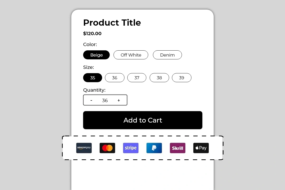 The Payment Icons Block displays a row of branded payment method icons on your product page — showing shoppers exactly which payment options are accepted before they reach checkout. It supports an optional heading above the icons, such as Your Payment Is Protected with Us, which adds a trust layer alongside the visual payment logos.
Available icons include widely recognized payment brands such as Amazon Pay, Mastercard, Stripe, PayPal, Skrill, Apple Pay, and more. Each icon uses its official branding — the actual logo, colors, and badge format that shoppers recognize instantly.
The Payment Icons Block displays a row of branded payment method icons on your product page — showing shoppers exactly which payment options are accepted before they reach checkout. It supports an optional heading above the icons, such as Your Payment Is Protected with Us, which adds a trust layer alongside the visual payment logos.
Available icons include widely recognized payment brands such as Amazon Pay, Mastercard, Stripe, PayPal, Skrill, Apple Pay, and more. Each icon uses its official branding — the actual logo, colors, and badge format that shoppers recognize instantly.
Why It Matters for Conversion
Payment uncertainty is a silent conversion killer. Many shoppers — particularly first-time visitors — will not proceed to checkout if they are not confident their preferred payment method is accepted. Rather than finding out at checkout that their payment option is not available, they leave the product page without even trying. Displaying payment icons on the product page does two things: It removes payment uncertainty before checkout. A shopper who sees the PayPal or Apple Pay logo on the product page knows they can complete the purchase without entering card details. That single piece of information removes a real barrier for a significant segment of shoppers. It adds a trust signal at the point of decision. Recognized payment brand logos — especially Mastercard, PayPal, and Apple Pay — carry institutional trust. Seeing these logos on a product page signals that the store is legitimate and professionally set up, even to first-time visitors who have no prior experience with the brand.How to Add the Payment Icons Block
- Go to Online Store → Themes in your Shopify admin
- Click Customize on your active theme
- Using the top dropdown, open your product template
- In the left sidebar, click Add block
- Under Apps, select Iconic Blocks → Payment Icons
- The block appears in your layout — configure it in the right sidebar
- Drag the block to your preferred position in the left sidebar
- Click Save
Key Settings
Heading Text An optional single line of text displayed above the payment icons (for example, Your Payment Is Protected with Us). This heading adds a trust statement that frames the icons as a security signal rather than just a list of logos. Use it when:- Your store is new and shoppers may not yet trust the brand
- You want to explicitly connect payment logos to security messaging
- Your product price point is high enough that payment trust is a significant consideration
- Your product page already has trust badges covering payment security
- You prefer a minimal layout and the icons alone communicate enough
- The heading would make the block feel repetitive alongside other trust content
- Your Payment Is Protected with Us
- Safe & Secure Checkout
- We Accept All Major Payment Methods
- 100% Secure Payment
- Amazon Pay
- Mastercard
- Visa
- Stripe
- PayPal
- Skrill
- Apple Pay
- Google Pay
- American Express
- Shop Pay
Placement Strategy
Best position: Directly below the Add to Cart button This is typically the most effective position for payment icons. A shopper who is about to click Add to Cart sees the payment logos immediately below. This confirms their payment method is accepted at the exact moment of commitment — removing one of the last barriers before conversion. Second best position: Between the price and Add to Cart button Works well for higher-priced products where payment method availability is a primary concern before the shopper even considers adding to cart. Seeing PayPal or Apple Pay next to a $300 price point immediately reduces payment anxiety. Avoid placing it:- Above the product title — payment information is a checkout detail, not a product introduction
- At the bottom of the page — it needs to be visible in the buying decision zone
- Repeated in multiple positions on the same page — one instance is a signal, two looks cluttered
Best Practices
- Only show payment methods that are actually active in your checkout. This is the single most important rule for this block. If a shopper sees the PayPal logo on the product page, adds to cart, reaches checkout, and PayPal is not available — it creates confusion and erodes trust. Every icon shown must correspond to a working payment option.
- Verify payment method availability in your Shopify admin before publishing. Go to Shopify Admin → Settings → Payments and confirm every method shown in the block is enabled and configured correctly.
- Use the heading for new stores or high-value products. The heading Your Payment Is Protected with Us adds a security context that is particularly valuable for stores that are still building brand recognition. For established brands with strong trust signals elsewhere on the page, the icons alone are sufficient.
- Keep the icon count to what is genuinely relevant. Showing 10 payment icons when you only actively support 4 looks dishonest and creates checkout confusion. Show the 4 to 6 methods your customers actually use most.
- Check mobile layout after selecting icons. A row of 6 or more icons can wrap to a second line on smaller screens. Preview on mobile and adjust icon size or count if the layout breaks.
- Pair with the Trust Badges Strip for maximum checkout confidence. Payment icons answer “can I pay my preferred way?” while trust badges answer “is this store safe and will I be protected?” The two blocks together cover the full spectrum of pre-checkout trust concerns.
Common Mistakes
Displaying payment icons for methods not enabled in checkout The most serious mistake with this block. If a shopper sees Apple Pay on the product page and Apple Pay is not available at checkout, the mismatch creates confusion and distrust. Always keep the icons in this block exactly in sync with your active Shopify payment methods. Showing too many icons A row of 10 or 12 payment badges looks unvetted and cluttered. It signals that the icons were added without thought rather than curated to reflect what the store actually supports. Stick to the 4 to 6 methods your customers are most likely to use. Using the heading redundantly If your page already has a Trust Badges block with Secure Payment as one of the badges, adding a heading of Your Payment Is Protected with Us above the payment icons repeats the same message twice. Either use the heading without a Secure Payment trust badge, or skip the heading and let the trust badge cover that message. Not checking mobile layout Six full-size payment badges in a horizontal row can overflow or wrap awkwardly on mobile screens. Always use the mobile preview toggle in the Theme Editor after configuring this block and adjust icon size or count if needed. Placing the block above the Add to Cart button on a crowded product page On pages with many blocks between the title and Add to Cart button, adding payment icons to that zone makes it more crowded. Payment icons work best below Add to Cart — they are confirmatory, not persuasive. Keep them out of the primary evaluation zone unless payment method is a key selling point.Troubleshooting
The block is not appearing on the product page- Cause: The block was not saved after being added, or it was added to the wrong product template.
- Solution: Go to Online Store → Themes → Customize, open the correct product template, confirm the block is in the left sidebar layout, and click Save.
- Cause: A specific icon asset failed to load, or there is a browser caching issue.
- Solution: Hard refresh the live page. If specific icons are consistently not showing, deselect and reselect them in the block settings and save. If the issue continues, contact Iconic Blocks support.
- Cause: Too many icons selected, or icon size is set too large for smaller screen widths.
- Solution: Reduce the number of icons to 4 or 5, or decrease the icon size setting. Preview on mobile using the Theme Editor toggle after each change.
- Cause: The heading font size or color is not aligned with the theme’s body text style.
- Solution: Adjust the heading font size and color in the block settings to match your theme’s standard text. Use the Theme Editor preview to compare against surrounding text elements.
- Cause: Your store uses multiple product templates and the block was only added to one.
- Solution: Open each product template in the Theme Editor and add the block to any template where it is missing.
- Cause: Changes were not saved, or the browser is showing a cached version of the page.
- Solution: Click Save in the Theme Editor, then open the live product page in a new private or incognito browser window.