

Circle Menu Block
What Is the Circle Menu Block?
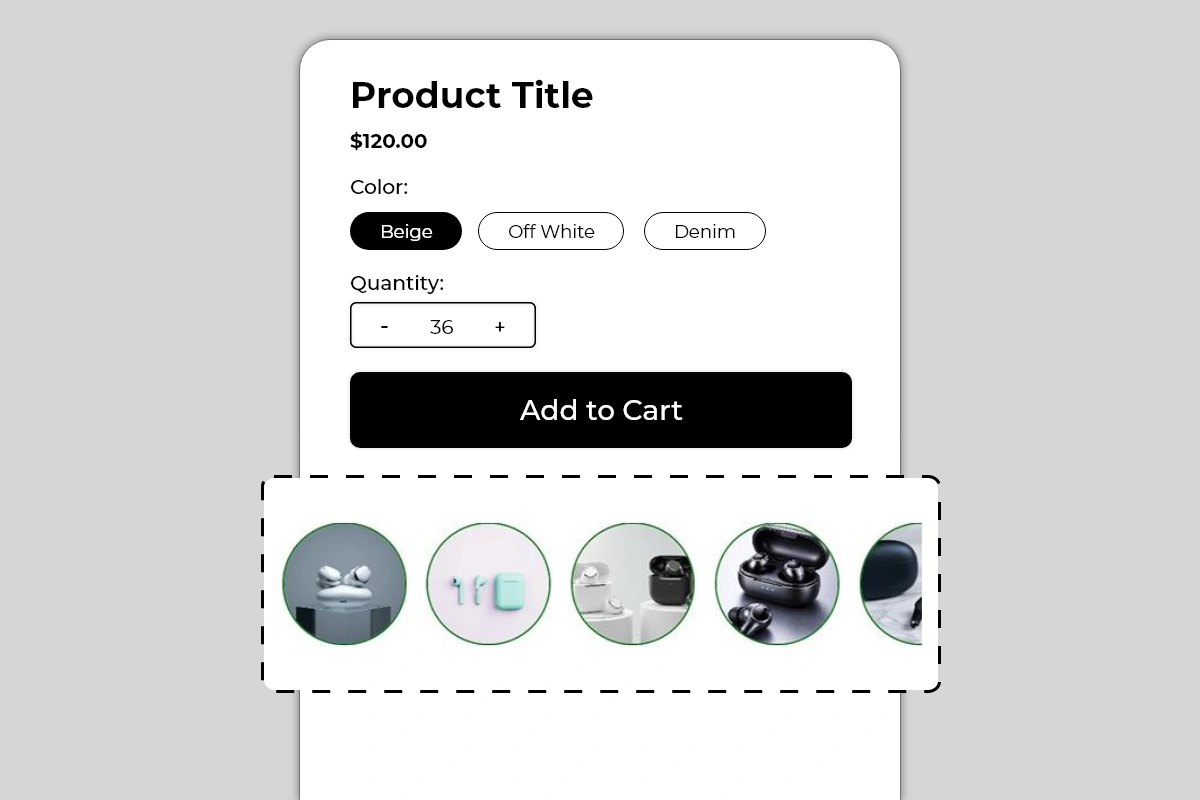
The Circle Menu Block displays a horizontally scrollable row of circular image thumbnails on your product page. Each circle contains an image and links to a product, variant, or URL you specify. Shoppers scroll through the row and tap or click any circle to navigate directly to that item.
The block is purely visual — no labels, no prices, no text. The images do the entire job of communicating what each circle links to. A colored border around each circle adds visual definition and is fully configurable to match your brand.
This block is used in two primary ways:
Variant navigation — showing different colors, styles, or versions of the same product as individual circles, each linking to the relevant variant or product page
Related product navigation — showing complementary or similar products from the same category, letting shoppers move between them without going back to a collection page
Why It Matters for Conversion
Two of the most common reasons shoppers leave a product page without buying are:
They want a different variant or version of the product but cannot find it easily
They are comparing the product to similar options and have to navigate away to do so
The Circle Menu Block solves both problems by keeping the navigation on the product page itself. A shopper who can see all available variants as visual circles — and switch between them with a single tap — is less likely to leave the page to find what they want. A shopper who can browse related products without returning to the collection page stays engaged in the buying flow for longer.
The circular format specifically works because it is visual and immediate. Shoppers assess product images faster than they read product titles. A row of product circles communicates the full range at a glance — which is exactly what a shopper needs when deciding between variants or comparing options.
How to Add the Circle Menu Block
Go to Online Store → Themes in your Shopify admin
Click Customize on your active theme
Using the top dropdown, open your product template
In the left sidebar, click Add block
Under Apps, select Iconic Blocks → Circle Menu
The block appears in your layout — configure it in the right sidebar
Drag the block to your preferred position in the left sidebar
Click Save
Key Settings
Circle Images Upload or select the image for each circle. These are manually uploaded — they are not automatically pulled from product variants. This gives you full control over which image represents each circle, but it also means you are responsible for keeping images accurate and up to date when products or variants change.
Use clean, centered product images with a consistent background across all circles. Consistency across all circles in the row is what makes the block look designed rather than assembled.
Link per Circle Each circle has its own URL or product link. Set this to the product page, variant URL, or collection URL you want the shopper to navigate to when they tap that circle. Verify every link is correct and active before publishing — a broken link in a navigation block is a dead end for the shopper.
Circle Border Color The colored ring around each circle. Shown in green in the example. This border is what visually defines each circle against the page background. Use your brand's primary color or an accent color that complements your theme. Keep it consistent across all circles — varying border colors per circle creates visual noise.
Border Width Control the thickness of the circle border. A thin border (1 to 2px) looks minimal and refined. A thicker border (3 to 4px) is more prominent and works better on busy or dark backgrounds. Default works for most themes.
Active/Selected Circle State When a shopper is currently on the product that corresponds to one of the circles, that circle can show a different border style or color to indicate it is the currently active item. This active state helps with orientation — shoppers know which product they are currently viewing within the set. Configure the active state color to be distinct from the default border color.
Circle Size Control the diameter of each circle. The default size works for most product pages. Increase if the images need more detail to be distinguishable. Reduce if the row is taking up too much vertical space. Always preview on mobile after adjusting — circles that look good on desktop can feel large or small on a phone screen.
Number of Circles Visible The block shows a fixed number of circles at full size before the row becomes horizontally scrollable. The partial fifth circle visible in the image is a deliberate affordance — it signals to shoppers that there are more items to scroll to. Do not configure the block to show all circles fully if you have more than 4 — the partial cut-off circle is an important scroll indicator.
Use Cases by Store Type
Fashion and apparel Show the same product in different colorways — one circle per color variant. Each circle links to the product page for that color. A shopper on the black version can instantly switch to the white or navy version without returning to the collection.
Footwear Show the same shoe model in different colors or materials. Each circle links to the correct product page for that variant. Works especially well for stores with a hero product available in multiple options.
Electronics and accessories Show different models or versions of a product — as demonstrated in the images with different earbud products. Each circle links to the product page for that model. Shoppers compare options visually without leaving the product page context.
Beauty and skincare Show different shades, scents, or formulations of a product. Each circle links to the relevant variant. The visual format works particularly well for color-differentiated products like lipsticks, nail polishes, or eyeshadows.
Home and lifestyle Show a product available in different finishes, sizes, or materials. Each circle links to the correct variant. Particularly effective for furniture, ceramics, or textiles where visual differentiation between variants is the primary decision factor.
Placement Strategy
Best position: Directly below the Add to Cart button This is the placement shown in Image 1 and the most effective position for this block. A shopper who has evaluated the product and is near the Add to Cart button sees the circle menu immediately below. If they are not completely sold on the current variant, they can quickly switch to another without losing their place on the page. This keeps them engaged rather than navigating away.
Second best position: Between the product title and variant selectors Works well when the circles represent color or style variants of the same product. Placing them near the existing variant selectors creates a visual selection area where the shopper can see both the native Shopify variant buttons and the circle images together.
Avoid placing it:
Above the product title — navigation elements belong below the product identity, not above it
At the very bottom of the page — by the time a shopper reaches the bottom they have either committed or left
Immediately above the Add to Cart button — the circle menu should follow the buying decision, not interrupt it
Best Practices
Use consistent images across all circles. All circles should use the same image style — same background, same angle, same framing. Mixing lifestyle shots with product-only shots, or images from different angles, makes the row look inconsistent and reduces the visual quality of the block.
Keep the image subject centered. Circular cropping cuts the corners of every image. A product that sits at the edge of the frame will be cropped out of the circle. Center the key subject of every image before uploading.
Always verify every link before publishing. A circle that links to a 404 page or a wrong product is worse than no link at all. Test every circle on the live page after publishing.
Use the partial circle cutoff as a scroll signal. Do not configure the block to show all circles fully if you have more than 4 items. The partially visible fifth circle tells shoppers the row is scrollable. Without it, shoppers may not realize there are more items.
Keep the circle count reasonable. A row of 3 to 6 circles works well. More than 8 circles makes the row feel like a catalog rather than a curated navigation. If you have many variants, consider grouping them or using Shopify's native variant selectors for the full range.
Update images and links immediately when products change. If a variant is discontinued or a product page URL changes, the corresponding circle will either show an outdated image or link to a broken page. Set a process to update this block whenever your product catalog changes.
Common Mistakes
Using images that are too different in style or framing A row where one circle has a plain white background product shot, the next has a lifestyle photo, and the third has a dark studio image looks undesigned and inconsistent. All circles in a row should use the same image treatment.
Not testing links after publishing It is easy to paste a link incorrectly or link to a product that has since been unpublished. Always open every circle link on the live page after publishing and verify it lands on the correct product or variant.
Showing all circles without a scroll indicator If you have 6 products but configure the block to show all 6 fully without any cut-off, shoppers have no visual cue that the row is interactive or that it contains navigable items. The partial circle at the end is what makes the scrollable nature of the block apparent. Keep at least one circle partially cut off.
Using poor quality or small source images Circular thumbnails are displayed at a consistent size on the page. If the source image is low resolution, it will look blurry in the circle. Use product images of at least 400 x 400 pixels for every circle.
Setting every circle border to a different color Varying border colors per circle creates visual chaos. The border should be a consistent design element across all circles — one color, same weight. If you want to indicate the currently active item, use the active state setting to differentiate just that one circle.
Forgetting to update the block when products change This block is manually configured — images and links do not update automatically when products change in Shopify. If a product is renamed, repriced, or discontinued, the circle image and link will not update on their own. Build a habit of reviewing this block whenever your product catalog changes.
Troubleshooting
A circle is linking to the wrong product or a 404 page
Cause: The link was entered incorrectly, or the product URL has changed since the block was configured.
Solution: Open the block settings in the Theme Editor, locate the affected circle, and update the link to the correct current product URL. Test on the live page after saving.
Circle images are appearing blurry or pixelated
Cause: The source images uploaded to the block are too low in resolution for the circle size being used.
Solution: Replace the affected images with higher resolution versions — minimum 400 x 400 pixels recommended. Re-upload in the block settings and save.
The row is not scrolling on mobile
Cause: A theme CSS conflict may be preventing horizontal scroll behavior, or all circles are fitting within the screen width without requiring scroll.
Solution: Add more circles so the row exceeds the screen width, or check for theme CSS conflicts. If scrolling is broken on a device where it should be active, contact Iconic Blocks support with your store URL and device type.
The block is not appearing on the product page
Cause: The block was not saved after being added, or it was added to the wrong product template.
Solution: Go to Online Store → Themes → Customize, open the correct product template, confirm the block is in the left sidebar layout, and click Save.
The active circle state is not showing correctly
Cause: The active state is determined by the current page URL matching the circle's link. If the URL structure does not match exactly — for example, due to variant parameters — the active state may not trigger.
Solution: Verify the link set for each circle exactly matches the URL of the corresponding product page as it appears in the browser address bar. Contact Iconic Blocks support if the active state continues to behave unexpectedly.
The block appears on some products but not others
Cause: Your store uses multiple product templates and the block was only added to one.
Solution: Open each product template in the Theme Editor and add the block to any template where it is missing. Configure separate circle sets per template if the related products differ by category.
The block is visible in the Theme Editor but not on the live store
Cause: Changes were not saved, or the browser is showing a cached version of the page.
Solution: Click Save in the Theme Editor, then open the live product page in a new private or incognito browser window.