

Countdown Timer Block
What Is the Countdown Timer Block?
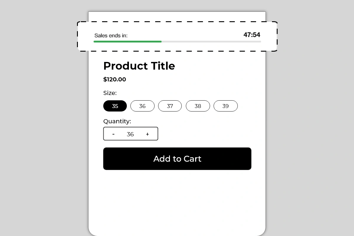
The Countdown Timer Block displays a live countdown on your product page showing how much time is left before a sale, offer, or deal ends. It shows a custom label, a ticking timer in minutes and seconds, and a green progress bar that visually depletes in real time as the clock runs down.
Unlike a static text message saying "Sale ends soon", this block shows an actual clock counting down, which creates a fundamentally different psychological response. A shopper watching time run out is far more motivated to act than a shopper reading a vague claim of urgency.
Why It Matters for Conversion
The single biggest conversion killer on any product page is the decision to "come back later." When a shopper feels no time pressure, there is no cost to delaying the purchase — and most delayed purchases never happen.
A countdown timer removes that option. It makes the cost of waiting visible and real. The depleting progress bar reinforces this visually — every second the bar gets shorter, the offer gets closer to expiring. This combination of a live clock and a shrinking visual bar is one of the most effective urgency mechanisms available on a product page.
Used correctly — meaning tied to a real, time-limited offer — a countdown timer can meaningfully increase the percentage of shoppers who convert on their first visit instead of leaving and never returning.
How to Add the Countdown Timer Block
Go to Online Store → Themes in your Shopify admin
Click Customize on your active theme
Using the top dropdown, open your product template
In the left sidebar, click Add block
Under Apps, select Iconic Blocks → Countdown Timer
The block appears in your layout — configure it in the right sidebar
Drag the block to your preferred position in the left sidebar
Click Save
Key Settings
Label Text The short text displayed on the left side of the timer — shown as Sales ends in: in the example. This sets the context for the countdown. Keep it to 3 to 5 words. The label should tell the shopper exactly what is ending so the urgency is immediately understood.
Good label examples:
Sales ends in:
Offer expires in:
Deal ends in:
Free shipping ends in:
Flash sale ends in:
Countdown Duration Set the total time the timer counts down from. This is typically set in minutes. The example shows 47:54 — just under 48 minutes remaining. Choose a duration that is realistic for your offer. A timer set to 60 minutes that resets every time the page loads is not a real countdown — see Common Mistakes below.
Progress Bar Color The bar starts full and depletes as time runs out. The default color is green. You can change this to match your brand color or use a color that signals urgency — green for early time remaining, or consider a warmer tone if you want the bar to feel more pressing as it depletes.
Progress Bar Background Color The unfilled portion of the bar. Keep this light and neutral — light gray works on most themes. The contrast between the filled bar color and the empty background is what makes the depletion visually clear.
Timer Text Color The color of the countdown numbers on the right. Keep this dark and high contrast — the timer numbers need to be immediately readable. Bold black on white works for most themes.
Label Text Color The color of the label on the left. Typically matches body text or is slightly lighter — the label is supporting context, not the primary focus. The countdown number and the bar are the visual anchors.
Placement Strategy
Best position: Above the product title This is the placement shown in the image and the highest-impact position for a countdown timer. A shopper landing on the product page sees the timer immediately — before the title, before the price. This creates urgency from the very first second of the page visit and frames the entire product evaluation under time pressure.
Second best position: Between the price and Add to Cart button If your timer is tied specifically to a price offer — a discounted price that expires — placing it between the price and Add to Cart button connects the urgency directly to the buying decision. The shopper sees the price, sees the clock running out, and acts.
Third position: Directly below the Add to Cart button Works as a reinforcing signal for shoppers who have scrolled past the title and are close to converting but have not yet committed. Seeing the timer just below the button they are about to click can be the final push.
Avoid placing it:
At the bottom of the product page — the timer only creates urgency if it is seen early in the page visit
Repeated in multiple positions on the same page — one timer is a signal, two timers looks desperate
On pages where no real offer is active — a timer with no corresponding offer confuses shoppers
Best Practices
Always tie the timer to a real offer. A countdown that counts down to nothing — no price change, no expiry, no consequence — destroys trust the moment a shopper realizes it. Every timer should correspond to an actual limited-time event: a sale price, a free shipping window, a flash deal, a promotional code expiry.
Set a realistic duration. A timer showing 47 minutes creates genuine urgency. A timer showing 23 hours feels like a standard sale banner. A timer showing 5 minutes feels fake if the page resets it every visit. Match the duration to the real urgency of the offer.
Use the label to name the offer specifically. Sales ends in: is good. Free Shipping ends in: is better — it tells the shopper exactly what they will lose if they wait. The more specific the label, the more real the urgency feels.
Pair with a discount or offer that is visible on the same page. The timer works best when the shopper can see both the offer and the clock simultaneously. If the discount is only visible at checkout, the urgency of the timer is weakened because the shopper cannot see what they are racing to claim.
Remove the timer when the offer is no longer active. A countdown that has expired and now shows 00:00 — or worse, resets — signals to shoppers that the urgency was artificial. Take the block down or update it when the offer ends.
Test on mobile before publishing. The label, timer, and progress bar all need to fit cleanly in a single row on smaller screens. If the layout breaks on mobile, shorten the label text and verify the bar scales correctly.
Common Mistakes
Using a timer that resets on every page load If the countdown starts from the same time every time a shopper visits or refreshes the page, it is not a real countdown — it is a looping animation. Shoppers who notice this immediately lose trust in the store. Use a timer tied to a real end time, not a recurring interval.
Running a timer with no corresponding offer A timer that counts down to nothing — no sale, no expiry, no consequence — is misleading. If a shopper sees Sales ends in: 00:00 and the price has not changed, they know the urgency was fake. This damages trust more than not having a timer at all.
Setting the duration too long A timer showing 18 hours or 23 hours does not create urgency — it reads as a standard promotional banner. Timers work because time is visibly running out. Keep durations under a few hours for maximum urgency impact.
Leaving an expired timer on the page An expired timer showing 00:00 with no offer change is confusing and looks broken. As soon as an offer ends, either remove the block or update it with the next active offer.
Using a label that is too vague Hurry! or Limited Time! as a label tells the shopper nothing specific. Always name what is ending — Sales ends in:, Free Shipping ends in:, Discount expires in:. Specificity makes the urgency credible.
Placing the timer where shoppers cannot see it A timer placed below the fold — below the description, tabs, or reviews — will be seen by very few shoppers. The timer must be in the immediate view area when the page loads to have any urgency impact.
What Happens When the Timer Expires?
Decide in advance what shoppers should see at the end of the countdown. Check the block settings (right sidebar in the Theme Editor) for any option that controls the expired state (for example: hide the block, show 00:00, or replace with a message). If there is no expired-state setting, plan to manually remove or update the block when the offer ends so the product page does not display an expired timer.
Troubleshooting
The timer is not counting down — it appears frozen
Cause: A browser or theme script conflict is preventing the timer from running, or the block did not load correctly.
Solution: Hard refresh the live product page (Ctrl + Shift + R or Cmd + Shift + R). If the timer still does not move, try a different browser. If the issue persists, contact Iconic Blocks support.
The progress bar is not visible on the live store
Cause: The bar color is too similar to the background color, or the theme CSS is overriding the bar styling.
Solution: Increase the contrast between the bar color and background color in the block settings. Preview on the live page in an incognito window after saving.
The block is not appearing on the product page
Cause: The block was not saved after being added, or it was added to the wrong product template.
Solution: Go to Online Store → Themes → Customize, open the correct product template, confirm the block is visible in the left sidebar layout, and click Save.
The layout is breaking on mobile — label and timer are overlapping
Cause: The label text is too long to fit alongside the timer number on smaller screens.
Solution: Shorten the label to 3 words or fewer — Sale ends in: instead of This special offer ends in:. Preview using the mobile toggle in the Theme Editor after each change.
The block appears on some products but not others
Cause: Your store uses multiple product templates and the block was only added to one.
Solution: Open each product template in the Theme Editor and add the block to any template where it is missing.