

Benefits Block
What Is the Benefits Block?
The Benefits Block displays your product's key selling points directly on the product page in a scannable, visual format. Instead of burying benefits inside a long product description, this block puts them front and center — right where shoppers are making their buying decision.
It comes in two layout styles:
Benefits List — a vertical checklist with an icon, a bold keyword, and a short supporting text per item
Benefits Grid — a two-column card layout with an icon, a title, and a subtitle per item
Both layouts serve the same purpose. The right choice depends on your product type, the number of benefits you want to show, and the visual style of your store.
Why It Matters for Conversion
Shoppers skim product pages. They do not read full descriptions — they scan for reasons to buy or reasons to hesitate. If your key selling points are written inside a paragraph, most shoppers will miss them entirely.
The Benefits Block solves this by presenting your strongest selling points in a format that is impossible to miss and takes seconds to read. Placed directly below the Add to Cart button or just above it, it gives shoppers the quick confirmation they need to feel confident about their purchase.
Layout 1 — Benefits List
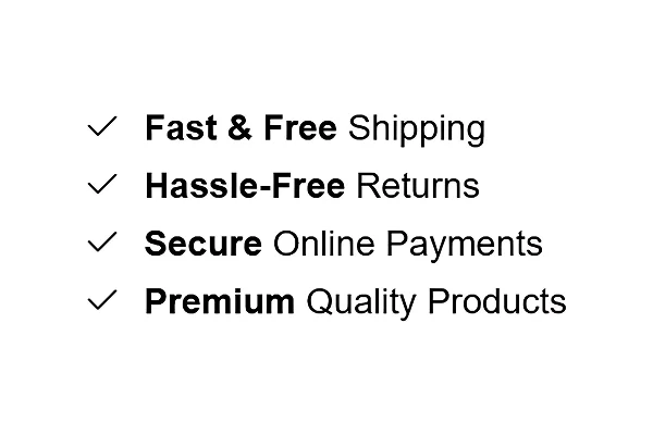
What It Looks Like
A vertical list where each row contains:
A checkmark or custom icon on the left
A bold keyword (e.g. Fast & Free) followed by supporting text (e.g. Shipping)
Each item stacked cleanly below the last
Best for stores that want a clean, minimal look — works well for fashion, lifestyle, general merchandise, and any store where trust and reassurance are the primary message.
How to Add Benefits List
Go to Online Store → Themes in your Shopify admin
Click Customize on your active theme
Using the top dropdown, open your product template
In the left sidebar, click Add block
Under Apps, select Iconic Blocks → Benefit #1
The block appears in your layout — configure it in the right sidebar
Drag the block to your preferred position in the left sidebar
Click Save
Key Settings — Benefits List
Icon Choose a checkmark or upload a custom icon for each benefit item. Keep icons consistent across all items — mixing styles looks unpolished.
Bold Keyword This is the first part of each benefit line and displays in bold. Keep it to 1–3 words. This is what the shopper reads first — make it the most impactful word in the benefit (e.g. Free, Secure, Hassle-Free).
Benefit Text The regular weight text that follows the bold keyword. This completes the benefit statement (e.g. Shipping, Online Payments, Returns). Keep it short — 2 to 4 words.
Number of Items Add between 3 and 5 benefit items. Fewer than 3 looks sparse. More than 5 starts to feel like a list nobody will read.
Spacing and Dividers Control the spacing between items and whether a divider line appears between each row. Dividers work well on light themes. Remove them on dark or minimal themes for a cleaner look.
Layout 2 — Benefits Grid
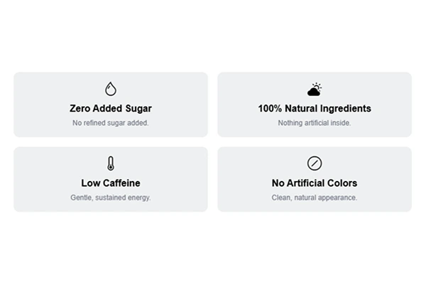
What It Looks Like
A two-column card grid where each card contains:
An emoji or icon at the top center
A bold title below the icon (e.g. Zero Added Sugar)
A short subtitle below the title (e.g. No Refined Sugar Added.)
Each card has a light background, giving it a boxed, structured appearance. Best for health, food, wellness, beauty, and supplement products where specific product attributes need individual emphasis.
How to Add Benefits Grid
Go to Online Store → Themes in your Shopify admin
Click Customize on your active theme
Using the top dropdown, open your product template
In the left sidebar, click Add block
Under Apps, select Iconic Blocks → Benefit #2
The block appears in your layout — configure it in the right sidebar
Drag the block to your preferred position in the left sidebar
Click Save
Key Settings — Benefits Grid
Icon or Emoji Each card supports an emoji or uploaded icon at the top. Emojis work well for food and wellness products because they are immediately recognizable and add visual warmth. Custom icons work better for brands with a more formal or premium tone.
Card Title The bold text inside each card. This should name the benefit directly — not describe it. Keep it under 5 words (e.g. Zero Added Sugar, 100% Natural Ingredients).
Card Subtitle A single short sentence that supports the title. This is not the place for marketing language — use it to add one specific, credible detail (e.g. No Refined Sugar Added., Nothing artificial inside.).
Number of Cards The grid works best with 4 cards (2 rows of 2). You can also use 2, but 4 is the most visually balanced and easiest to read on both desktop and mobile.
Card Background Color Use a light neutral that complements your theme background. Avoid strong colors — the card background is structural, not decorative. Its job is to separate each benefit visually, not draw attention to itself.
Placement Strategy
Where you place the Benefits Block on your product page has a direct impact on how many shoppers see it and act on it.
Best position: Directly below the Add to Cart button This is the highest-impact placement. A shopper reads the product name, sees the price, selects their variant, and is about to click Add to Cart. The benefits block at this exact moment answers the unspoken question — "Why should I buy this right now?"
Second best position: Between the price and the Add to Cart button Works well if your product page is long and the Add to Cart button sits lower on the page. Placing benefits here keeps them visible in the zone where the buying decision is being made.
Avoid placing it:
At the very bottom of the product page — most shoppers will never scroll that far
Above the product title — it disrupts the natural reading flow
Inside a collapsed accordion or tab — it reduces visibility significantly
Best Practices
Lead with your strongest benefit first. Shoppers read top to bottom. Put the benefit that removes the biggest objection at the top of the list.
Use specific language, not generic claims. Free shipping on all orders converts better than Great Shipping. 30-day hassle-free returns converts better than Easy Returns.
Match the layout to your product type. Use Benefits List for trust and reassurance messaging. Use Benefits Grid for product-specific attributes and features.
Keep all benefit text at a similar length. Inconsistent lengths look unfinished and break the visual rhythm of the block.
Do not use both layouts on the same product page. Pick one. Using both creates visual repetition and dilutes the impact of each.
Test on mobile before publishing. The Grid layout especially needs to be checked on mobile — cards should stack cleanly and remain readable at small screen sizes.
Common Mistakes
Using vague benefit text Writing Good Quality or Best Products communicates nothing specific. Every benefit should answer a real question a shopper might have.
Adding too many items More than 5 items in a list or more than 6 cards in a grid starts to feel overwhelming. If everything is highlighted, nothing stands out. Pick your best 3 to 4 benefits and stop there.
Placing the block too far down the page If the block appears after a long description, size guides, and shipping tabs, most shoppers will never see it. Benefits need to be in the zone where the purchase decision is happening — near the price and Add to Cart button.
Using mismatched icons Mixing flat icons with emojis or using icons of different visual weights makes the block look inconsistent. Choose one style and apply it across all items.
Writing card subtitles that repeat the title Title: Zero Added Sugar / Subtitle: No sugar added. — this adds no value. Use the subtitle to add a new piece of information, not restate what the title already says.
Troubleshooting
The block is not appearing on the product page
Cause: The block was added but the theme was not saved, or it was added to the wrong template.
Solution: Go to Online Store → Themes → Customize, open the correct product template, confirm the block is visible in the left sidebar layout, and click Save.
The block appears on some products but not others
Cause: Your store uses multiple product templates and the block was only added to one of them.
Solution: In the Theme Editor, check each product template separately and add the block to any template where it is missing.
Icons are not displaying
Cause: The icon file format is not supported, or the image did not upload correctly.
Solution: Use PNG or SVG format. Re-upload the icon in the block settings. If the issue persists, try a different browser.
The grid cards are stacking unevenly on mobile
Cause: Card subtitles are significantly different lengths, causing uneven card heights.
Solution: Edit subtitle text so all cards have a similar character count. Aim for one short sentence per card, consistently.
The block is visible in the Theme Editor preview but not on the live store
Cause: Changes were not saved, or the browser is showing a cached version of the page.
Solution: Click Save in the Theme Editor, then open the live product page in a new private/incognito browser window.