

Addons Product Block
What Is the Addons Product Block?
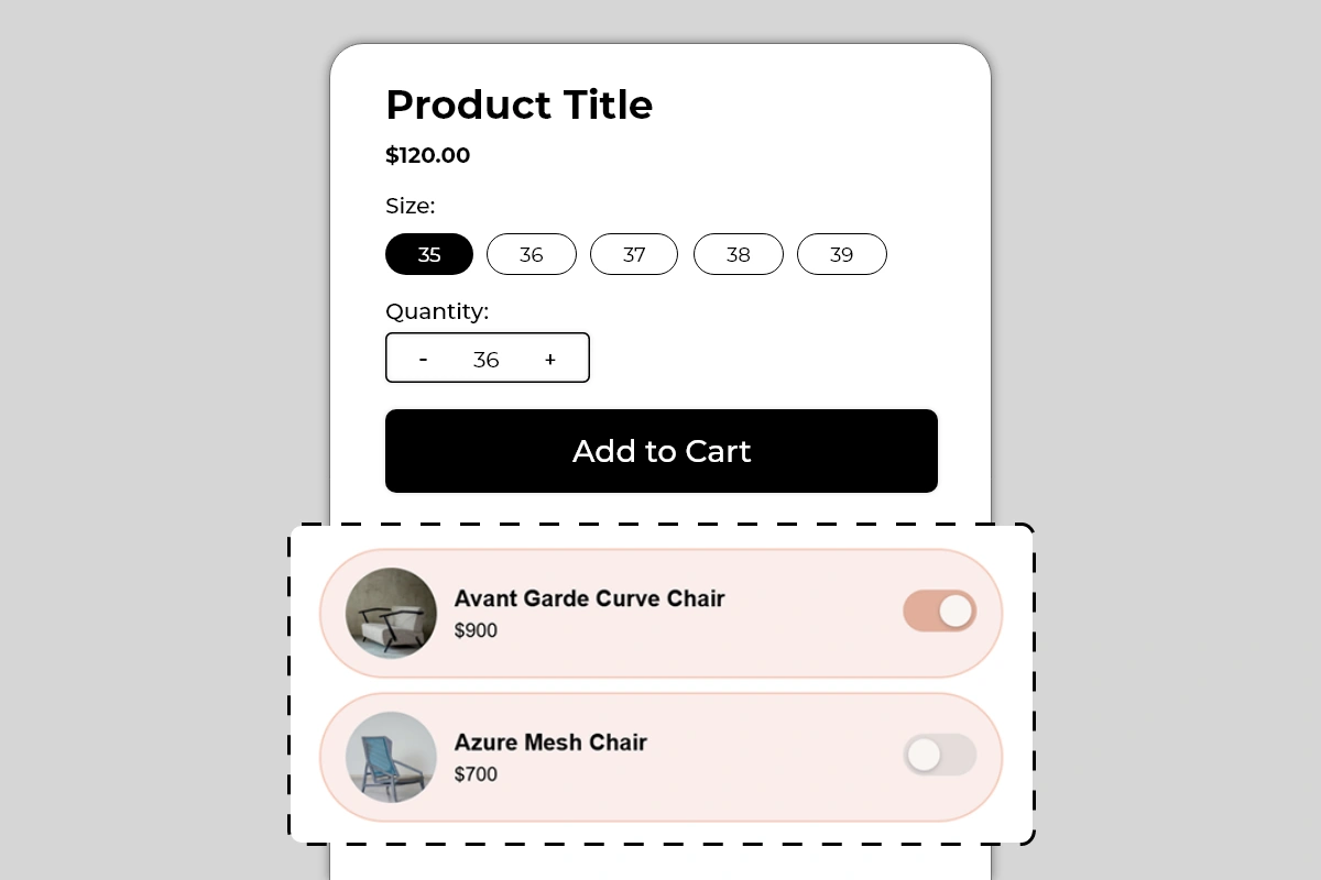
The Addons Product Block displays a list of complementary products directly on your product page, each with a toggle switch that shoppers use to add them to their cart alongside the main product. Each add-on row shows a product image, product name, and price — with a toggle on the right that activates or deactivates the add-on.
When a shopper toggles an add-on on, that product is added to their cart together with the main product they are buying. No separate product page visit required. No extra search needed. The add-on goes into the cart in one tap.
This block is one of the most direct average order value tools in Iconic Blocks — it turns a single-product purchase into a multi-product purchase at the exact moment the shopper is already in buying mode.
Why It Matters for Conversion and AOV
Getting a shopper to the point of buying is the hardest part of e-commerce. Once a shopper is on a product page, engaged, and about to add to cart, they are in the highest-intent state they will ever be in. This is the moment when suggesting a complementary product has the highest chance of being accepted.
The toggle format is specifically designed to reduce friction in this moment:
It does not interrupt the main purchase flow
It does not redirect to another product page
It does not require the shopper to search or browse
A single tap adds the product — a second tap removes it
The result is that shoppers who would never have sought out the add-on product independently will add it simply because it is presented at the right moment in a frictionless format. This is the core mechanic behind add-on and bundle upselling — and it works because the effort required is near zero.
How to Add the Addons Product Block
Go to Online Store → Themes in your Shopify admin
Click Customize on your active theme
Using the top dropdown, open your product template
In the left sidebar, click Add block
Under Apps, select Iconic Blocks → Addons Product
The block appears in your layout — configure it in the right sidebar
Drag the block to your preferred position in the left sidebar
Click Save
Key Settings
Add-on Products Select the products you want to display as add-ons. These are pulled from your Shopify product catalog. You can add multiple products — each appears as its own row in the block. The product image, name, and price are pulled automatically from the product in your Shopify admin.
Choose products carefully — see Best Practices below for guidance on what makes a good add-on versus a poor one.
Product Image Pulled automatically from the product's main image in Shopify. Displayed as a circular thumbnail on the left of each row. If a product's main image is not ideal for a small circular thumbnail — for example, a full lifestyle shot — consider updating the product image in Shopify admin to a clean product-only image that works at small sizes.
Product Name Pulled automatically from the product title in Shopify. Displayed in bold in the center of the row. If your product titles are long, they may truncate on smaller screens — keep product titles concise for products used as add-ons.
Price Pulled automatically from the product's current price in Shopify. Displayed below the product name. If the product has a sale price, confirm which price is showing and that it is accurate.
Toggle State on Load Configure whether each add-on starts with the toggle in the on or off position when the page loads. Starting a toggle in the on position means the add-on is pre-selected — the shopper has to actively turn it off if they do not want it. This increases add-on attachment rate but can feel presumptuous if not clearly communicated. Use pre-selected toggles only for genuinely essential or universally relevant add-ons.
Card Background Color The background color of each add-on row card. The default is a soft pink/blush tone as shown in the example. Choose a color that is noticeably different from the product page background — enough to visually group the add-on rows as a distinct block — but soft enough not to overpower the product content above.
Toggle Active Color The color of the toggle when it is switched on. The default matches the card background in a deeper tone. Use your brand's primary color here — it makes the active toggle feel intentional and on-brand.
Block Heading An optional heading above the add-on rows — for example, Complete the Look, Frequently Bought Together, Add to Your Order, or You May Also Need. A heading contextualizes the block and makes it clear to shoppers what these products are and why they are being shown.
Choosing the Right Add-on Products
The products you select for this block determine its effectiveness entirely. A poorly chosen add-on will be ignored. A well-chosen add-on will be toggled on by a significant percentage of shoppers.
What makes a good add-on:
Directly complements the main product — a chair cover for a chair, a lens cap for a camera, socks for shoes
Lower in price than the main product — an add-on priced higher than the main product feels like an upsell to a better product, not an add-on to the current one
Something the shopper genuinely needs alongside the main product — a charger for an electronic device, a carrying case for equipment
A consumable or accessory the shopper would buy anyway — replacement parts, care products, cleaning kits
What makes a poor add-on:
A completely unrelated product from a different category
A product that is the same as or more expensive than the main product
A product the shopper would never think to need — no matter how good the product is, if the shopper has no mental model for needing it, they will not toggle it on
A product that is already included with the main product — showing it as an add-on creates confusion
Placement Strategy
Best position: Directly below the Add to Cart button This is the placement shown in Image 1 and the most effective position for this block. A shopper who has decided to buy the main product sees the add-ons immediately after the Add to Cart button. They are in active buying mode — this is exactly when a frictionless add-on toggle is most likely to be accepted. The sequence is: decide to buy main product → see complementary add-ons → toggle on the relevant one → add everything to cart.
Second best position: Between the price and Add to Cart button Works for add-ons that are so closely related to the main product that they influence the buying decision itself — for example, a warranty, a protection plan, or a customization option. In this case the shopper evaluates the main product and the add-on together before deciding.
Avoid placing it:
Above the product title — add-ons are supplementary, not introductory
At the bottom of the page below reviews and descriptions — by this point the shopper has already decided and the add-on opportunity is largely missed
Before the shopper has seen the main product price — add-on pricing only makes sense in context of the main product price the shopper has already seen
Best Practices
Limit to 2 to 3 add-ons maximum. One well-chosen add-on converts better than five mediocre ones. Too many options creates decision fatigue and can reduce both the add-on conversion rate and the main product conversion rate. Pick the 2 to 3 most relevant, highest-value add-ons and stop there.
Price add-ons below the main product. An add-on priced at $20 to $50 alongside a $120 main product feels natural — a small incremental spend for a useful complement. An add-on priced at $200 alongside a $120 product feels like being upsold to a different product entirely.
Use a descriptive block heading. Complete the Look works for fashion. Frequently Bought Together works for home and electronics. Add to Your Order works for consumables. The heading should tell the shopper exactly why these products are being shown and what relationship they have to the main product.
Test pre-selected toggles carefully. Pre-selecting an add-on can increase attachment rate but can also frustrate shoppers who do not notice the toggle is on and end up with an unwanted product in their cart. If you use pre-selected toggles, make the toggle state clearly visible and use a heading that signals the add-on is included by default.
Keep product images clean and product-focused. Circular thumbnails at small sizes work best with clean, centered product images on a plain or minimal background. Lifestyle images and busy compositions do not read well at thumbnail size.
Update add-on selections seasonally or when product relevance changes. An add-on that was relevant during winter may not be relevant in summer. Review the add-on selections periodically and update them to maintain relevance.
Common Mistakes
Selecting add-ons that are unrelated to the main product Showing a candle as an add-on on a footwear product page has no logical connection for the shopper. They will ignore it. Every add-on must have an obvious and immediate relationship to the main product.
Using too many add-ons A block with 5 or 6 add-on rows takes up significant vertical space and overwhelms the shopper with choices. Decision fatigue reduces both add-on and main product conversion. Keep it to 2 to 3 maximum.
Pricing add-ons higher than the main product A $900 add-on shown below a $120 main product is not an add-on — it is a more expensive alternative. Shoppers will either be confused or feel pressured. Add-ons should feel like a small, sensible incremental spend.
Not verifying product prices are current Add-on prices are pulled from Shopify in real time. If a product goes on sale or the price changes, the block will reflect the new price automatically. This is generally correct behavior — but verify that sale prices showing in the block are accurate and intentional before publishing.
Pre-selecting high-value add-ons without clear communication Pre-selecting a $150 add-on toggle means a shopper who does not notice it will reach checkout with an unexpected $150 item in their cart. This creates disputes and erodes trust. Only pre-select low-cost, genuinely essential add-ons — and always use a heading that makes the pre-selection visible and intentional.
Using poor quality or unsuitable thumbnail images A blurry, off-center, or lifestyle-heavy image does not read well at the small circular thumbnail size used by this block. Update product images in Shopify admin for any product used as an add-on to ensure the thumbnail is clean, centered, and immediately identifiable.
Troubleshooting
The add-on is not being added to the cart when toggled on
Cause: The product may be out of stock, or there is a cart conflict with the toggle action.
Solution: Verify the add-on product has available inventory in Shopify Admin → Products → [Product] → Inventory. Test the toggle on the live page in an incognito browser. If the issue persists, contact Iconic Blocks support.
The product image is not showing or showing incorrectly
Cause: The product does not have a main image set in Shopify, or the image is not loading correctly.
Solution: Go to Shopify Admin → Products → [Product] and verify a main product image is uploaded. If the image exists but is not rendering, hard refresh the live page. If the issue continues, contact Iconic Blocks support.
The block is not appearing on the product page
Cause: The block was not saved after being added, or it was added to the wrong product template.
Solution: Go to Online Store → Themes → Customize, open the correct product template, confirm the block is in the left sidebar layout, and click Save.
The add-on price shown is incorrect
Cause: The price in the block is pulled directly from the product in Shopify. If it looks wrong, the product price in Shopify admin may have been updated or a discount may be active.
Solution: Go to Shopify Admin → Products → [Product] and verify the current price is correct. Check for any active automatic discounts that may be affecting the displayed price.
The block appears on some products but not others
Cause: Your store uses multiple product templates and the block was only added to one.
Solution: Open each product template in the Theme Editor and add the block to any template where it is missing. Configure different add-on products per template if the complementary products differ by product category.
The block is visible in the Theme Editor but not on the live store
Cause: Changes were not saved, or the browser is showing a cached version of the page.
Solution: Click Save in the Theme Editor, then open the live product page in a new private or incognito browser window.